
TL;DR
Choose an app explainer reference by the belief it must prove. Use Google Calendar for context-first storytelling, Spotify for a single-feature launch, Amazon Lens for an input-action-result chain, and Windows App for cross-device evidence. Build from current UI captures, approved copy, and a shot-to-asset map so the final video preserves the product facts it explains.
An app explainer video should do more than move a phone mockup across the screen. It needs to make one user problem recognizable, show the app solving it, and preserve enough real interface detail for the viewer to believe the product can deliver. The eight examples below use different combinations of live action, animation, product UI, text, and voiceover. Each one offers a pattern you can adapt without copying its style frame for frame.
Build an explainer from the product materials you already have
01
What an app explainer video needs to explain
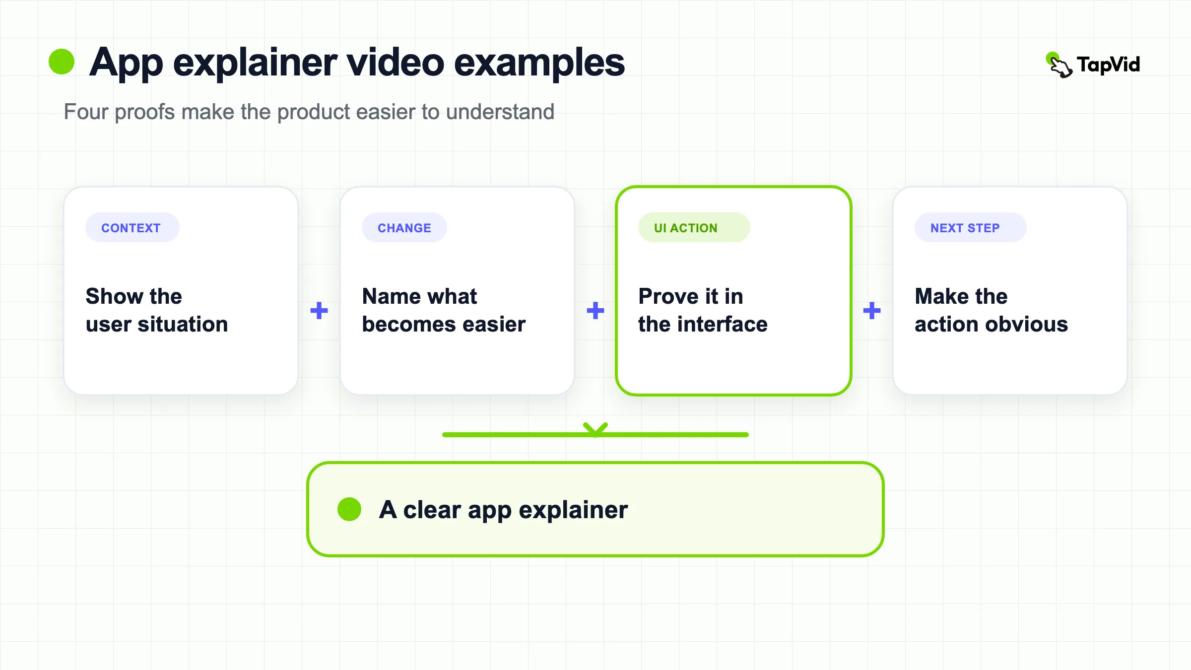
Most viewers need answers to four questions before they will keep watching or try an app:
- What situation is this for?
- What changes after I use it?
- What does the important action look like inside the app?
- What should I do next?
The balance changes by product. A familiar category can spend less time defining the problem and more time on a distinctive feature. A new category needs more context before the interface appears. A trust-sensitive app should show the real workflow and exact on-screen labels instead of relying on abstract animation.
This gives us a useful way to compare examples:
| Example | Opening device | Product proof | Best pattern to copy |
|---|---|---|---|
| Google Calendar | Everyday situations | Calendar cards inside real scenes | Connect features to recognizable moments |
| Spotify AI Playlist | One-line feature promise | Prompt and playlist UI | Explain one feature, not the whole app |
| Headspace | Calm guided orientation | Real navigation and content categories | Let the product's emotional tone control the pace |
| Amazon Lens | Immediate visual action | Photo, circle, matching products | Show input, action, result in one chain |
| Windows App | Cross-device problem | Interfaces across supported devices | Prove availability visually |
| Waze | Driver scenario | Voice interaction and map response | Put the feature inside a real day |
| MyHeritage | Family motivation | Tree, records, and photo workflows | Let emotion give functional screens meaning |
| Doctors in Italy | Urgent location problem | Search and matching flow | Use a familiar visual metaphor for a local service |
02
8 app explainer video examples worth studying
1. Google Calendar: attach features to real moments
Google does not begin with a feature list. The video moves through recognizable plans and lets the calendar interface appear as part of each moment. That choice makes automated event details and visual schedule cards feel useful before the viewer has to understand how they work.
The transferable pattern is context first, interface second. Start with the moment your user wants to organize, improve, or avoid. Then show the relevant screen. This prevents the UI from becoming an unexplained sequence of taps.
What to copy: choose three situations that share one user goal. Keep the app screen legible and connected to the narration. Avoid inventing a different visual treatment for every feature. The repeated relationship between life moment and calendar card is what makes the video coherent.
2. Spotify AI Playlist: make one feature the whole story
Spotify focuses on a single job: turning a written idea into a playlist. The product already has broad awareness, so the video does not explain streaming, libraries, or account setup. It can spend its limited time on the new interaction and the result.
This is the right structure for a feature launch or an app whose core product is already understood. State the feature promise, show the input, reveal the result, and stop. The restraint matters. Adding unrelated capabilities would weaken the reason this particular update deserves attention.
What to copy: write one sentence that completes “Now you can...” and build every shot around proving it. If a scene does not support that sentence, move it to another video.
3. Headspace: match the explanation to the product experience
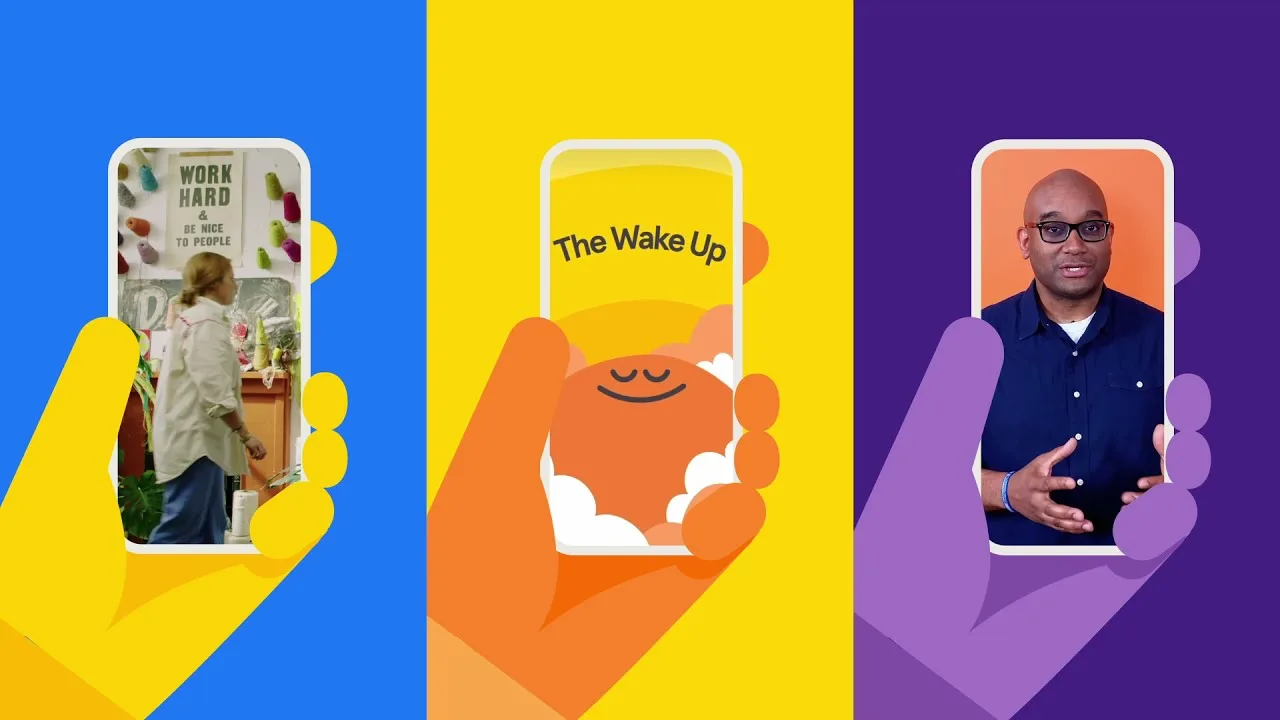
Watch Headspace explain its app.
Headspace uses a calm pace and clear orientation to introduce where a new user can begin and how the content is organized. The video behaves like the product promises to behave. It does not use frantic cuts to make a meditation app appear more exciting.
That alignment is easy to miss. An explainer is not only a container for facts. Its pacing, voice, density, and transitions set expectations for using the product. A finance app may need a controlled, precise rhythm. A social app can support faster edits. A wellness app benefits from leaving room for the viewer to understand each choice.
What to copy: define three adjectives for the product experience before choosing music or motion. Use those adjectives to reject effects that may look polished but create the wrong expectation.
4. Amazon Lens: show the complete cause-and-effect chain
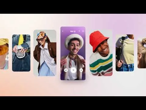
Watch Amazon Lens in the Shopping app.
The Amazon Lens video makes a camera-based feature understandable by showing the entire chain: select a photo, identify an item, and view relevant shopping results. Each step is visible. The viewer does not have to trust a narrator's summary of what the app supposedly does.
This pattern is especially useful for apps that transform an input. The input could be a photo, document, voice command, location, or data file. Showing only the final result removes the evidence that connects the user's action to the outcome.
What to copy: create a three-column storyboard labeled input, action, and result. Use the real interface for all three stages. Keep any pointer, highlight, or zoom close to the actual control it explains.
5. Windows App: prove cross-device access visually
Watch Windows explain the Windows App.
The Windows App has a cross-device promise. Its video therefore needs to do more than display one polished desktop screen. It shows the Windows experience appearing across different devices so the availability claim is part of the visual evidence.
This is a useful lesson for any app that works across platforms, roles, or locations. A line of narration saying “available everywhere” is weaker than a controlled sequence that shows the same task continuing on each supported surface. The device sequence should not become decorative mockup theater. Each screen should prove a real part of the claim.
What to copy: list every platform that matters to the audience, then decide which one action best demonstrates continuity. Use exact product screenshots and current interface states. Do not show a platform or capability that the release does not support.
6. Waze: put a feature inside a real day
Watch Waze introduce Conversational Reporting.
Waze frames conversational reporting through a driver's day instead of presenting voice input as an isolated technical feature. The situation supplies the reason to use it: the driver is already moving and needs a low-friction way to report what is happening.
Scenario-first storytelling works when the feature's value depends on context. The same interaction might appear ordinary in a clean studio mockup but important on a busy street, in a store aisle, or during a customer call.
What to copy: define the trigger moment before writing the product line. Ask what the user is doing immediately before the feature becomes useful. Show that trigger, then the interaction, then the response from the app. Keep the UI readable even when live action carries the scene.
7. MyHeritage: let emotion support the workflow
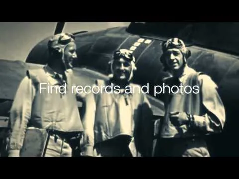
Watch the MyHeritage mobile app video.
MyHeritage connects practical app functions such as building a family tree, searching records, and sharing photos to a larger emotional reason for using them. The screens matter because they help preserve and explore family history.
Emotion is most effective here when it gives the workflow meaning. It should not replace the workflow. A beautiful family montage with no view of the product would function as a brand film, not an app explainer. The video earns its emotional ending by first establishing what the user can actually do.
What to copy: pair every emotional claim with one visible product action. If the script says the app helps people stay connected, show the screen, object, or exchange that creates that connection.
8. Doctors in Italy: use a familiar metaphor to orient the viewer

Watch Doctors in Italy explain how it works.
Doctors in Italy starts from a clear local problem: a traveler needs an English-speaking doctor. The visual language connects the service to its location and then moves toward how the matching experience works.
A familiar metaphor can reduce explanation time, especially for marketplaces and location services. The risk is letting the metaphor become the entire video. Viewers still need to see how the app turns the problem into a result.
What to copy: use one recognizable visual anchor to establish place or situation, then transition quickly to the real product. Treat the metaphor as a doorway, not a substitute for UI evidence.
03
Choose the right pattern for your app
Do not choose a reference because its animation style looks expensive. Choose it because its evidence pattern matches the belief your viewer needs.
| Viewer must believe... | Use this pattern | Strong reference |
|---|---|---|
| The feature works in one simple flow | Input, action, result | Amazon Lens |
| The app fits an existing routine | Situation, screen, benefit | Google Calendar |
| A new feature deserves attention | One promise, one workflow | Spotify AI Playlist |
| The experience feels calm or controlled | Product-matched pacing | Headspace |
| The app works across devices | Repeated task across surfaces | Windows App |
| The feature matters in context | Real-day trigger and response | Waze |
| Functional actions support a human goal | Workflow followed by emotional payoff | MyHeritage |
| The service solves a location-specific need | Familiar anchor plus real matching flow | Doctors in Italy |
The pattern also tells you what source assets to collect. An input-action-result video needs exact screenshots for each state. A scenario-first video needs both situational footage and product UI. A cross-device video needs current captures from every platform shown.
04
Build an app explainer video from real product evidence
The safest production process begins before animation. Create a small evidence packet with:
- the exact audience and use case for this video;
- the approved script, including every number and on-screen label;
- current screenshots or recordings for each product state;
- brand assets that may appear on screen;
- a shot-to-asset map showing which screen belongs with each line;
- the intended destination and aspect ratio.
Then review the storyboard on three levels.
First, check asset fidelity. The logo, interface, icons, and product screens should remain recognizable and current. Second, check information fidelity. Names, prices, numbers, and legal wording should match the approved copy. Third, check correspondence. When the narration describes one feature, the screen should show that feature, not a nearby but different workflow.
This is where TapVid's product demo video workflow is relevant. TapVid is an Explainer Video Engine that turns supplied assets and written copy into a reviewable video structure. The positioning is accuracy first: the product UI and literal text should be treated as facts, while motion supports attention and comprehension. If you still need to shape the narration, use the explainer video script guide before producing scenes.
Do not claim that any automated workflow is error-free. The practical standard is that the source material, script, and shot mapping are visible enough to inspect, and that obvious mismatches can be corrected before delivery.
05
Common mistakes in app explainer videos
Showing every feature. A crowded tour asks the viewer to remember too much. Choose the smallest workflow that proves the main value.
Using decorative phone mockups instead of readable UI. A tilted device can look polished while hiding the action the viewer needs to understand.
Letting narration and screens drift apart. If the script describes search while the screen shows a dashboard, the viewer has to reconcile two different ideas.
Recreating the interface loosely. Stylized UI can introduce labels, colors, or states that do not exist in the product. Use current captures when the screen is evidence.
Choosing pace by trend. Fast cuts do not automatically improve retention, and slow pacing does not automatically create trust. Match the pace to the product and the complexity of the action.
Ending without a next step. The call to action should fit the video's job, whether that is trying a feature, downloading the app, joining a waitlist, or viewing a detailed demo.
06
Frequently asked questions
What is an app explainer video?
An app explainer video is a short video that connects a user problem or situation to a specific app workflow and outcome. It usually combines real or simulated interface views with narration, text, animation, or live action.
How is an app explainer different from an app demo video?
An explainer is usually chosen to clarify value, context, and a reusable story pattern. A demo is more likely to teach or prove how a workflow operates step by step. The formats can overlap, but the reader tasks are different, which is also reflected in their separate US search results.
How long should an app explainer video be?
There is no universal duration. A single-feature explanation may need less than a minute, while a new category or multi-step trust-sensitive workflow may need longer. Cut the video when the viewer has enough evidence to understand the value and take the intended next step.
Should an app explainer use real UI or animated UI?
Use real UI when exact screens, labels, and states are important evidence. Animation can clarify focus, sequence, or transitions, but it should not change factual product details. A hybrid often works well: real screens for proof, with motion guiding attention.
What assets are needed before production?
At minimum, collect an approved script, current screenshots or recordings, brand assets, and a shot-to-asset map. Add live-action footage when the value depends on a real-world situation, and capture every platform when cross-device access is part of the promise.