TL;DR
Whiteboard works best when a process, causal chain, or system needs to build step by step. Choose screen recording when real interface proof matters, motion graphics for fast brand and data emphasis, and presenter video when personal trust is the message.
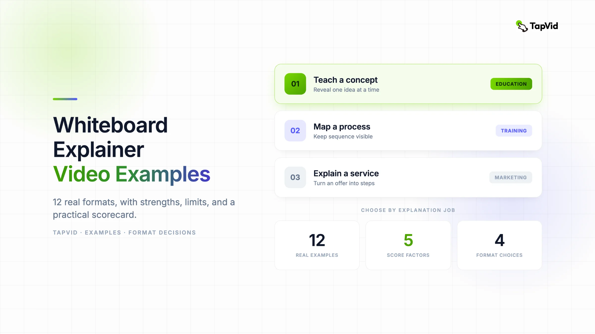
A strong whiteboard explainer video does more than show drawings. It reveals an explanation in the order the audience needs to understand it. I reviewed 12 published examples across education, technology, healthcare, nonprofit communication, service marketing, and training to identify what each format does well, where it breaks, and what a creator can reuse.
Need the production workflow? Read the whiteboard video maker guide.
01
What qualifies as a whiteboard explainer video
A whiteboard explainer video builds an explanation by revealing drawings, labels, and relationships in the order the audience needs them. The white background and marker look are optional conventions. Progressive reveal is the defining mechanism. If the complete diagram appears at once, the viewer has to decide where to look. If it is drawn in sequence, the creator controls attention and turns the finished canvas into a memory map.
That distinction matters because many roundups group doodle animation, paper cutouts, screen annotations, and any video with a white background into one style. The examples below use a wider but useful definition: each one creates meaning through an accumulating visual explanation. Some show a literal hand. Others use motion, color, or physical props. The question is not whether every frame looks traditional. It is whether the reveal order does explanatory work.
This guide is deliberately examples-led. The existing whiteboard video maker guide explains production and tool choices. This article asks a different question: which whiteboard format fits the job, what does each published example do well, and where does each approach become a liability?
02
The 12 whiteboard explainer video examples at a glance
The set covers youth education, technical sales, healthcare, service marketing, nonprofit missions, manufacturing, financial decisions, risk communication, and employee training. That range makes one pattern clear: whiteboard is strongest when the audience must understand a sequence or relationship before accepting a conclusion.
The table does not rank production quality. It classifies the explanation job. A beautifully drawn video can still be the wrong format, while a visually modest one can be effective because it reveals exactly the right information at the right moment.
| Example | Explanation job | Primary strength | Watch |
|---|---|---|---|
| USA Football | Youth education | Colorful progressive instruction | Source |
| Red Hat | Technical B2B | Audience-specific technical framing | Source |
| Santen | Healthcare education | Cause before solution | Source |
| Cisco | Sales enablement | Technical depth with brand cues | Source |
| Closet Factory | Service marketing | Turns an offer into a process | Source |
| Christian Church Homes | Nonprofit mission | History and values on one canvas | Source |
| FibroGen | Medical mechanism | Physiology in causal order | Source |
| Method Apparel | Manufacturing | Industry diagrams tied to value | Source |
| Citi Bank | Consumer finance | An audience-surrogate story | Source |
| AFEX | Risk communication | A short physical metaphor | Source |
| GRIFOLS | Employee training | A fixed production sequence | Source |
| The Community Builders | Nonprofit brand story | Values resolve into one system | Source |
03
Examples 1 to 3: teaching a concept before asking for action
1. USA Football uses bright color and removes the literal drawing hand while keeping the staged reveal. That choice fits a younger audience better than a monochrome corporate sketch would. Each visual beat can be understood quickly, and the color supplies energy without requiring fast cuts. The reusable lesson is that whiteboard is a logic, not a costume. You can change the surface style as long as the audience still receives one idea at a time. The weakness is visual load. More colors and characters create more competition for attention, so every scene needs a single obvious focal point.
2. Red Hat takes the opposite route. Its operational-resilience explainer uses a more serious illustration style and language aimed at a technically experienced military audience. It does not dilute the subject into a generic technology story. That preserves credibility and shows why audience fluency should determine how much terminology a script keeps. The weakness is reach. A script calibrated for specialists can become inaccessible when reused for buyers, executives, or the public. The format makes complexity approachable, but it cannot repair an audience mismatch.
3. Santen explains what causes dry eyes before moving toward a product context. That cause-first order is especially useful in health communication. The viewer needs a mental model of tear function and irritation before a solution can feel justified. Whiteboard handles the mechanism because anatomy can appear piece by piece instead of arriving as one dense medical diagram. The weakness is the transition from education to promotion. If the brand solution arrives too abruptly, the neutral teaching frame can start to feel like a sales device. The lesson is to mark the boundary clearly.
04
Examples 4 to 6: explaining products, services, and missions
4. Cisco uses whiteboard for sales enablement, not merely customer acquisition. The video gives sellers a technical story they can retell, combining a long explanation with restrained brand color. This is a strong fit because a sales team needs both the product logic and the reason the logic matters. The limitation is runtime. A video longer than three minutes cannot depend on the drawing hand as a novelty. It needs chapter-like changes in question, composition, and pace or the method becomes predictable.
5. Closet Factory turns an intangible service into a visible journey. Services are hard to explain because the buyer cannot inspect a finished object before purchasing. A staged story can show the starting frustration, consultation, design decisions, installation, and resulting benefit in a single line of thought. The risk is that a polished narrative delays the concrete offer. A viewer can enjoy the story and still miss what is included, how the next step works, or why this provider is distinct. Put the service promise and CTA in the final visual map.
6. Christian Church Homes needs to communicate history, values, audience, and mission without making a nonprofit story feel like an annual report. Custom illustrations give those abstract ideas human anchors, while the accumulating canvas makes separate facts feel connected. The limitation is hierarchy. When too many values, milestones, and beneficiary groups remain visible, the final canvas can flatten them into equal importance. A mission video still needs one thesis. Everything else should support it rather than compete with it.
05
Examples 7 to 9: mechanisms, processes, and high-stakes decisions
7. FibroGen uses progressive drawing to explain a physiological mechanism and the role of Roxadustat. Medical mechanisms are a natural whiteboard use case because cause and effect can be placed in sequence: condition, biological response, intervention, and expected result. The reusable move is to let the visual show the mechanism while narration supplies meaning and clinical context. The danger is over-simplification. A clean diagram can imply certainty or linearity that the underlying science does not support. Medical review has to govern the script, labels, and transitions.
8. Method Apparel maps a manufacturing-efficiency product with industry-specific diagrams. This is stronger than a generic before-and-after claim because the audience can see where time or waste enters the process. It also shows that whiteboard does not require childish doodles. Technical symbols can remain professional when line weight, color, and labeling are disciplined. The weakness is assumed knowledge. A diagram that feels obvious to an operations manager may be opaque to a finance buyer. Define specialist symbols the first time they appear.
9. Citi Bank uses a relatable character to represent a person facing relocation and mortgage decisions. The audience surrogate turns an intimidating financial process into a sequence of human questions. This creates emotional continuity, which pure diagrams often lack. The limitation is precision. Story can reduce anxiety, but financial products also depend on conditions, rates, eligibility, and exceptions. A friendly narrative should lead to precise next-step information, not replace it. Whiteboard is the orientation layer, not the full disclosure layer.
06
Examples 10 to 12: short metaphors, training, and brand systems
10. AFEX compresses risk management into roughly 30 seconds by mixing a whiteboard surface with physical props and a road metaphor. The hybrid treatment makes an invisible service tangible quickly. This is useful when the audience only needs the category idea and reassurance, not a full operating model. Its weakness is explanatory depth. A metaphor can make risk memorable while hiding the actual mechanics of exposure, hedging, or service delivery. Use this approach as a hook, then provide a deeper asset for evaluation.
11. GRIFOLS explains the Albutein FlexBag production flow for employees. A fixed sequence of manufacturing, quality checks, transport, filling, sealing, and release is exactly the kind of information whiteboard can hold together. Employees can see the current stage and how it connects to the whole. The limitation is density. A linear watch is less useful when a worker needs to revisit one procedure. Pair the video with chapters, a transcript, or separate task-level clips so the visual overview does not become the only reference.
12. The Community Builders closes by zooming out from individual scenes to a canvas that connects integrity, community, dedication, collaboration, and sustainability with the organization. That final composition is not decoration. It pays off the progressive reveal by showing that separate values form one operating system. The weakness appears on small screens, where a full-canvas view can become illegible. Design the final map at phone size first, and remove any label that cannot be read without pausing and zooming.
07
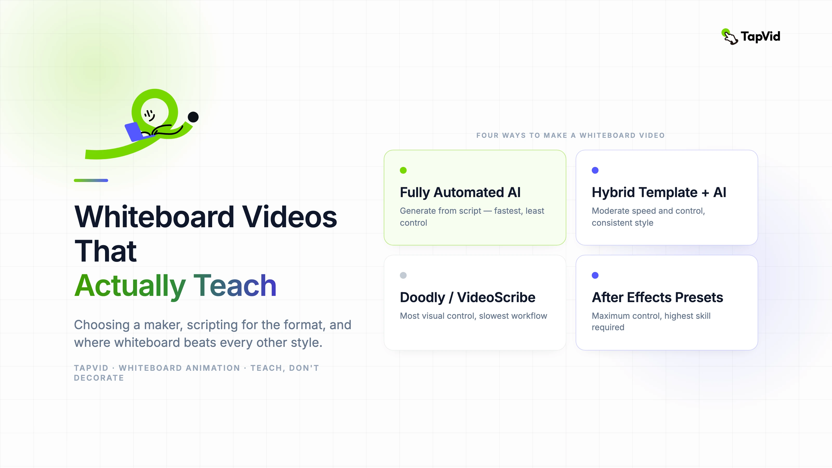
Choose the format before you choose the tool
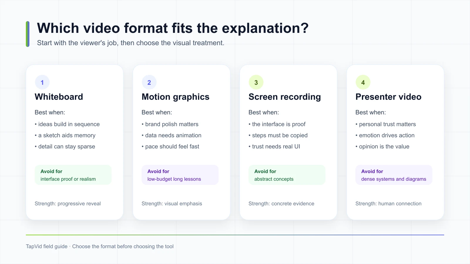
Whiteboard is not the default answer for every explanation. It wins when the message accumulates: a causal chain, process, system, argument, or journey. Motion graphics is usually better when brand polish, data emphasis, and fast rhythm carry the message. Screen recording is better when the interface itself is proof and the viewer must copy exact steps. Presenter video is better when trust, personality, or opinion is the main value.
A useful test is to write the viewer outcome as a verb. If the viewer must understand, map, or remember a relationship, test whiteboard. If they must click, configure, or verify a product, start with a real screen. If they must believe a person, put that person on camera. A hybrid is valid, but each added format should solve a specific communication problem.

| Viewer needs to | Best starting format | Reason |
|---|---|---|
| Understand a causal chain | Whiteboard | Progressive reveal controls the reasoning order |
| Compare data or show brand energy | Motion graphics | Motion and emphasis carry the hierarchy |
| Repeat exact product steps | Screen recording | The real interface is the evidence |
| Trust an opinion or personal story | Presenter video | The speaker is part of the message |
08
Use this five-factor scorecard before publishing
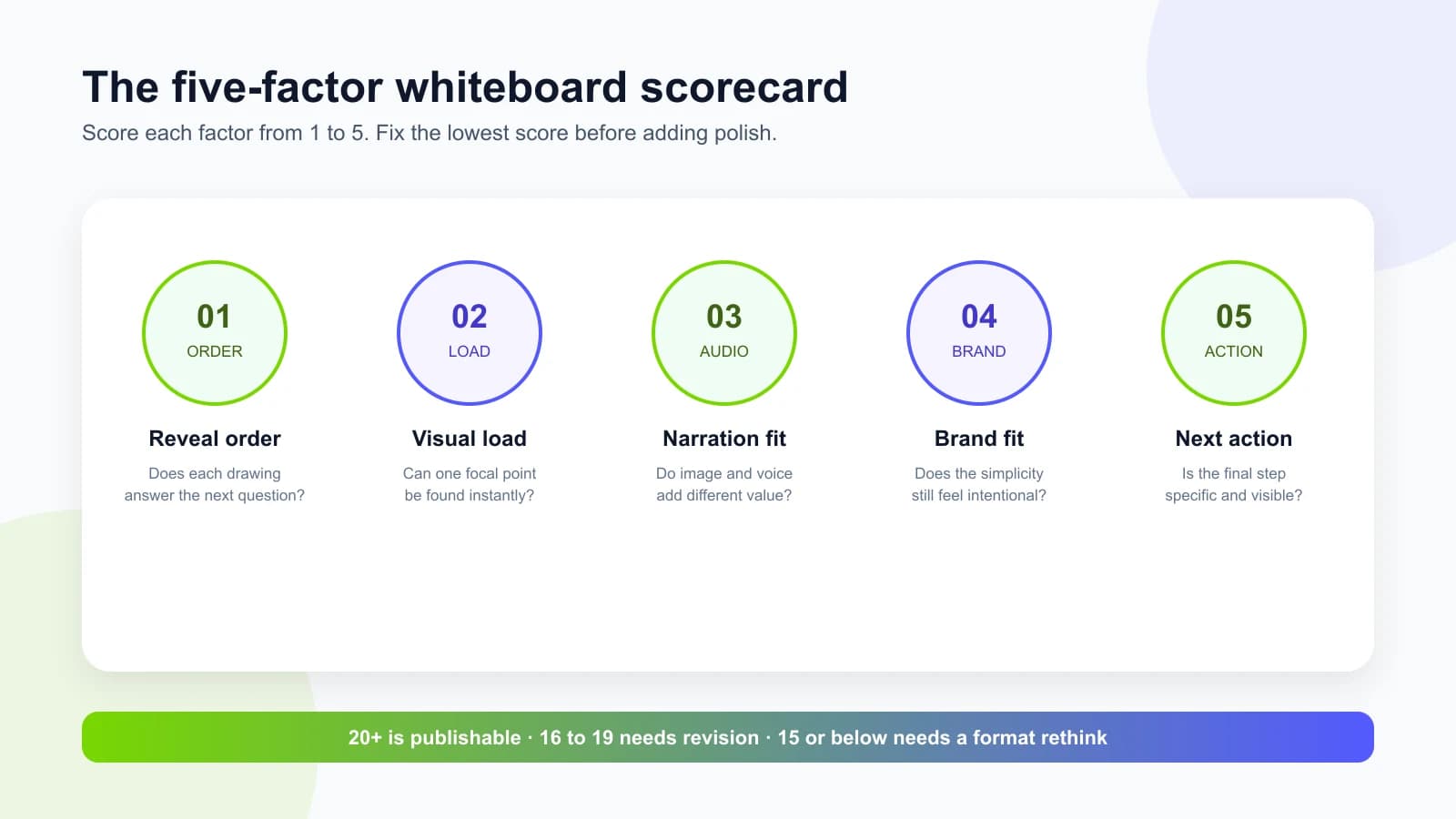
Score each factor from one to five after the first complete draft. Do not average away a serious weakness. A reveal-order score of two means the explanation is structurally confusing even if the art looks excellent. Fix the lowest factor first. Most whiteboard videos improve more from deleting, reordering, or clarifying than from adding animation.
Reveal order asks whether each new drawing answers the next audience question. Visual load asks whether one focal point is obvious at any moment. Narration fit asks whether voice and image contribute different information instead of duplicating each other. Brand fit asks whether the simplicity looks intentional. Next action asks whether the final frame tells the viewer exactly what to do.

| Factor | A score of 5 looks like | Warning sign |
|---|---|---|
| Reveal order | Every new mark resolves the next question | The viewer must infer why a drawing appeared |
| Visual load | One focal point is obvious without pausing | Several labels or characters compete |
| Narration fit | Voice explains meaning while image shows structure | Narration describes exactly what is visible |
| Brand fit | Color, line, and tone feel deliberately limited | The result looks like a generic template |
| Next action | One specific action remains on the final frame | The ending becomes a logo with no direction |
09
Where TapVid fits, and the whiteboard capability boundary
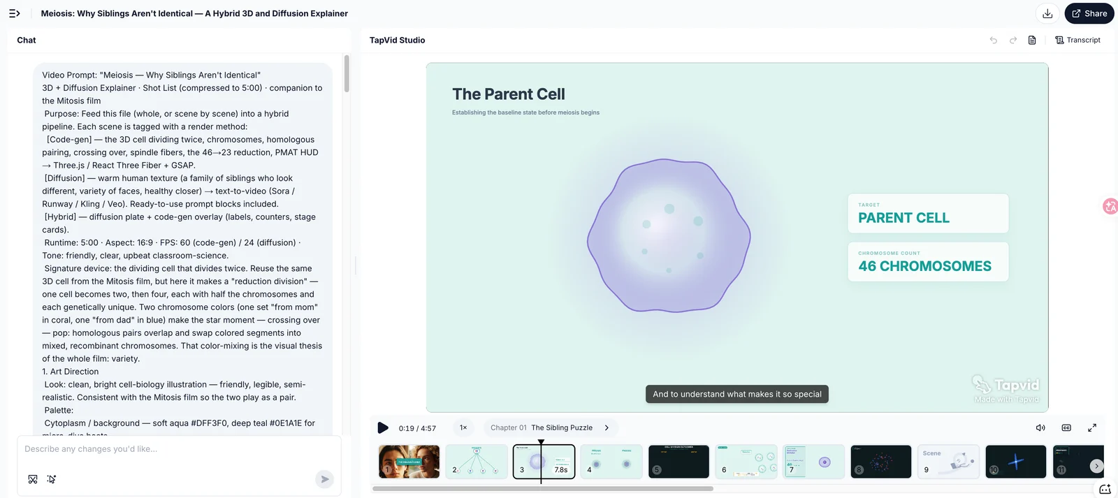
TapVid is an Explainer Video Engine that starts from creator-owned content such as an article, PDF, link, or script and turns it into a structured explainer draft. That source-to-structure work is relevant to whiteboard production because it helps identify scenes, narration beats, visual claims, and revision points before a style is finalized.
The screenshot below is genuine TapVid Studio workflow evidence from a separate explainer project. It shows a source prompt, generated scene structure, narration, and an editable timeline. It does not show or prove stable hand-drawn whiteboard output. If a hand-drawn style is a hard requirement, verify the current output on the whiteboard animation maker page before selecting the production path. For broader structured explainers, see the AI explainer video generator.
This distinction protects the production decision. Structure and visual style are related, but they are not the same capability. A useful scene plan can move into whiteboard software, custom animation, motion graphics, or another renderer. Do not let a style demo substitute for evidence that the whole explanation remains accurate, editable, and coherent.

10
When whiteboard is the wrong format
Whiteboard can signal clarity, but it can also remove the evidence a viewer needs. Reject the format when the explanation depends on realistic texture, emotional facial performance, exact interface states, fast visual spectacle, or legal and technical detail that must remain continuously readable. A simple style is not automatically a simple explanation.
Also reject it when the drawing hand is the only source of interest. The reveal device loses value if the script has no meaningful sequence. In that case, the viewer waits for drawings to finish without gaining a stronger mental model. Start with the information architecture. Style comes after the explanation earns it.
- Use screen recording for software onboarding where button names, menus, and state changes are the proof.
- Use presenter video for testimony, leadership communication, and creator-led opinion where facial trust matters.
- Use motion graphics for dense data comparison, high-energy launches, or strict brand systems that need controlled animation.
- Use product footage or 3D when material detail, physical scale, or spatial realism affects the buying decision.
- Use a document, checklist, or searchable knowledge base when viewers must retrieve exact steps later.
11
A production checklist for your own whiteboard explainer
Begin with a claim map, not a scene list. Write the final idea the viewer should remember, then list the minimum relationships needed to reach it. Convert each relationship into one visual beat. If a sentence introduces three ideas, split it. If a visual needs three labels before it makes sense, simplify or stage those labels.
Review the silent cut before polishing narration. You should be able to identify the explanation order even without audio, though the full meaning may still depend on voice. Then review an audio-only pass. If either version communicates the entire message alone, image and narration are probably duplicating each other instead of working as two channels.
- Define one audience and one decision the video supports.
- Write the explanation as questions the audience asks in order.
- Assign one drawing or relationship to each narration beat.
- Keep one focal point active, even when earlier drawings remain visible.
- Use color as a code for meaning, not as decoration.
- Test the final full-canvas composition at phone size.
- Check every factual, medical, financial, and technical label with a subject expert.
- Add chapters, transcript, or task-level clips when the video also serves as training reference.
- Score reveal order, visual load, narration fit, brand fit, and next action.
- Verify the current output of any tool with your own source before committing the production schedule.
12
Whiteboard explainer video FAQ
What is a whiteboard explainer video?
It is an explainer that reveals drawings, labels, and relationships progressively so the audience follows the intended reasoning order. A literal hand and pure white background are common, but progressive reveal is the more important feature.
How long should a whiteboard explainer video be?
Use the shortest runtime that completes the explanation. A focused marketing concept may fit 60 to 90 seconds. Training and technical processes can run longer if the video has clear sections and a searchable companion resource.
Are whiteboard videos still effective in 2026?
They remain useful when ideas build in sequence and the drawing creates a durable mental map. They are less effective when the audience needs real interface proof, realistic product detail, or a human speaker.
What makes a good whiteboard explainer?
A strong example has a clear reveal order, one focal point, complementary narration, intentional brand limits, and a specific next action. Illustration quality cannot compensate for a confusing explanation.
Can AI make a whiteboard explainer video?
AI can help structure a script, generate scenes, create narration, and automate some visual production. Stable hand-drawn style, factual accuracy, visual consistency, and editability still need to be verified in the actual tool and with the actual source.
13
The best whiteboard explainer video examples make the finished canvas inevitable
Across these 12 whiteboard explainer video examples, the strongest work does not merely decorate narration with drawings. It makes every new mark feel necessary. The viewer can sense why the next element appears, how it changes the model, and what the completed canvas means. That is the standard worth copying.
Choose whiteboard when the explanation benefits from accumulation. Keep the reveal order tighter than the art style, name one weakness before production, and test the smallest screen the audience will use. If the explanation survives those checks, the hand-drawn look becomes more than an aesthetic. It becomes a way to think with the viewer.