
TL;DR
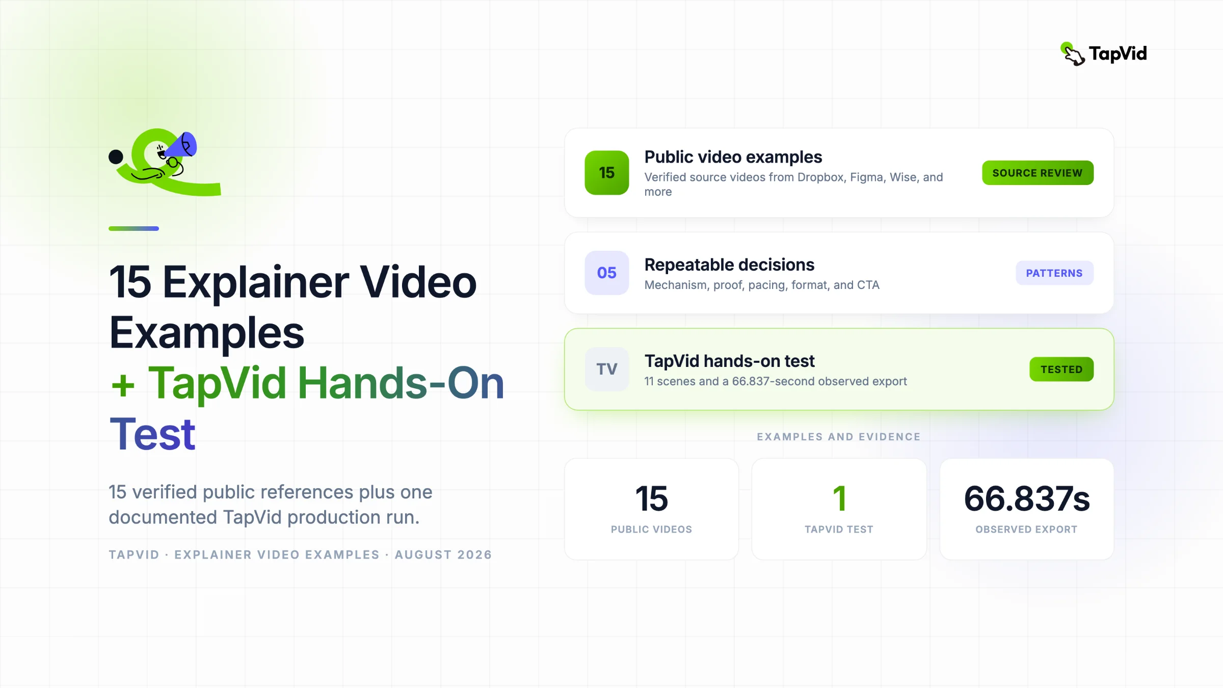
Compare the 15 public examples by viewer, problem, mechanism, proof, and CTA. Borrow the communication decision, not the brand surface. Then use the separate TapVid hands-on test to see how those choices change an original brief, generated scenes, and the final export.
A reference is useful only when it changes a production decision. These 15 public videos were reviewed through available captions and sampled frames, without inferring undisclosed conversion results. Each analysis names a strength, limitation, reusable lesson, and original brief instruction. A separate TapVid hands-on bonus then shows how those decisions survived one documented production run. It is first-party workflow evidence, not a sixteenth independent endorsement.
Use the AI explainer video maker with your approved brief
01
1. How these explainer video examples were reviewed
Every public video source was reviewed using available captions and sampled frames to follow the spoken and visual structure. Two originally collected links were rejected because their actual videos did not match the claimed brands or topics. The Figma and Wise entries below use verified official sources instead. This source check matters because a polished list is useless when its evidence points to a different product.
Each analysis uses the same lens: viewer, problem, mechanism, proof, and CTA. It also names a limitation. A video can be effective for brand positioning and still be poor onboarding. A detailed tutorial can explain a workflow accurately and still be too long for a landing page. The goal is to identify the explanation job before judging style, length, or production value.
- Viewer: Who can follow the video without extra category or product context?
- Problem: Which recognizable situation or question gives the video its reason to exist?
- Mechanism: What process, product primitive, metaphor, or sequence creates understanding?
- Proof: What does the viewer see or hear that supports the claimed change?
- CTA: Which one action, if any, continues the explanation after the video?
- Limitation: Which audience, placement, or information need would require a different asset?
No performance, conversion, customer, or award claim is inferred from the videos. When a source contains its own numerical or comparative claim, this article analyzes the communication choice without adopting that claim as a TapVid fact. Sources can also age. Product screens, plans, availability, and terminology should be checked again before they are used as current product evidence.
02
2. Quick comparison of the 15 examples
| Example | Explanation job | Format | Primary strength | Important limit |
|---|---|---|---|---|
| Dropbox | Expand a familiar product | Product montage | Two concrete adjacent workflows | Assumes category familiarity |
| Crazy Egg | Teach interpretation | UI tutorial | Output becomes mechanism and proof | Dense for a cold viewer |
| Notion | Unify a broad product | UI-led brand explainer | One primitive connects many use cases | Broad two-and-a-half-minute scope |
| Slack | Reframe communication | Animated metaphor | Visual before-and-after system | Limited exact workflow proof |
| Atlassian | Explain suite teamwork | Hybrid motion and product | One cross-team process connects tools | Portfolio-level detail |
| Rippling | Position consolidation | Fast product montage | One repeated organizing word | Little workflow depth |
| Snyk | Explain developer security | Technical motion graphics | Specific workflow terminology | Abstract product evidence |
| Enphase | Introduce home energy | Short conceptual animation | Three buyer-level actions | No system or policy detail |
| Articulate 360 | Announce an assistant | UI and motion montage | Shows tasks inside the product | Fast steps and limited mechanism |
| Travel Oregon | Create destination desire | Fantasy animation | Style carries emotional promise | No logistics or practical proof |
| Dollar Shave Club | Explain a subscription offer | Founder-led live action | Offer and operation stay visible | Tone is not widely transferable |
| Headspace | Explain an abstract concept | Character metaphor | One metaphor sustains the story | Not clinical evidence |
| Figma | Teach a two-role handoff | Detailed UI tutorial | Complete state-change story | More than six minutes |
| Wise | Teach a regulated transaction | Presenter plus UI tutorial | Context alternates with exact steps | Dated screens and conditions |
| Shopify | Show portability | Product-centered montage | One device across several contexts | No setup or commercial detail |
Use the table to choose a communication pattern, not a favorite color palette. If you need to explain an invisible workflow, start with Dropbox, Crazy Egg, Notion, Figma, or Wise. If you need category or platform positioning, compare Slack, Atlassian, Rippling, and Snyk. If emotion or tone is part of the message, study Enphase, Travel Oregon, Dollar Shave Club, and Headspace. Shopify shows how one product can anchor many contexts.
- Select one reference for structure, one for visual evidence, and one for pacing at most.
- Write the decision you are borrowing before saving a screenshot or style frame.
- Record the limitation so a stakeholder does not import the wrong lesson later.
- Keep your own viewer, claim sources, product states, brand system, and CTA independent.
03
3. Dropbox: expand a familiar product through two workflows
Dropbox opens by acknowledging the viewer already knows it for file storage. It confirms that familiar job, then expands the mental model through two connected workflows: editing, sending, tracking, and signing a contract inside Dropbox, followed by commenting on and approving video work. The visuals combine close product interactions with energetic abstract transitions. The final line returns to the idea that work now requires less work.
- Strongest decision: The video does not spend time reintroducing the category. It uses existing awareness as the starting point and earns expansion through concrete workflows.
- Limitation: Two use cases fit because the audience already knows Dropbox. A new product using the same pace could feel like a feature montage without enough mechanism.
- Borrow: When viewers know your core job, confirm it in one sentence and use the rest of the video to demonstrate one or two adjacent jobs.
- Do not copy: Do not copy the rapid visual polish while removing the product actions that make the expanded promise believable.
- Brief instruction: Begin with the audience's current product association, then prove one expanded workflow from start to completed state.
04
4. Crazy Egg: let the product output become the explanation
Crazy Egg uses a longer product-led tutorial to explain its heatmap report. The narration defines the color behavior, identifies hotspots on a real page, changes brightness and zoom, then compares desktop and tablet views. Each feature is tied to an interpretation: where visitors click, which areas receive less attention, and what page change could be tested next. The heatmap itself carries most of the explanatory work.
- Strongest decision: The product output is both mechanism and evidence. Viewers can see color intensity, specific page elements, and cross-device differences while hearing how to interpret them.
- Limitation: The video is about two minutes and forty seconds and contains dense UI. It suits an interested evaluator or user better than a cold landing-page visitor.
- Borrow: Use one representative dataset or project and follow it through the controls that change an actual decision.
- Do not copy: Do not tour every available control. Keep interface movement tied to one analysis question and one outcome.
- Brief instruction: Demonstrate one real output, explain how to read it, and end with the decision that output enables.
05
5. Notion: make flexibility legible with repeated product actions
Notion begins with a broad desire for clarity and a quiet place to think. It then makes that abstract promise concrete through repeated interface actions: capturing thoughts, managing projects, arranging blocks, nesting pages, finding information, collaborating, and building databases. The narration returns to one organizing idea, a single adaptable space, while the screen continually shows different manifestations of that idea.
- Strongest decision: A broad product is held together by one consistent mechanism: flexible pages and blocks can be organized for many kinds of work.
- Limitation: The two-and-a-half-minute scope covers many use cases. Viewers looking for one immediate task may need a shorter, role-specific follow-up.
- Borrow: For a multi-purpose product, define one product primitive and show how several use cases emerge from it.
- Do not copy: Do not list unrelated personas or templates unless the same visible mechanism connects them.
- Brief instruction: Choose one product primitive, repeat it across three escalating use cases, and return to one positioning idea.
06
6. Slack: dramatize communication overload before naming the product
Slack uses animated metaphors and workplace scenes to establish communication overload before resolving it with organized channels. The sampled frames move from gray, chaotic email imagery into Slack's saturated color system, distinct conversation spaces, and a simplified email contrast. The product is not introduced as a list of messaging features. It is presented as a different structure for team communication.
- Strongest decision: The visual transformation from gray disorder to organized color makes the positioning change understandable before the viewer studies interface details.
- Limitation: The metaphor-led treatment depends on strong art direction and category familiarity. It does not prove exact product behavior for an evaluator who needs workflow detail.
- Borrow: Use a before-and-after visual system when the product changes how information is organized, not merely where buttons sit.
- Do not copy: Do not let the metaphor replace the mechanism. Include enough concrete structure for the viewer to explain what changed.
- Brief instruction: Show the old communication system as visible disorder, then introduce one organizing rule that changes the visual world.
07
7. Atlassian: make fragmented teamwork the antagonist
Atlassian opens with scattered notes, disconnected paths, hand gestures, and separate work surfaces. It then shows product cards and connected tools moving toward one network around a teammate. The story treats fragmentation as the problem and coordinated work as the outcome. Human hands and faces are mixed with interface and graphic elements, which keeps the video connected to people rather than presenting an abstract software stack.
- Strongest decision: The problem is systemic rather than a single missing feature. The visual network helps explain why several tools belong in one teamwork story.
- Limitation: A portfolio message can stay high-level. Buyers comparing a specific product may still need a use-case video that shows exact ownership and handoff.
- Borrow: When explaining a suite, organize products around one cross-team process instead of giving each product equal screen time.
- Do not copy: Do not draw connections that the workflow cannot actually support or that require unmentioned integrations.
- Brief instruction: Visualize the handoff that currently breaks, then show how roles and tools remain connected across the same project.
08
8. Rippling: compress breadth with one repeated word
Rippling uses a 30-second contrast: managing employees globally appears to require an absurd number of apps, but the product asks the viewer to use one. The word one then structures onboarding, payroll, expenses, computers, and benefits. Product and lifestyle visuals move quickly under the repeated narration. The ending condenses the category into one place for HR, IT, and finance and asks the viewer to book a demo.
- Strongest decision: Repetition gives a broad platform a simple organizing device. Each capability feels like another proof of consolidation rather than a separate feature.
- Limitation: The speed and breadth leave little room to understand any workflow. The efficiency claims inside the source video should not be repeated without primary support.
- Borrow: Find one repeated word or contrast that accurately connects several capabilities and makes the sequence easier to remember.
- Do not copy: Do not import the video's numerical claims or fast feature cadence into your script without evidence and audience testing.
- Brief instruction: Contrast the fragmented old stack with one system, then give each capability one short visual proof beat.
09
9. Snyk: preserve technical credibility through workflow language
Snyk frames software growth as a tension between development speed and security risk. It resolves the tension by bringing developers into the security process and naming the environments where the product works: IDEs, repositories, and CI pipelines. The narration then gives concrete mechanisms such as scanning, remediation advice, and automated pull requests before returning to the promise of developing fast while staying secure.
- Strongest decision: Technical terms are not removed for simplicity. They are selected because they locate the mechanism inside the developer's real workflow.
- Limitation: The animation abstracts the product, so an evaluator may still need interface evidence and clarity about which capabilities apply to their environment.
- Borrow: Keep the nouns your expert audience uses, but place them in a causal workflow rather than a dense specification list.
- Do not copy: Do not simplify a technical tradeoff into a false guarantee or imply coverage beyond the approved product scope.
- Brief instruction: Name the technical tension, show where the mechanism enters the existing workflow, and end by resolving the original tradeoff.
10
10. Enphase: explain a system through three everyday energy verbs
Enphase opens with the scale of solar energy, then moves quickly from the sun to a hand holding light. The script translates a home energy system into three actions: make power, use power, and save or sell what is not needed. Warm animation keeps the idea human and avoids a component diagram. The final line returns to putting power in people's hands.
- Strongest decision: The video selects buyer-level verbs that explain the system outcome without forcing the viewer through electrical architecture.
- Limitation: The 30-second treatment creates interest but does not explain equipment, installation, eligibility, economics, or the limits of selling energy.
- Borrow: For a technical system, identify the few actions a buyer must understand before they need component detail.
- Do not copy: Do not remove conditions or imply universal availability when the real action depends on location, hardware, policy, or plan.
- Brief instruction: Translate the system into three approved user actions, then use one visual metaphor to connect them.
11
11. Articulate 360: show the assistant completing recognizable tasks
The Articulate 360 video uses a high-contrast product montage to introduce its AI Assistant. The sampled frames move from a simple promise about bringing ideas to life into product screens, generated text, course content, and a final invitation to try the assistant in Rise and Storyline. The source did not expose usable captions in this audit, so the analysis is limited to visible structure and on-screen text.
- Strongest decision: The product remains on screen. The assistant is explained through completed content tasks rather than a free-floating AI symbol or cinematic metaphor.
- Limitation: Fast transitions and blurred motion can make exact steps difficult to inspect. Without a slower workflow, viewers may remember capability categories more than the mechanism.
- Borrow: Show the assistant acting inside the existing creator workflow and connect every generated result to a recognizable task.
- Do not copy: Do not imply that a polished output appeared without input, review, or editing when those stages matter to the real workflow.
- Brief instruction: Follow one source input through an assistant action, editable result, and final use inside the product.
12
12. Travel Oregon: let visual exaggeration communicate the promise
Travel Oregon uses hand-drawn fantasy animation to move through city, food, sport, wildlife, coast, night, wine, and mountain scenes. Familiar Oregon experiences are enlarged into magical events, including luminous animals and oversized natural imagery. The sampled frames show a consistent illustrated world rather than a list of attractions. The source exposed no usable transcript in this audit, so the analysis stays with visible sequencing and art direction.
- Strongest decision: The style is the argument. Exaggeration turns a destination promise into a world the viewer can feel before planning a specific trip.
- Limitation: This structure communicates desire better than logistics. It would not answer practical questions about itinerary, access, price, or season.
- Borrow: Use a distinctive visual world when emotional interpretation is part of what the product or destination must explain.
- Do not copy: Do not copy an art style as decoration when your brief requires procedural clarity or literal product proof.
- Brief instruction: Choose five experiences that support one emotional promise and connect them through a consistent visual world.
13
13. Dollar Shave Club: use founder-led humor to explain the offer
The founder speaks directly to camera while walking through a warehouse. He states the basic offer early, answers whether the blades are good, contrasts the service with expensive and overengineered alternatives, explains recurring delivery, and ends on the brand. Physical movement, employees, props, and jokes keep the monologue visually active while the commercial mechanism remains simple: razors are shipped to the customer.
- Strongest decision: The spokesperson, location, offer, and delivery model reinforce one another. Humor adds pace without hiding what the customer receives.
- Limitation: The tone and some jokes are intentionally provocative. Copying them into a different brand, audience, or regulated category could damage trust.
- Borrow: Use a credible spokesperson to answer the obvious buyer questions in plain language while showing the operation behind the promise.
- Do not copy: Do not borrow shock, profanity, or random props unless they clarify the audience, offer, or objection being addressed.
- Brief instruction: Put the founder in the real operating environment and answer offer, quality, old-way objection, delivery, and CTA in one walk-through.
14
14. Headspace: sustain one metaphor from problem to reassurance
Headspace asks the viewer to imagine a blue sky as a metaphor for the mind. Small clouds become darker weather as thoughts and pressure accumulate. The explanation then reveals that the blue sky still exists above the clouds. Simple character animation and changing weather carry the concept while the narration returns to calm as something present but temporarily obscured.
- Strongest decision: One metaphor is introduced, stressed, and resolved. It gives an abstract mental experience a stable spatial model the viewer can recall.
- Limitation: A metaphor can oversimplify an individual health experience. The video explains an idea, not treatment, diagnosis, or a guaranteed outcome.
- Borrow: Choose one metaphor with enough range to represent calm state, difficult state, and resolution without changing visual rules.
- Do not copy: Do not stack several metaphors or let an analogy imply a clinical promise that the source and product cannot support.
- Brief instruction: Establish one visual metaphor, increase the pressure inside it, then reveal the original stable state without changing the rules.
15
15. Figma: explain collaboration through a complete handoff story
Figma's official tutorial follows a designer and developer through a changing handoff. The designer adds measurements and annotations, marks work ready for development, and shares it. The developer inspects the design, finds a color issue, comments, and later compares versions. The designer fixes the variable and copy, while status changes keep both roles synchronized. The video ends by connecting those actions to continuous communication.
- Strongest decision: The product is explained through two named roles and one evolving project. Collaboration is demonstrated as a sequence of state changes, not asserted as a benefit.
- Limitation: At more than six minutes, this is task education for an interested user. It is too detailed for a short positioning slot and assumes design terminology.
- Borrow: Use a role-to-role story when the product's value appears in a handoff rather than inside one person's isolated task.
- Do not copy: Do not compress a multi-role workflow until approvals, status, or responsibility become impossible to follow.
- Brief instruction: Follow one artifact from creator preparation through reviewer feedback, revision, status change, and completed handoff.
16
16. Wise: combine a presenter with exact transaction steps
Wise uses a presenter to frame the problem of fees and exchange rates, then moves into exact registration and transfer steps. The tutorial covers account choice, recipient details, verification, payment methods, displayed costs, status, timing, cancellation, and account ownership questions. Presenter segments reset attention between interface sequences, while the screen provides the evidence required for a financial task.
- Strongest decision: The video separates persuasion from instruction. The presenter gives context, and the product screen shows where the viewer makes each decision.
- Limitation: The source is dated 2023 and runs more than five minutes. Financial interfaces, rules, fees, and availability can change, so current official information must be rechecked.
- Borrow: Use a human guide to explain why a choice matters, then switch to the exact interface when the viewer must act accurately.
- Do not copy: Do not reuse old financial screens, timing, fees, or availability without checking the current product and region.
- Brief instruction: Alternate context and exact UI steps, and place conditions beside the decision they affect rather than in a closing disclaimer.
17
17. Shopify: explain portability by changing the business around one device
Shopify presents one payment reader against a sequence of colorful business contexts. The narration names a pop-up, gallery, trade-show stand, jewelry shop, and record store while the same device remains the anchor. The ending turns the sequence into one outcome: wireless payments in the hand mean the merchant can be open for business anywhere. The video stays close to 30 seconds and uses few words.
- Strongest decision: Changing the environment proves versatility without introducing a separate mechanism for every merchant type. One physical object keeps the sequence coherent.
- Limitation: The video does not explain setup, transaction flow, compatibility, pricing, or current availability. Those require separate current product evidence.
- Borrow: When one product serves several contexts, keep the product constant and change only the situation around it.
- Do not copy: Do not present a long persona list if the visual cannot show why the same product works for each one.
- Brief instruction: Hold one product at the center, move it through five recognizable customer contexts, and end on one shared outcome.
18
18. Five repeatable patterns across the examples
The examples differ in duration and style, but five patterns recur. First, a stable mechanism holds breadth together, as with Notion blocks or Rippling's consolidation. Second, the proof resolves the opening problem, as with the shared state in Figma or the interpreted heatmap in Crazy Egg. Third, roles make handoffs visible. Fourth, one metaphor can explain an abstract concept. Fifth, the CTA works best when it continues the demonstrated action.
| Pattern | Best examples | Use when | Failure risk |
|---|---|---|---|
| One primitive, many outcomes | Notion, Dropbox, Rippling | A broad product needs one organizing mechanism | A feature list disguised as breadth |
| Old state to resolved state | Slack, Atlassian, Figma | The product changes coordination or ownership | Beautiful contrast without exact behavior |
| Product output as proof | Crazy Egg, Wise, Shopify | The viewer must inspect an output or action | Tiny UI and obsolete screens |
| One sustained metaphor | Headspace, Enphase, Travel Oregon | The concept is abstract or emotional | Analogy implying unsupported facts |
| Credible guide inside the workflow | Dollar Shave Club, Wise, Figma | A person must explain choices or objections | Personality replacing mechanism |
- A pattern is reusable when it describes a communication relationship, not a branded surface treatment.
- A reference should change one decision in the script or storyboard; otherwise it is mood-board clutter.
- Mechanism and proof deserve more attention than transitions because they determine whether the viewer can explain the product.
- Limitations belong in the brief so the team knows which additional video or page must carry missing detail.
Combine patterns only when the explanation requires them. A presenter can introduce a problem, a UI sequence can prove the mechanism, and a final metaphor can summarize the result. That combination also increases complexity. Each format change needs a story reason, consistent terminology, and enough time for the viewer to reset. A simpler single-pattern video is often easier to approve and update.
19
19. Failure patterns that attractive references can hide
A reference can look excellent and still teach the wrong lesson for your project. Fast pacing can conceal that a viewer needs time to read your UI. A famous founder can make direct address feel universally appropriate. A fantasy animation can make style appear to be the explanation. A long tutorial can tempt a landing-page video into teaching account setup. Separate what succeeds in that placement from what your viewer needs.
| Hidden failure | How it appears | Correction |
|---|---|---|
| Style without mechanism | The mood is memorable but the viewer cannot explain how the result happens | Add one observable process or product state |
| Breadth without hierarchy | Many features or personas receive equal time | Choose one primitive, workflow, or outcome to organize them |
| UI without legibility | The cursor moves while labels and states remain too small | Crop, simplify, slow down, and narrate the decision |
| Metaphor without boundary | The analogy implies product or health behavior it cannot prove | State which part is conceptual and add literal evidence |
| Tone without audience fit | Humor or cinematic language overpowers trust | Test the tone with the intended viewer and subject owner |
| CTA without continuity | The ending requests an action the video never demonstrated | Use a CTA that extends the shown mechanism |
- Ask what the viewer can repeat after one watch, not which frame the team wants on a mood board.
- Check whether the source video assumes brand awareness or signed-in product knowledge that your audience lacks.
- Distinguish a positioning video, feature announcement, tutorial, and brand film before comparing durations.
- Treat old interfaces and current product claims as separate verification work.
The best defense is an evidence-backed brief with acceptance tests. Name the one problem, mechanism, proof, and CTA. Then annotate every reference with the one decision it informs and the one thing it cannot answer. If a stakeholder requests a shot because it looks premium, ask which communication job it performs. The question protects originality and keeps production focused on understanding.
20
20. Choose three references without creating an imitation
Use no more than three primary references. Give each a different responsibility. The structure reference informs narrative order. The evidence reference informs how product or source material appears. The pacing reference informs scene density and visual holds. Do not ask one video to become the template for script, palette, character design, transitions, framing, and CTA. That turns analysis into imitation.
| Reference role | Question to answer | What to record |
|---|---|---|
| Structure | How does the story move from viewer problem to resolved state? | Beat order, time allocation, and proof position |
| Evidence | What literal screen, object, output, or example makes the mechanism believable? | Required asset, crop, source, and approval owner |
| Pacing | How many ideas appear before the viewer receives a pause or summary? | Scene count, hold time, caption density, and runtime |
- Write one sentence beginning We are borrowing the decision to, followed by a specific communication choice.
- Write a second sentence beginning We are not copying, followed by brand surface, assets, script, or characters.
- Replace every reference claim with your own approved source and every reference CTA with your own next action.
- Remove references that do not change the brief, storyboard, or review criteria.
A useful reference note might say: We are borrowing Figma's decision to follow one artifact across a two-role handoff. We are not copying its interface, characters, narration, duration, or visual system. That note is precise enough to guide production and narrow enough to protect originality. It also gives reviewers a better vocabulary than make it feel like Figma.
21
21. Reference-to-brief worksheet
Complete the worksheet before turning references into prompts or storyboard frames. The first half describes your project. The second half converts each reference into a decision and boundary. The final row creates an approval test. A reviewer should be able to reject a scene for failing the viewer, mechanism, evidence, or CTA without debating whether it looks similar enough to the source video.
| Field | Your answer |
|---|---|
| Viewer and trigger | One role, one situation, and what the viewer already understands |
| Problem and consequence | The visible old state and why it matters now |
| Mechanism | The approved process that changes the old state |
| Proof | The screen, output, example, object, or source that resolves the opening |
| CTA | One visible next action and destination |
| Structure reference | Decision borrowed, limitation, and what remains original |
| Evidence reference | Decision borrowed, required asset, source, and approval owner |
| Pacing reference | Scene density, hold time, text density, and target runtime |
| Brand system | Original palette, type, icon, character, composition, and motion rules |
| Acceptance test | What an unfamiliar viewer must be able to explain after one watch |

- Attach public source URLs and capture dates so references can be rechecked before publication.
- Mark tutorials, ads, feature announcements, and brand films because their jobs and audiences differ.
- Keep product claims and reference observations in separate evidence records.
- Assign one owner to approve factual behavior and one owner to approve editorial scope.
Do not feed a collection of links into a generator and ask for a blended result. Convert the links into your own written decisions first. That step removes copyrighted wording and surface details while keeping the useful reasoning. It also produces a clearer prompt: the system receives audience, mechanism, proof, original visual rules, and scene jobs instead of an instruction to imitate several brands.
22
22. TapVid hands-on bonus example: one shared-inbox test
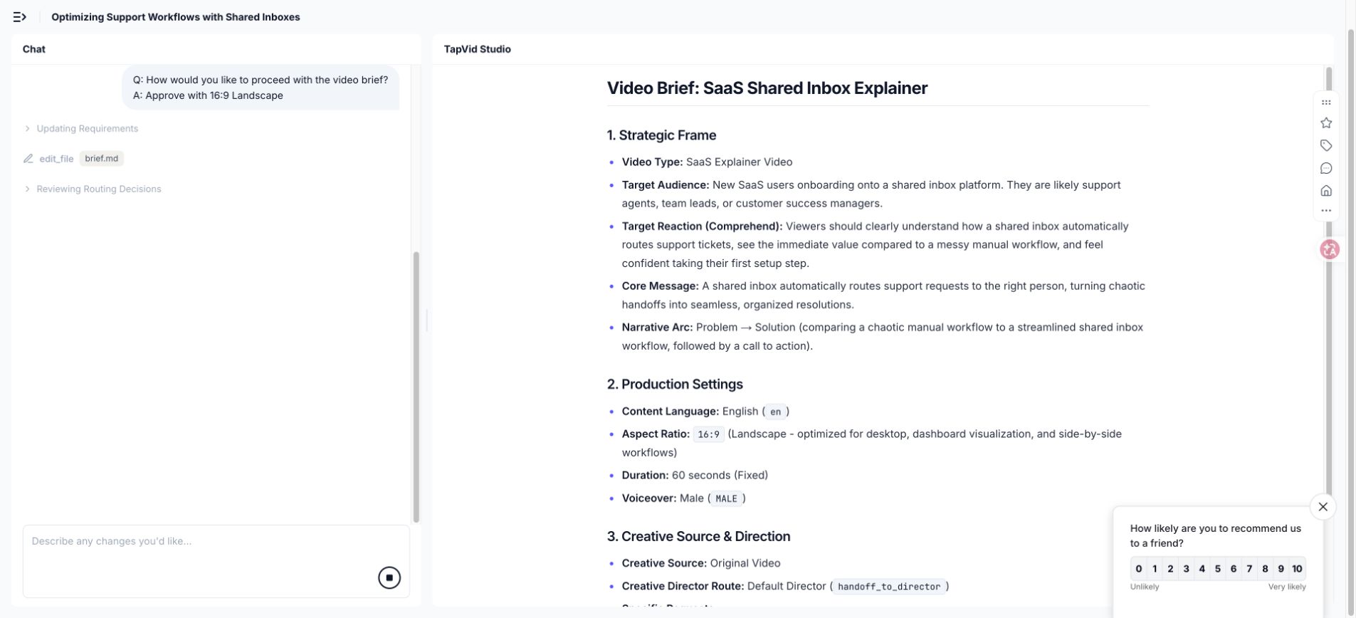
The shared-inbox test used one viewer, a small SaaS support team, and one trigger, a new request arriving while several teammates are active. The old state contained duplicate replies and unowned requests. The mechanism was a routing rule connecting request type, channel, and owner. The proof returned to the opening pattern and showed one request following one coordinated path. The CTA asked the viewer to create the first rule.
This is a first-party production test, not a sixteenth public endorsement. Figma informed the cross-role structure, Crazy Egg the visible product evidence, and Shopify the pacing contrast. Their scripts, interfaces, art systems, characters, and claims did not enter the shared-inbox video.
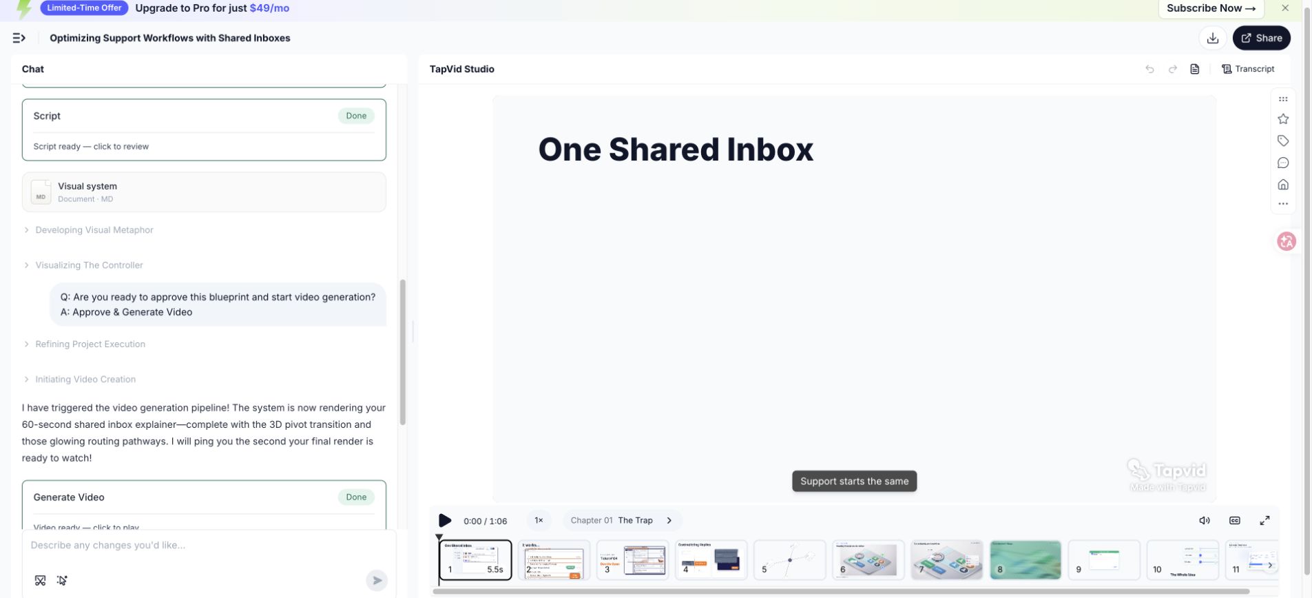
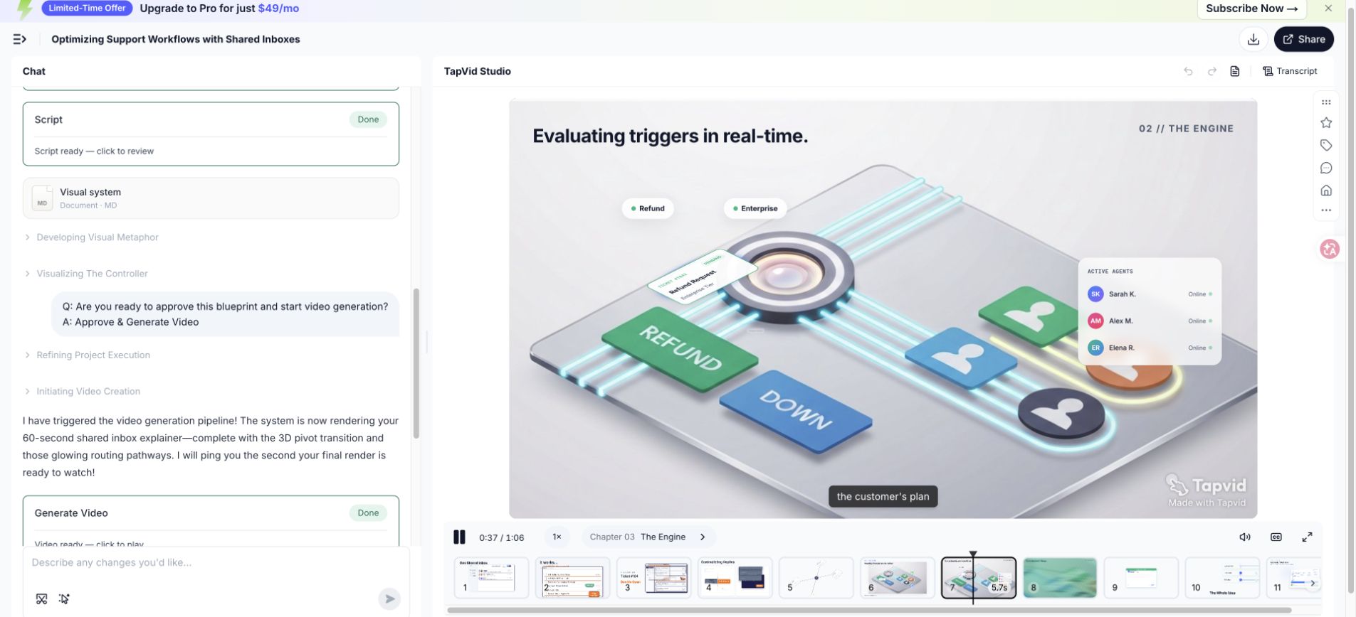
- Strongest decision: follow one request through routing, ownership, and coordinated response.
- Limitation: this was one August 6 run. TapVid estimated 180 credits; the observed balance delta was 198, so this is not a typical-cost claim.
- Borrow: approve the viewer, old state, routing mechanism, proof, and CTA before generation.
- Do not copy: source scripts, interfaces, art systems, characters, or brand claims.
- Brief instruction: use one fictional SaaS scenario, an original isometric system, and readable subtitles.
- Observed output: four chapters, 11 scenes, and a 66.837-second export.
The initial request used 9:16, but the approved brief moved to 16:9 because the interface-led story needed horizontal room. The change came from the content, not a copied reference ratio. References identify options; the approved viewer, evidence, and placement determine the production choice.
23
23. Explainer video examples FAQ
The examples above are public references, not endorsements. Continue with the production workflow and script template. For protected expression, start with the U.S. Copyright Office overview.
What makes an explainer video example useful?
A useful example helps you make a specific decision about viewer, problem, mechanism, proof, CTA, pacing, evidence, or format. It also exposes a limitation. A beautiful frame without a transferable communication decision is inspiration, but it is not yet a production reference.
How many explainer video references should I use?
Use up to three primary references with separate jobs: one for structure, one for evidence treatment, and one for pacing. More references often create conflicting directions. Convert each source into a written decision and a do-not-copy boundary before it enters the brief.
Can I copy the style of an explainer video I like?
Study why the style supports the message, then create an original visual system using your own brand, assets, characters, compositions, script, and evidence. Do not copy proprietary artwork, footage, screenshots, wording, or a distinctive execution. Borrow a communication principle, not a branded surface.
Should an explainer video always be animated?
No. UI capture, live action, motion graphics, character animation, presenter-led instruction, physical demonstration, or a hybrid can all work. Choose the format that lets the viewer see the mechanism and proof clearly. Animation is useful when it makes an invisible or abstract process legible.
How long should an explainer video example be?
Length follows the explanation job. Rippling, Enphase, and Shopify make focused positioning points in about 30 seconds. Crazy Egg, Notion, Figma, and Wise teach more detailed workflows over several minutes. Decide whether the viewer needs interest, understanding, evaluation, or task completion before setting duration.
How do I evaluate an explainer video without performance data?
Evaluate observable communication: can the intended viewer identify the problem, explain the mechanism, locate proof, and state the next action? Check scene continuity, spoken clarity, caption legibility, claim support, and placement fit. Do not infer conversion, retention, or business impact from production quality alone.
Can AI generate a video from these references?
First convert references into an original brief with viewer, mechanism, evidence, visual rules, and scene jobs. Do not ask a system to imitate copyrighted scripts, artwork, footage, voices, characters, or brand assets. Review generated output for factual accuracy, originality, product implications, and current rights requirements.
How do I keep an examples article current?
Store the public source URL, title, uploader, review date, observation, and limitation. Reopen sources during editorial updates. Replace dead or mismatched links, recheck old UI and product claims, and avoid describing current performance or availability unless a current primary source supports it.