

TL;DR
The best product demo reference is the one that proves the same buyer question you face. Use Headspace for a new mental model, Slack for a human workflow, Grammarly for a visible before-and-after, and IKEA Place for proof in context. If you already have product copy, a script, article, PDF, or PRD, TapVid can help structure it into a motion-led explainer; use a screen recorder when exact clicks are the evidence.
The most useful product demo video examples do one job clearly: they let a buyer see the proof that matters before the video asks for attention elsewhere. A software demo might show the exact workflow. A physical product demo might show the object in context. An unfamiliar product may need to explain the category before it can demonstrate a feature. This guide studies ten public examples through that proof-first lens. It does not rank them by production budget, views, or conversion rate because those figures are not comparable or publicly verified. Instead, each example is tied to a reusable decision: what the viewer needs to believe, what visual evidence creates that belief, and what you should avoid copying. The same framework applies across product demonstration video examples, from a short SaaS demo video to a physical product launch.
01
A proof-first index to 10 product demo video examples
Start with Slack when a relatable person needs to carry a software workflow. Study Project.co when the interface can explain itself with labels and motion. Headspace is useful when the product is intangible and the viewer first needs a mental model. Duolingo shows how to reduce a complex product to a few actions. Microsoft Surface is a strong reference for dense specifications, while Grammarly shows the product changing real work. Soapbox demonstrates self-aware storytelling. Apple shows how far pace can be pushed when awareness is already high.
The choice depends on your proof job, not your industry. A SaaS founder should not copy Apple's tempo when the audience still does not understand the workflow. A known consumer brand may not need the careful setup that a new B2B product requires.
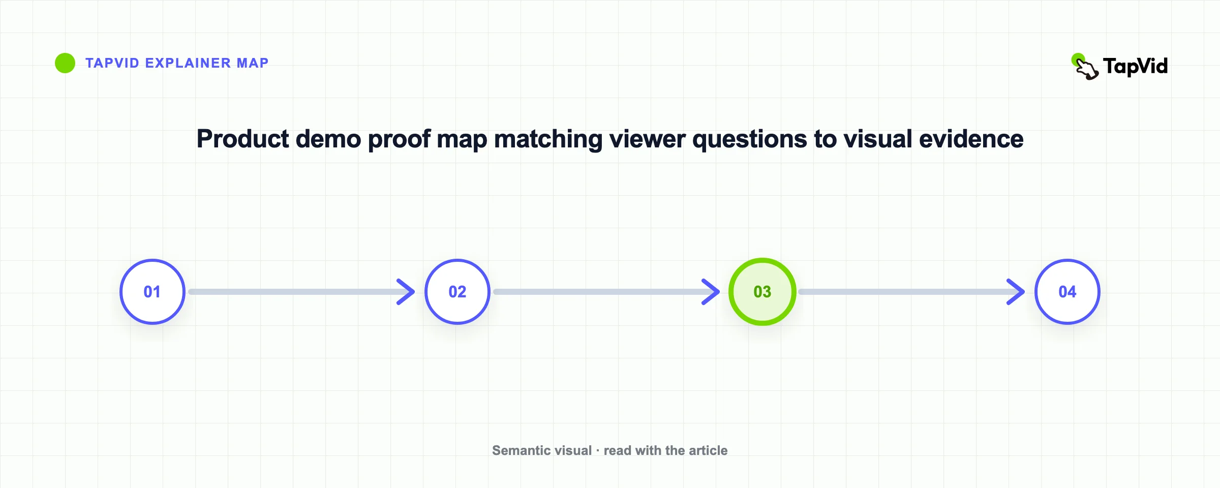
| Example | Main proof job | Visual mechanism | Best reference for |
|---|---|---|---|
| Headspace | Make an intangible service understandable | Character-led explanation plus simplified app views | New categories and abstract products |
| Slack | Put a person inside the workflow | Live action, voiceover, and interface shots | Relatable SaaS stories |
| Project.co | Show breadth without a long narration | Feature chapters, labels, and interface motion | Product overviews |
| Duolingo | Make the first action feel obvious | A small set of clear app interactions | Activation-focused demos |
| Microsoft Surface | Present specifications without a wall of text | Captions placed beside the physical feature | Hardware and technical products |
| Grammarly | Connect a feature to a visible outcome | Before-and-after changes inside real writing | Benefit-led software demos |
| Soapbox | Teach the product through an entertaining premise | Self-aware story with screen recording | Challenger brands |
| Apple | Create attention around known features | Fast cuts, typography, and music | Launch teasers for known brands |
| Google Chrome | Let several features support one human story | Product moments embedded in a narrative | Ecosystems and multi-feature products |
| IKEA Place | Remove uncertainty before purchase | Product use inside realistic environments | AR and context-dependent products |
02
When the viewer needs a new mental model
The first two examples make an unfamiliar or multi-step product easier to understand by giving the viewer a person or concept to follow. Their common strength is sequence: context arrives before feature breadth.
1. Headspace: explain the category before the interface
Headspace's public demo has a hard problem: meditation is not a physical object, and the value is not obvious from one app screen. The video uses characters and a simple explanation to establish what the service is for, then shows enough of the app to make starting feel concrete.
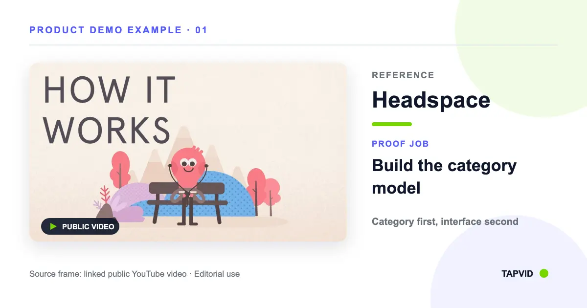
The pattern is category first, interface second. Use it when the viewer cannot judge the product by looking at the UI alone. The opening should name the situation and desired change in plain language. The product view arrives only after that mental model is clear.
Do not copy the illustration style as decoration. The characters work because they explain an invisible experience. If your product already has visible input and output, delaying the interface may weaken the proof.
2. Slack: make the user the center of a software demo
Slack's “You've Probably Heard of Slack” video combines a person, narration, interface views, and workplace scenes. Wyzowl's review points to the character as the element that makes the workflow relatable rather than leaving the piece as a plain screen recording.
This is useful for products whose value appears across several actions. Instead of presenting channels, messages, and search as disconnected features, the demo places those actions inside one person's work. The viewer follows a situation, while the interface proves each step.
The reusable structure is role, friction, action, result. Pick one recognizable user and one task. Show only the interface moments that move that task forward. Avoid adding extra personas just to represent every buyer segment. More characters often create more setup without adding proof.
03
Make the first useful loop visible
These three examples reduce product complexity by controlling what the viewer sees at each step. Project.co organizes breadth, Duolingo isolates activation, and Microsoft Surface keeps each technical claim beside its visual evidence.
3. Project.co: let chapters control feature breadth
Project.co's general overview uses title cards and interface animation to split a broad product into smaller feature groups. According to Wyzowl's analysis, it communicates without relying on a long spoken explanation.
The lesson is not that narration is unnecessary. It is that visual chapters can stop a feature-rich demo from becoming one continuous scroll through the UI. Each chapter should answer one buyer question, such as how work is assigned, how progress is seen, or how clients participate.
Use this pattern for a homepage overview or sales follow-up where the viewer needs a map of the product. For onboarding, create separate walkthroughs with the exact clicks. An overview and a tutorial are different assets, even when both contain screen recordings.
4. Duolingo: demonstrate the first useful loop
Duolingo's product demo keeps the focus on a small number of recognizable app actions. Wyzowl notes that the simplicity helps a viewer understand how to get started rather than treating the demo as a complete manual.
This is the activation-loop pattern: show the trigger, the action, the response, and the reason to continue. For a creator tool, that could be source content, one generation action, the structured draft, and the exported result. For a collaboration tool, it could be an invitation, one shared task, a response, and a visible status change.
Do not squeeze every advanced feature into the same video. If the viewer cannot repeat the main loop after watching, the demo has probably spent too much time proving breadth.
5. Microsoft Surface: attach every specification to the object
Microsoft's Surface Laptop 4 introduction places captions and visual cues beside the physical features they describe. That relationship lets the video carry technical detail without turning into a narrated specification sheet.
The mechanism also works for software. Put the claim next to the interface state that proves it. “Review comments in context” should appear beside a real comment anchored to the work, not over a generic dashboard. “Export in multiple formats” should appear beside the export choices.
The limit is legibility. A specification that cannot be read at the expected player size should become its own shot or move to the page copy. Motion cannot rescue text that is too small.
04
Turn attention into product evidence
The next three videos use very different tones, but each controls attention deliberately. Grammarly holds on a visible change. Soapbox makes the production premise reveal the product. Apple moves quickly because the audience already recognizes the objects and context.
6. Grammarly: show the product changing real work
Grammarly's public product video shows the tool acting inside writing rather than describing an isolated feature list. The evidence is the changing work itself: the viewer can see the intervention and the revised result.
This before, action, after structure is one of the strongest patterns for SaaS. Start with a realistic input, expose the product's decision, and hold the result long enough to compare it with the original. The change must be visible without relying on the narrator's opinion.
Choose an example input that matches the customer's real work, not an idealized prompt designed only to make the product look perfect. If the input is unrealistically easy, the output proves less.
7. Soapbox: use the production premise as part of the story
Wistia's Soapbox video is self-aware about being an advertisement and uses that premise to demonstrate a screen and webcam recording product. The story earns attention, while the product remains part of how the story is made.
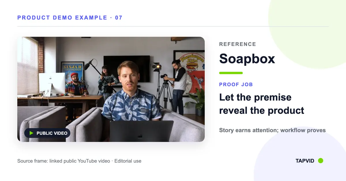
This pattern fits a challenger brand with a clear voice. The concept should reveal the product, not hide it behind a sketch. A useful test is to remove the logo: would a viewer still understand what the product helps them do? If not, the premise has taken over.
Humor is optional. Product evidence is not. Preserve the real workflow inside the entertaining structure.
8. Apple: use speed only when recognition is already high
Apple's “Don't Blink” video uses fast cuts, large typography, and music to turn known products and announcements into a high-energy summary. It is an attention pattern, not a teaching pattern.
This distinction matters for smaller companies. Apple can move quickly because viewers bring substantial context. A new product must spend more time on category, user, and workflow. Copying the pace without the prior awareness can create a video that feels impressive but leaves no usable memory.
Use fast montage for a launch recap, teaser, or second touch. Use a slower proof sequence when the video is the buyer's first explanation.
05
Put the proof where uncertainty happens
Chrome and IKEA Place both put the product inside the situation where its value becomes clear. One uses a long-term human story; the other recreates the moment of purchase uncertainty. In both cases, context is part of the evidence rather than decorative footage.
9. Google Chrome: let features serve one human outcome
Google Chrome's “Dear Sophie” video connects several Google product moments through one family story. The examples do not arrive as a menu. They accumulate as evidence that the product can preserve and organize meaningful moments.
The transferable pattern is narrative compression. Choose one outcome, then let each feature advance it. This can work for a product suite where a standard walkthrough would feel fragmented.
Be careful with emotional stories that could belong to any brand. The product actions must be structurally necessary to the narrative, not inserted between generic scenes.
10. IKEA Place: show the product where the uncertainty occurs
IKEA Place's public demo shows the augmented-reality product inside different homes. The context is the proof because the buyer's question is whether an item will fit and look right in a real room.
For B2B software, “context” may be a sales call, review meeting, publishing deadline, or handoff between teammates. Recreate the moment in which the customer currently hesitates or performs manual work. Then show the product changing that moment.
Avoid generic lifestyle footage when the uncertainty lives inside the interface. Context should make the product evidence stronger, not replace it.
06
Turn these examples into a proof-first demo brief
The examples above differ in style, but the planning sequence can stay consistent. Start by writing the buyer question in one sentence. Then choose the smallest piece of visual evidence that answers it. Only after that should you choose animation, screen recording, presenter footage, or live action.
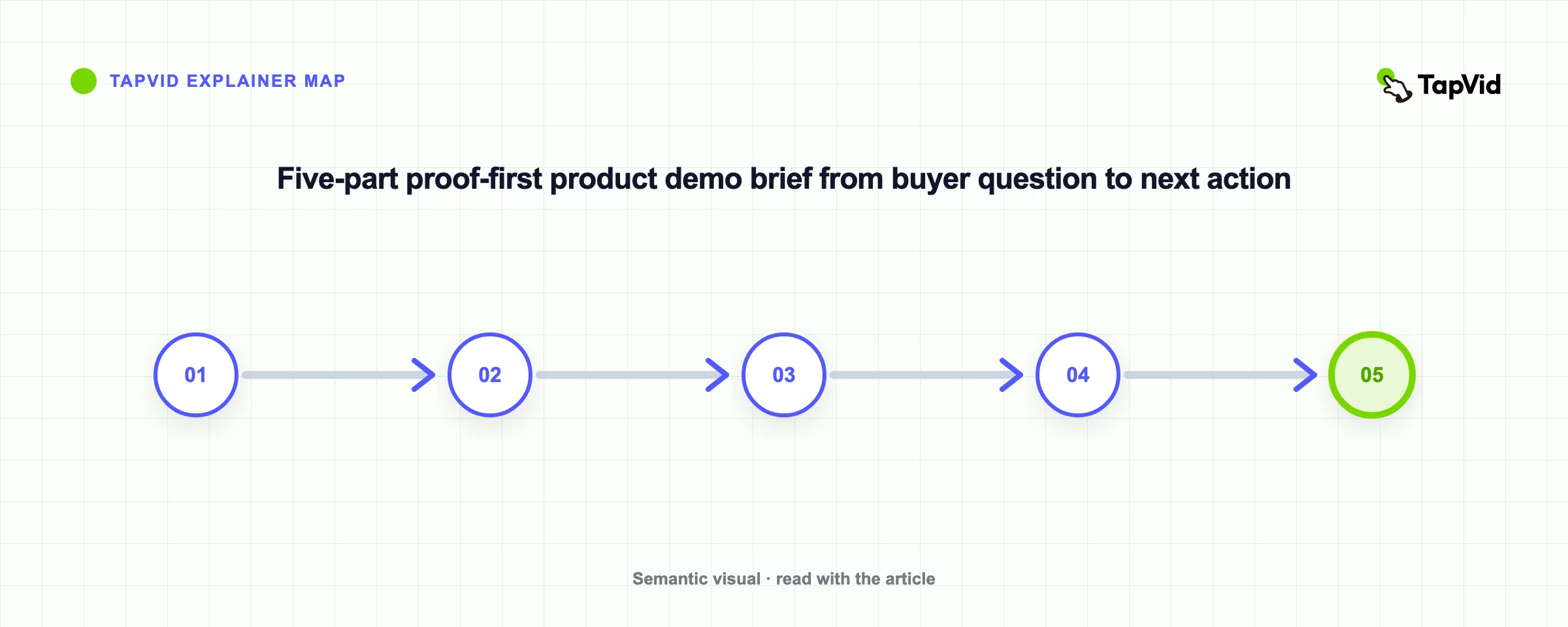
Use this five-part brief:
- Viewer and moment: who is watching, and what decision are they making now?
- Proof job: what must they believe after the video?
- Source truth: which real product state, input, output, or physical action proves it?
- Attention path: what should the eye see first, second, and third?
- Next action: what should the viewer do immediately after the video?
This brief prevents a common failure: picking a visual style before deciding what the style has to prove. It also creates a review standard. A stakeholder can challenge whether a shot supports the proof job instead of arguing only about taste.
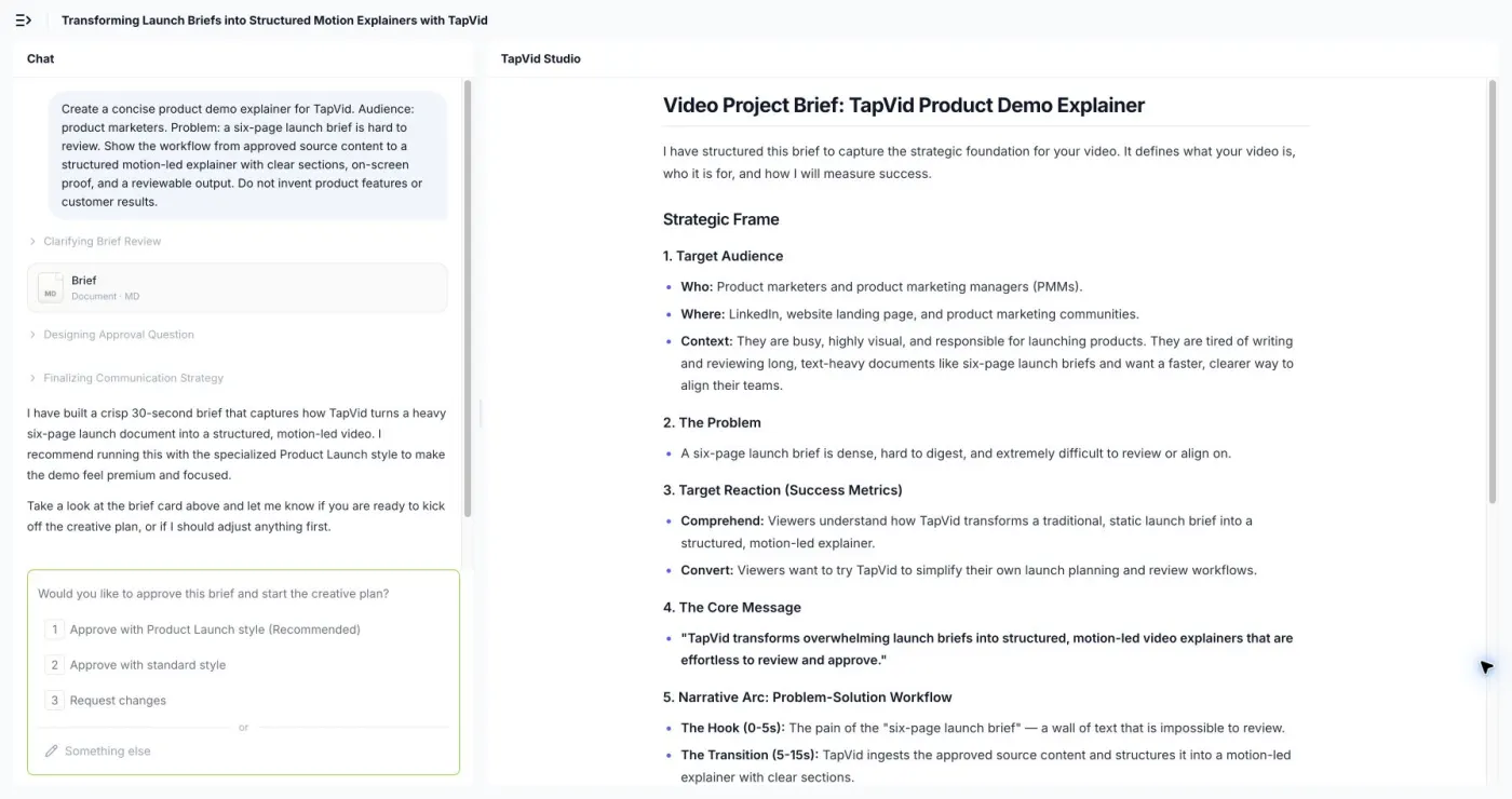
A TapVid editorial verification run used that brief on August 5, 2026, with a 30-second, 16:9, English setup, the Clean Modern style, and Alex voice. The input named product marketers, the six-page launch brief problem, the required source-to-explainer workflow, and an explicit instruction not to invent features or customer results.
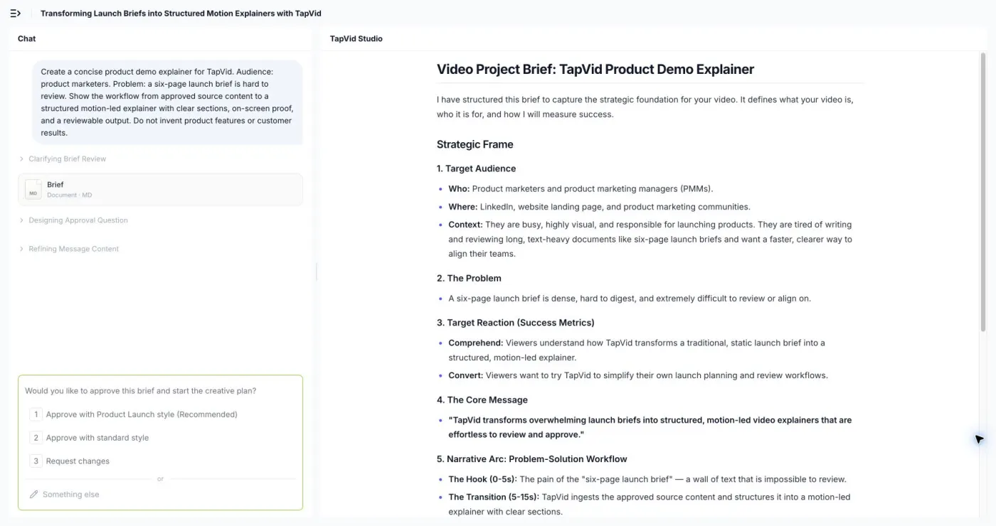
The first output was a reviewable project brief, not a finished video. TapVid organized the material into audience, problem, target reaction, core message, a 0-to-30-second narrative arc, and production settings. It then asked for approval before starting the creative plan. The verification stopped at that gate, so this run supports the brief-structuring and approval-boundary observations, not a judgment about final video quality.
07
Choose screen recording, motion explanation, or a hybrid
Use screen recording when the exact interface is the evidence. It works well for click paths, onboarding, and workflows where buyers need to trust that the product state exists. Use motion-led explanation when raw UI creates too much noise, the story crosses several screens, or the main value is a concept, relationship, or transformation rather than a sequence of clicks.
A hybrid can establish the problem with motion, show the real interface for the decisive action, then return to motion to summarize the outcome. That gives the viewer both a clear model and product truth.
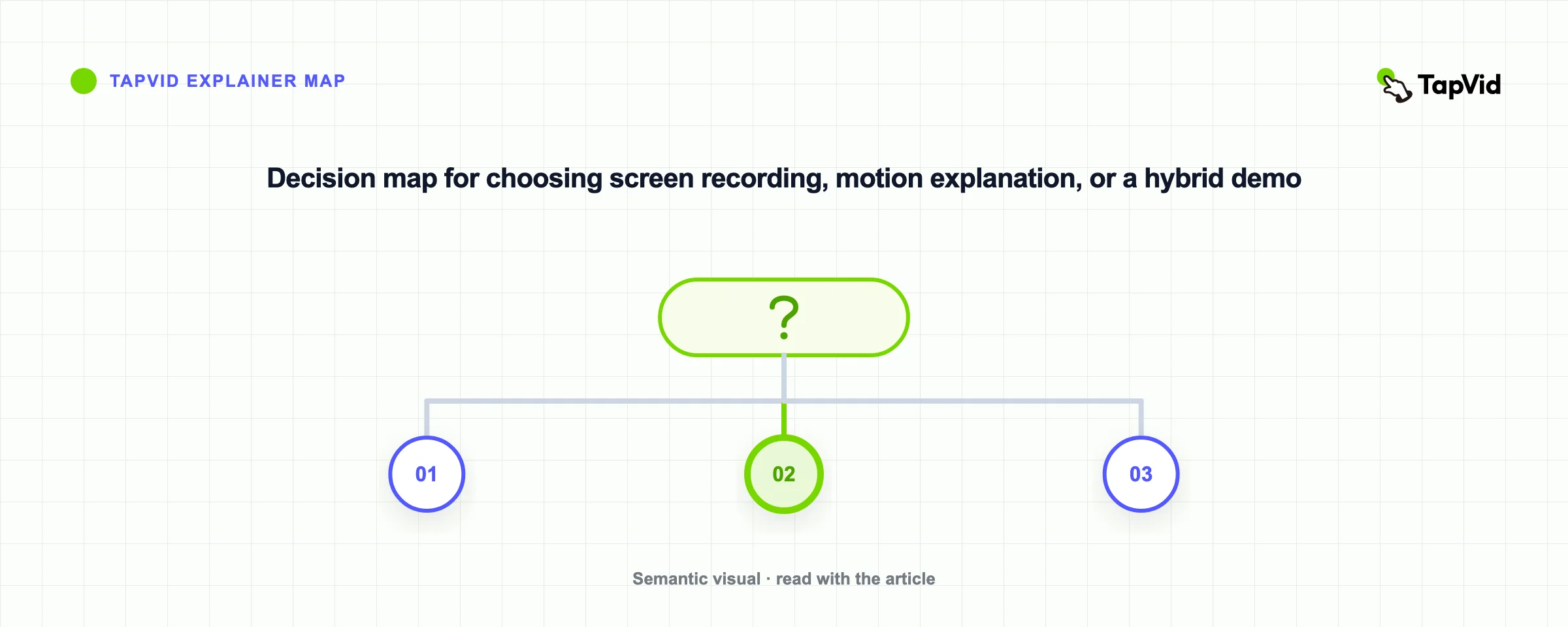
TapVid fits the motion-led side of this decision. It is an Explainer Video Engine for creators who already have the product copy, script, article, PDF, or PRD. It turns that existing material into a structured explainer rather than inventing the underlying claim. Start with the AI product demo video generator when the buyer needs a launch narrative or visual explanation. Use a dedicated screen recorder when exact live interaction is the core proof.
08
Questions to settle before you storyboard
What makes a product demo video effective?
An effective demo makes one buyer-relevant claim visible. The strongest structure connects a real input or situation to a product action and an observable result. Production polish helps only when the proof remains easy to follow.
How long should a product demo video be?
There is no universal length. A launch teaser, homepage overview, sales demo, and onboarding walkthrough solve different tasks. Use the shortest duration that completes the proof job without hiding a critical step. Split the asset when one video is trying to persuade, teach, and document every feature.
Should a SaaS demo show the real interface?
Show the real interface when buyers need to verify the workflow or product state. Simplified motion can be better when raw UI is too dense or the value crosses several screens. A hybrid is often useful: explain the model, show the decisive real action, then summarize the result.
What is the difference between a product demo and an explainer video?
A product demo usually proves how a product works through the object or interface. An explainer video can establish the problem, model, and outcome without following every click. Some assets combine both, but the exact interface should remain truthful whenever it is presented as product evidence.
How do I choose a product demo example to copy?
Copy the proof pattern, not the surface style. Match your viewer's question to an example that answers the same kind of uncertainty. A new SaaS workflow may learn more from Slack or Project.co than from a fast Apple launch montage.
09
Final takeaway
The best product demo video examples are useful because they expose a decision, not because they look expensive. Headspace builds a category model. Slack puts a person inside the workflow. Project.co controls breadth. Duolingo focuses on activation. Surface attaches claims to features. Grammarly shows change. Soapbox makes the premise part of the product. Apple uses recognition to move fast. Chrome organizes features around one outcome. IKEA Place proves value in context.
Pick the proof job first. Then choose the smallest truthful visual sequence that completes it. If your existing product copy or script needs to become a motion-led explanation, use an explainer video workflow. If the exact clicks are the proof, record the product directly.