
TL;DR
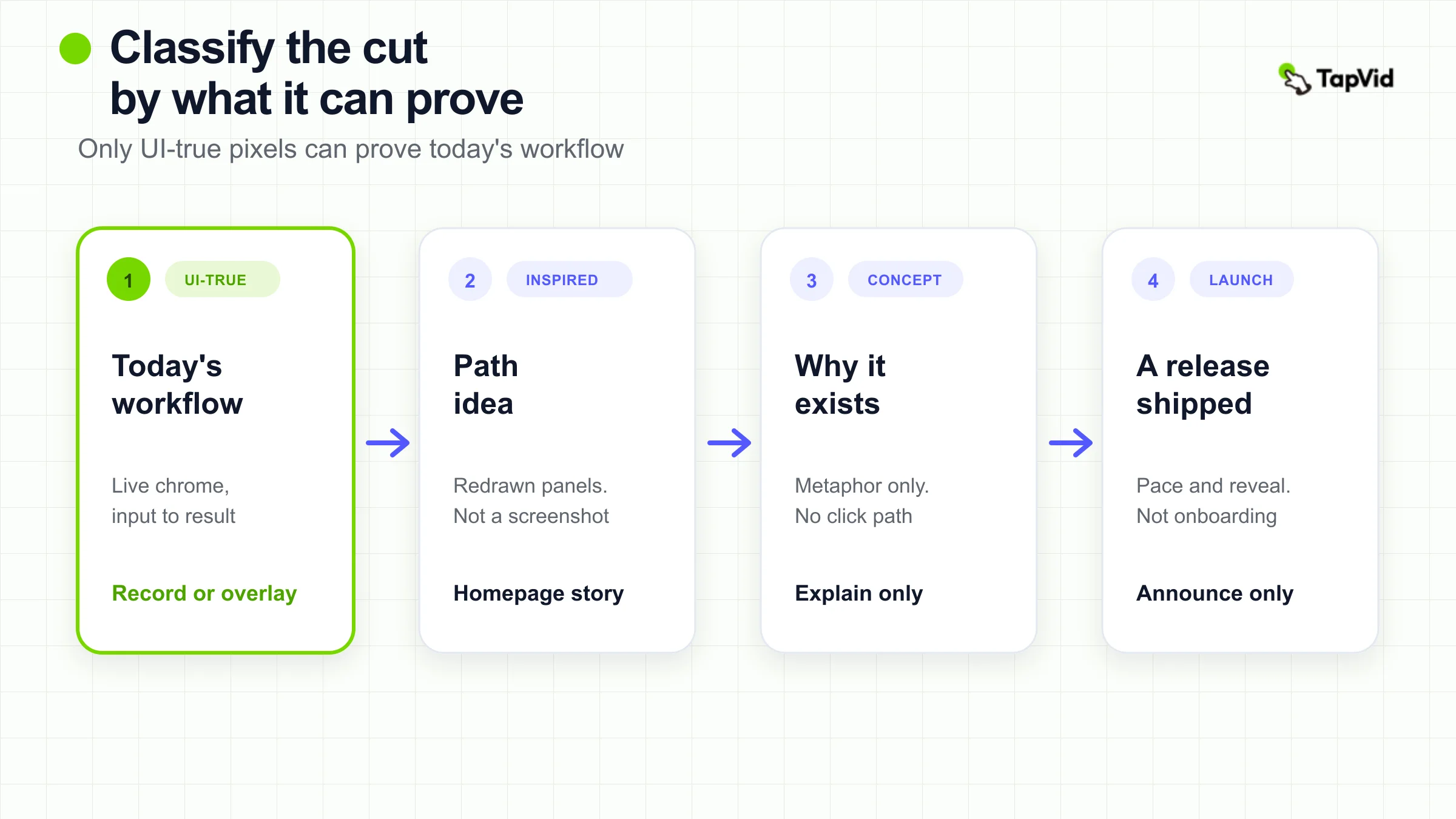
An animated product demo is not one format. Sort the cut into authentic UI-grounded, UI-inspired motion graphics, conceptual feature explanation, or launch animation. Only the first can prove how the product works today. The others can explain a model, carry brand, or announce a release. Do not copy a launch montage or a metaphor film as if it were a product workflow.
Search for animated product demo examples and you get a pile that looks similar in motion and disagrees about proof. One page treats a stylized interface as a durable replacement for a screen recording. Another defines “animated” as illustration with zero software UI. A third gallery mixes coffee process films, sweater origin stories, and carbon-neutral brand spots into the same product-video list. If you borrow the wrong object, you ship a homepage that cannot answer “show me the product,” or an onboarding clip that never matches the live screen.
This page is a classifier, not a production class and not a second swipe file of Slack, Headspace, and Apple. Those proof patterns already live on the product demo video examples guide. Launch adoption risk lives on the product launch video examples page. How to generate an AI cut lives on the AI product demo how-to. Stay here when the job is to name the category before you copy a move.
01
Compare Animated Product Demos by What They Can Prove
Use the table before you open a reference. The only dimensions that matter at this stage are what the pixels show, what claim they can carry, and what they must not be asked to prove.
| Category | What you can see | Claim it can support | Claim it cannot support | Typical placement |
|---|---|---|---|---|
| Authentic UI-grounded | Current product chrome is recognizable. An input, an action, and a result line up | The product can complete this workflow today | A brand feeling, or a feature that is not on screen | Onboarding, support, post-call sales follow-up |
| UI-inspired motion graphics | Interface shapes are redrawn, cleaned, or branded. The path is suggested, not captured | A viewer can follow the idea of the path | Exact clicks, current nav, or pixel-true states | Homepage overview, mid-funnel story, reusable library |
| Conceptual feature explanation | Metaphors, characters, data flows, or invisible mechanisms. Little or no working UI | Why the capability exists | That a specific screen or click path ships today | Category education, investor narrative, pre-UI teaser |
| Launch animation | Pace, type, logo, reveal, or event recap | Something new is out, and it is worth a look | How a first-time user completes a task | Release post, event recap, second-touch teaser |
Knowlify’s 2026 guide splits animated demos into UI mockup animation, conceptual and workflow animation, and hybrid screen recording with overlays (Knowlify). That split is useful for production method. It is incomplete as a proof rule, because a UI mockup and a hybrid overlay are not the same evidence. ContentBeta’s comparison goes the other way and defines animated SaaS demos as 100 percent illustration with zero actual software interface (ContentBeta). If you accept that definition, every “animated product demo” on your brief is already conceptual. This page keeps both sources as maps, then scores the pixels against the table.
02
What Counts as an Animated Product Demo
A useful animated product demo example is a motion-led cut whose job is to help a viewer understand a product, and whose pictures can be named as one of the four categories above. Motion is not the definition. Proof is. An animated demo is also one of several types of explainer videos, so check the format before you pick a reference.
A raw screen recording with no designed motion is a screen demo, not an animated product demo. A character film that never mentions a product is a brand or education piece. A 100-second recap of a keynote is a launch animation even if products flash past. The product demo examples page already treats Apple’s fast montage as an attention pattern, not a teaching pattern. This page starts from that distinction and applies it to the whole animated cluster.
Two vendor sentences are easy to over-copy. Knowlify argues that a stylized interface survives UI changes and can demo a product that does not exist yet (Knowlify). That is a maintenance argument. It is not a license to tell a buyer the mock is the current product. ContentBeta’s “zero interface” definition is a cost and durability argument (ContentBeta). It is a poor brief if the next action is “click here, then here.” Write the claim first. Then decide whether animation is even the right family.
03
Authentic UI-Grounded Demos
An authentic UI-grounded animated product demo keeps the live product recognizable. You should be able to name the surface: project header, board, editor, timeline, export dialog. You should see a starting state, one action, and a changed state. Motion may zoom, crop, or add a callout. Motion may not rebuild the chrome so thoroughly that a current user would not recognize the tool.
The test is boring and it works. Pause on three frames. If you cannot tell which product you are looking at, the cut has already left this category. If the cursor path is invented, or the panels are brand shapes with no corresponding live state, it is UI-inspired or conceptual. If the piece opens on a logo and never settles on a workflow, it is launch.
This page does not embed a named authentic UI-grounded example. Moonb describes monday.com’s “In 60 seconds” cut as motion that never strays far from the real interface (Moonb). Two independent searches on 2026-08-30 for an official monday.com YouTube original with that title did not return a stable public watch URL. A Facebook AI-agent post and a live training session are not that film. Until an official player can be opened and classified from its own pixels, monday.com stays `NOT_FOUND`. Do not treat a gallery caption as proof that the workflow is authentic.
- If you already own a recording of the live product, you do not need a celebrity example to use this category. Overlay arrows and chapter cards if you must. Keep the chrome. The AI product demo how-to is explicit that a screen recording is the path when the interface is the story. Use that path when the buyer has to trust the current UI.
- Limitation, kept next to the category: an authentic UI-grounded cut goes stale when the product ships a new nav. That is the maintenance cost Knowlify names. Pay it when the claim is “this is how it works today.” Do not hide the cost by redrawing the product and still speaking as if the pixels were captured.
04
UI-Inspired Motion Graphics
UI-inspired motion graphics rebuild the interface as design. Panels enlarge. Noise disappears. Brand color replaces the live theme. The viewer can often still say “that is a doc, a board, a timeline,” but they cannot treat the frame as a screenshot.
Coda’s official *Meet Coda* video is the verified example for this middle zone (Coda on YouTube). The published description, read on 2026-08-30 from the Coda channel, presents building blocks: pages, tables that talk to each other, views, and buttons. The narration is a category story about documents that never changed, then productivity software that multiplied process. Product chrome appears as support for that model, not as a click-by-click lesson. Borrow the move of naming a few building blocks and showing them as objects a team can combine. Do not borrow the film as evidence of today’s Coda settings, permissions, or a specific workflow a buyer will repeat after the video.
Knowlify calls the nearest production method “UI mockup animation” and recommends it for feature walkthroughs and mid-funnel tours (Knowlify). Keep the method. Drop the implication that a rendered interface is interchangeable with a captured one. A mock is easier to update. It is also easier to lie with, including by accident, when a designer “cleans up” a control the product does not have.
TapVid’s official product-demo generator is this side of the line, not the authentic-UI side. The page, read on 2026-08-30, says the workflow starts from a product URL, PDF, script, release note, screenshots, logo, and approved claims, then builds a brief, outline, script, and animated scenes (AI product demo video generator). The same page states that TapVid does not record a live screen and does not create an interactive click-through demo. Use it when the job is a structured product story from a source pack you already trust. Do not use it when the viewer must follow exact UI clicks. That limitation belongs next to the product sentence, not in a later FAQ.
WhatAStory lists “animated UI demo videos” as motion-graphics replacements for screen recordings when the product is still changing (WhatAStory). That is a fair homepage use. It is a weak onboarding use. If your reference never shows a real state, your new user will meet a different product than the one they watched.
05
Conceptual Feature Explanations
A conceptual animated product demo explains a mechanism the camera cannot honestly show: storage that is not a box, automation that is not a single button, a feeling the app produces, a backend path. The pictures are metaphors on purpose.
The trap is treating any charming animation from a software brand as a product demo. Headspace’s official *Quick Meditation: Changing Perspective* is the verified counterexample (Headspace on YouTube). The 2017 film, still on the Headspace channel when checked on 2026-08-30, is Andy Puddicombe explaining meditation as sitting beside a road and watching traffic. It is a conceptual explanation of a practice. It is not a walkthrough of the Headspace app, not an input-to-output loop, and not proof that a particular screen exists. Moonb still files it under animated product videos (Moonb). That filing is the error this page exists to catch.
A conceptual cut earns a place in a product library only when the metaphor is about the product’s mechanism and the script does not pretend the metaphor is the UI. The explainer video examples guide owns the broader explainer craft. Stay on this page only long enough to refuse the upgrade from “this idea is clearer as a picture” to “this is how you use the software.”
Knowlify recommends conceptual animation for top-of-funnel viewers who have never used the product and do not care about the settings menu (Knowlify). Agree with the audience note. Keep the claim ceiling low. A pre-launch teaser can visualize a feature that is not code-complete. It cannot support “available today” unless an approved source says so.
ngram’s 2026 demo roundup describes a Figma piece as pure brand animation with no actual Figma UI (ngram). That would be a clean conceptual or UI-inspired case if the original official player had been opened here. It was not. Two searches on 2026-08-30 did not lock a stable official watch URL for the exact cut ngram names. The secondhand description stays a discovery lead, not an embedded example.
06
Launch Animations Are Not Workflow Proof
A launch animation has a narrower job than a demo. It should make a release feel current and point to a next step. It should not be asked to teach a first workflow.
Apple’s official *Don’t Blink* video is the verified launch example (Apple on YouTube). The published line is a 107-second recap of launch news. The TapVid product demo examples page already uses that cut to show what happens when recognition is high and pace replaces teaching. Do not restudy the montage as a new case here. Use it as a category lock: if the viewer needs prior knowledge to understand the flash of objects, you are watching launch attention, not product instruction.
The dedicated product launch video examples page owns Notion Calendar, Linear, Figma Config, and the other adoption-risk patterns. If your brief is “what is new, who is it for, what proof, what next,” go there. If someone dropped a launch recap into an “animated product demo” folder, move it back. A logo open, a type barrage, and a CTA card can be excellent release craft. They do not show a user completing a task.
ContentBeta’s cost table is fine for budgeting animated versus live-action versus screen-recorded work (ContentBeta). It is not a reason to let the most expensive motion piece become your only demo. Price and proof are different columns.
07
What Popular Galleries Get Wrong
Moonb’s fifteen-row table is the clearest contamination sample in this SERP (Moonb). monday.com is described as UI-true. Headspace is a meditation character film. Starbucks explains why coffee is blended. Patagonia tells a recycled-sweater story. CRED is a comic-book brand piece. Apple’s carbon-neutral film is a hybrid accountability narrative. Duolingo’s entry is a behind-the-scenes mascot studio tour. Several of those may be strong films. Most of them are not animated product demo examples in the sense a buyer uses when they ask to see the product.
The damage is practical. A marketer copies Headspace’s warmth into a SaaS onboarding clip and never shows the workspace. A founder copies Apple’s pace and leaves no usable memory of the workflow. A team copies a sweater origin story and thinks they have covered “product education.”
WhatAStory’s seven examples mix an animated UI class with launch and plugin spots (WhatAStory). ngram groups craft, SaaS, short-form, sales, and onboarding, and reports Wyzowl survey figures as context (ngram). Survey percentages do not classify a frame. Open the official player. Score it on the table. If two columns already disagree, stop watching.
- Aggregator cards that rehost a Slack or Notion clip without the official watch URL are not sources. They are discovery leads. This page does not cite them as evidence.
08
Choose the Category by the Claim
Write one sentence the video must make believable. Then pick the category that can carry that sentence.
| Viewer claim | Category that can carry it | Category that will fail it |
|---|---|---|
| “I can do this in the product today.” | Authentic UI-grounded | Conceptual metaphor, launch recap |
| “I understand the path, even if chrome is simplified.” | UI-inspired motion, or hybrid overlay on a real capture | Launch montage with no settled state |
| “I understand why this invisible thing matters.” | Conceptual feature explanation | A click-path recording with no model |
| “Something new shipped, and I should look.” | Launch animation | A long onboarding walkthrough |
Homepage and paid social usually need a short UI-inspired or conceptual open. They can cut to one real state if the next click is “see the product.” Sales follow-up after a live demo should match what was shown, which pushes you toward authentic UI or a hybrid overlay. Onboarding and help should look like the product the user just opened. Launch week can spend a cut on announcement, then must add a demo that can stand without the event.
The motion graphics examples page is the format library when you already know you want type, infographic, or character motion and you are not deciding demo proof. Do not use it as a substitute for this table.
If the chosen category is UI-inspired or conceptual, and you already have a URL, PDF, screenshots, and approved wording, TapVid can structure that pack into an animated explainer you review scene by scene (AI product demo video generator). Official copy on that page keeps product names, numbers, screenshots, and approved wording tied to the source pack, and lets you rerun one scene. It does not approve claims for you, and it does not replace a screen-demo tool. If the chosen category is authentic UI-grounded, record the product.
09
When to Leave Animation
Leave animation when the lesson is the click path, the current chrome, or a compliance step that cannot be stylized.
That is not a taste preference. It is a proof rule. A buyer who has to implement software will punish a beautiful lie. A new user who watched a redrawn nav will stall on the live one. A reviewer who must confirm a permission model needs the real dialog, not a brand hexagon.
The how-to already splits the work: screen-record plus narration when the interface is the story, script-to-animation when the idea is the story (how to make an AI product demo). This page adds the missing scoring step. If your reference is Headspace traffic, you are not looking at a product demo. If your reference is *Don’t Blink*, you are looking at launch. If your reference is *Meet Coda*, you are looking at a model with designed UI support. If you cannot find an official authentic UI-grounded player, do not fill the hole with a brand film. Capture your own product, or keep the claim smaller.
10
Animated Product Demo FAQs
What is an animated product demo?
It is a motion-led product video whose pictures can be classified as authentic UI-grounded, UI-inspired, conceptual, or launch. Motion without a product claim is just animation. A product claim without matching pixels is a script.
Is a UI mockup the same as a real product demo?
No. A mockup can make a path easier to follow and easier to maintain (Knowlify). It cannot prove the current interface unless the live chrome is still recognizable and the states are real. If you need exact clicks, record the product.
Can an animated product demo skip the interface entirely?
Yes, as a conceptual explanation. ContentBeta even defines the animated type that way (ContentBeta). That cut can answer “why should I care?” It cannot answer “where do I click?” Label it so stakeholders do not file it as workflow proof.
Why isn’t Headspace’s Changing Perspective a product demo example?
Because the official film explains a meditation technique, not an app workflow (Headspace). It is a useful warning about gallery contamination, not a UI reference.
When is a launch animation the right reference?
When the job is to announce a release to an audience that already knows the objects. Apple’s *Don’t Blink* is that job (Apple). Use the launch examples page for adoption-risk patterns. Do not use a launch recap as onboarding.
Does TapVid make authentic UI-grounded demos?
No. The official generator builds structured animated scenes from a source pack and states that it does not record a live screen or create an interactive click-through (TapVid). That is a UI-inspired or conceptual path. For pixel-true clicks, use a screen recorder.
11
Pick the Proof, Then Make the Cut
The useful animated product demo examples are useful because they expose a category error, not because they look expensive. Coda’s *Meet Coda* shows a designed model with UI support. Headspace’s meditation film shows how a beloved animation can fail a product-demo brief. Apple’s *Don’t Blink* shows launch speed that depends on prior recognition. The missing official monday.com “In 60 seconds” player shows the other failure: a gallery caption is not a source.
Score the reference on the table. Keep launch films in the launch folder. Keep metaphors in the explainer folder. Keep mocks labeled as mocks. If the claim is that a person can do the work in the product today, show the product or narrow the claim. If the claim is a structured story from approved assets, start from the AI product demo video generator and review the script against the source pack before anyone treats the motion as proof.