
TL;DR
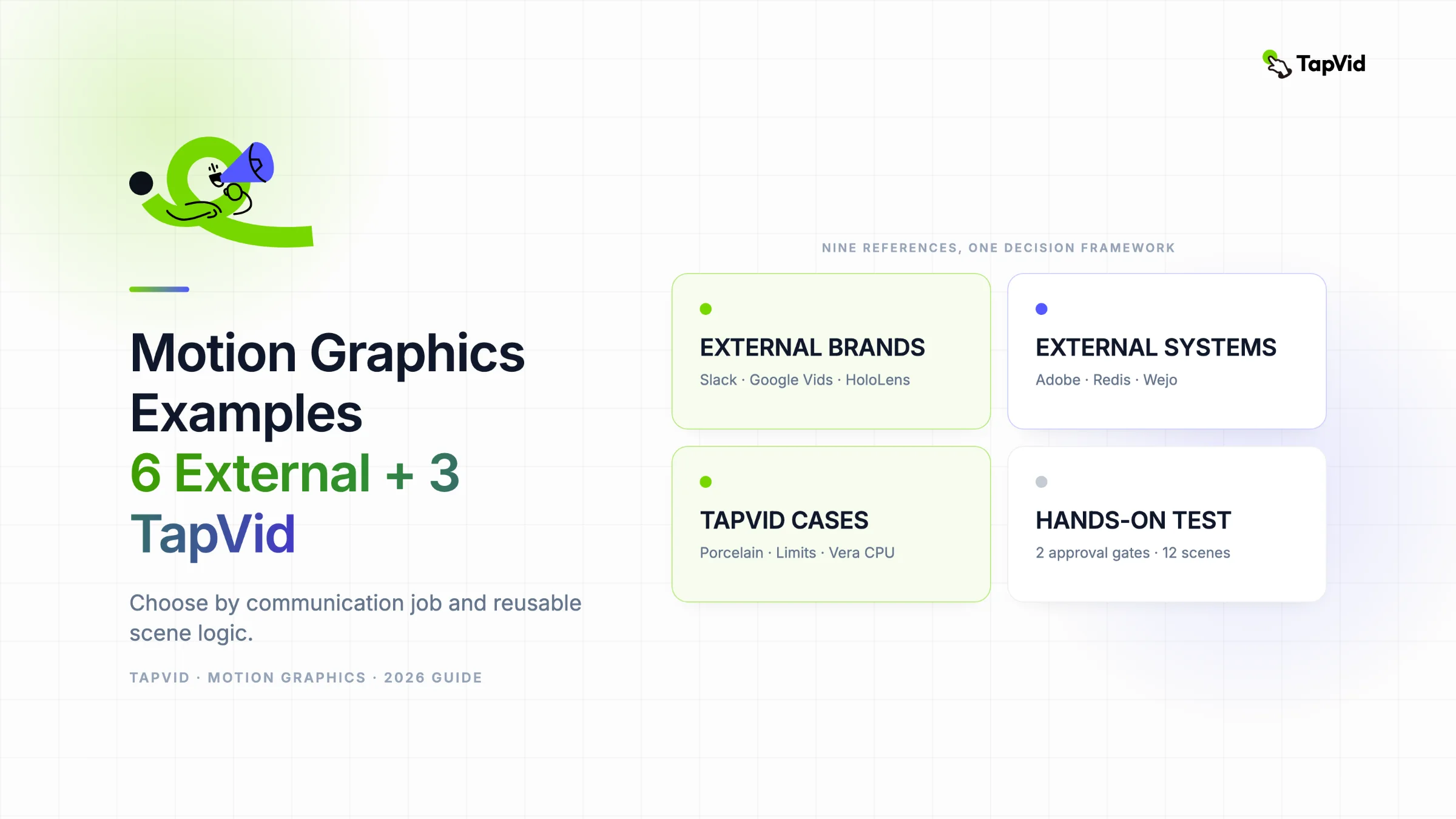
The most useful motion graphics examples expose a communication structure you can reuse, not a surface style to copy. Across the nine examples reviewed here, the repeatable jobs are problem framing, product reveal, hybrid technical explanation, series education, fact-led kinetic type, contextual data, process explanation, abstract-concept visualization, and technical hierarchy. TapVid fits this workflow when you already have an article, script, PDF, or production brief and need to turn that source into a structured motion-led explainer draft. In one observed 60-second run, TapVid exposed two approval gates and 12 scene previews before the final player. It also introduced unsupported numbers that were absent from the source. Use the TapVid AI Motion Graphics Generator to organize and visualize approved material, then review every claim before publication.
Create motion graphics with TapVid
01
Nine motion graphics examples at a glance
| Example | Communication job | Structure worth borrowing | Best fit | Main constraint |
|---|---|---|---|---|
| Slack, Work, simplified. | Make familiar friction visible | Crowded problem state, one behavior change, calmer state | Workflow and productivity products | The opening pain must remain credible |
| Google Vids launch film | Reveal the job before the feature list | Use case, creation behavior, media range | Product launches | Fast editing cannot replace a clear priority |
| Microsoft HoloLens case study | Show a technical layer that footage cannot capture | Physical task in footage, hidden system in graphics | Industrial and medical explainers | Overlays need expert-approved copy and data |
| Adobe Foundations | Build a repeatable educational series | Fixed identity rules with topic-specific variation | Courses and recurring content | One repeated metaphor or pace can flatten distinct topics |
| Redis explainer system | Let type carry facts | One sourced fact per frame with readable hold time | Developer and product explainers | Every number needs a unit, date, scope, and owner |
| Wejo data visualization | Place data inside the decision it supports | Place, behavior, data layer, decision | Data stories and business explainers | Labels, timeframe, population, and source must remain visible |
| TapVid porcelain explainer | Turn a process into visible stages | Animate the physical change while narration explains why | Process education | Diagrams cannot replace material detail |
| TapVid limits lesson | Make an abstract condition visible | Equation, graph, and visual interruption shown together | Mathematics and science lessons | A full lesson may be too dense for a short social cut |
| TapVid Vera CPU explainer | Organize technical detail into a hierarchy | System overview before subcomponents | Architecture explainers | Secondary labels may fail on a phone screen |
The table is a selection aid, not a scorecard. Choose the row whose communication job and constraint most closely match your brief, then inspect the full example below before adapting its structure.
This technical guide is for content creators, product marketers, and educators who need to turn a reference into a defensible production brief. The examples are grouped by communication job, not visual trend. A scene structure is useful because it tells the team what information belongs on screen, in what order, and under which constraints.
02
How these examples were reviewed
The review used official brand channels, credited production studio case studies, and TapVid public share pages. On August 5, 2026, each source was opened, its published context was checked, and its visible sequence was inspected. The Slack and Google Vids videos were played on their official YouTube channels. Three TapVid examples were also played on public share pages with their transcripts open, followed by one creator-owned source brief submitted to TapVid from source to final player. The screenshots below were captured during those reviews and the live test.
The analysis describes what is visible and how the sequence communicates. It does not infer conversion, adoption, or campaign performance.
03
1. Slack: make the problem visible before showing the product response
Watch Work, simplified. on Slack's official YouTube channel.
At about 0:10, the frame is crowded with email, calendar, chat, and notification blocks. People are partly hidden behind the interface clutter. By about 0:37, the composition has opened up and the people have room to move. The visual change carries the argument before the closing message has to explain it.
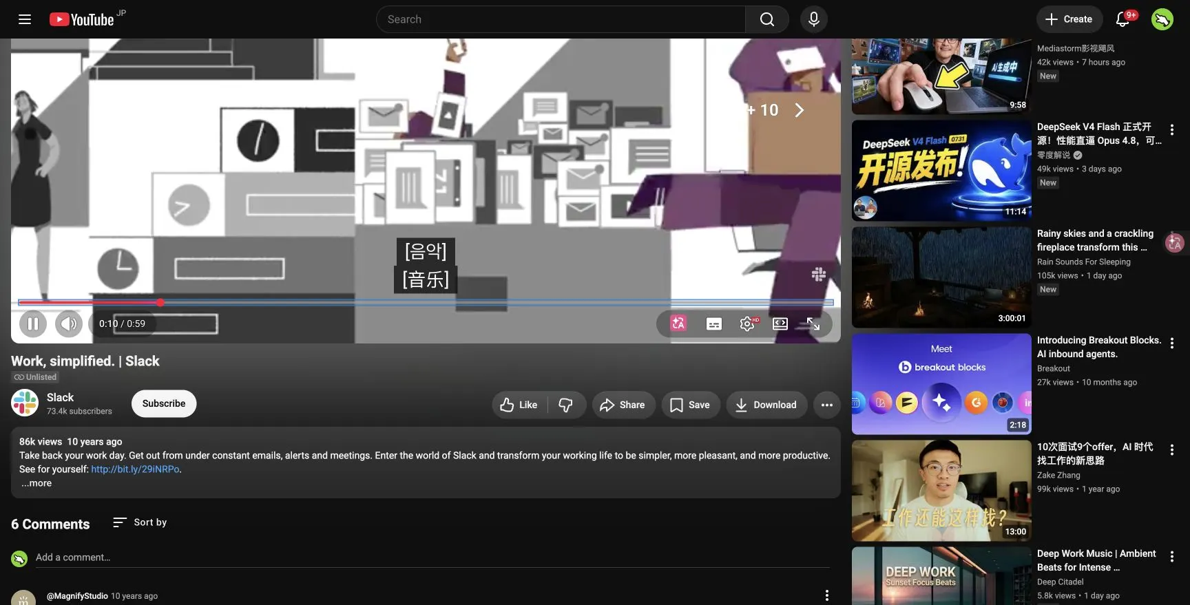
The useful lesson is not Slack's illustration style. It is the order: recognizable friction, one change in behavior, then a calmer state. This pattern works when a product removes a familiar burden. It becomes weak when the opening problem is exaggerated or when the product section turns into a feature tour.
Use it when: you can name one credible problem, one product behavior, and one visible improvement.
04
2. Google Vids: reveal the job before the feature list
Watch Introducing Google Vids on the Google Workspace channel and read BUCK's case study.
The film identifies concrete work use cases early. At about 0:10, “sales training video” appears before the film dives into creation details. Around 0:37, the typography and cursor treatment demonstrate adding a voice. Later scenes show the range of media that can be assembled. The viewer learns what the product is for, then how it behaves.
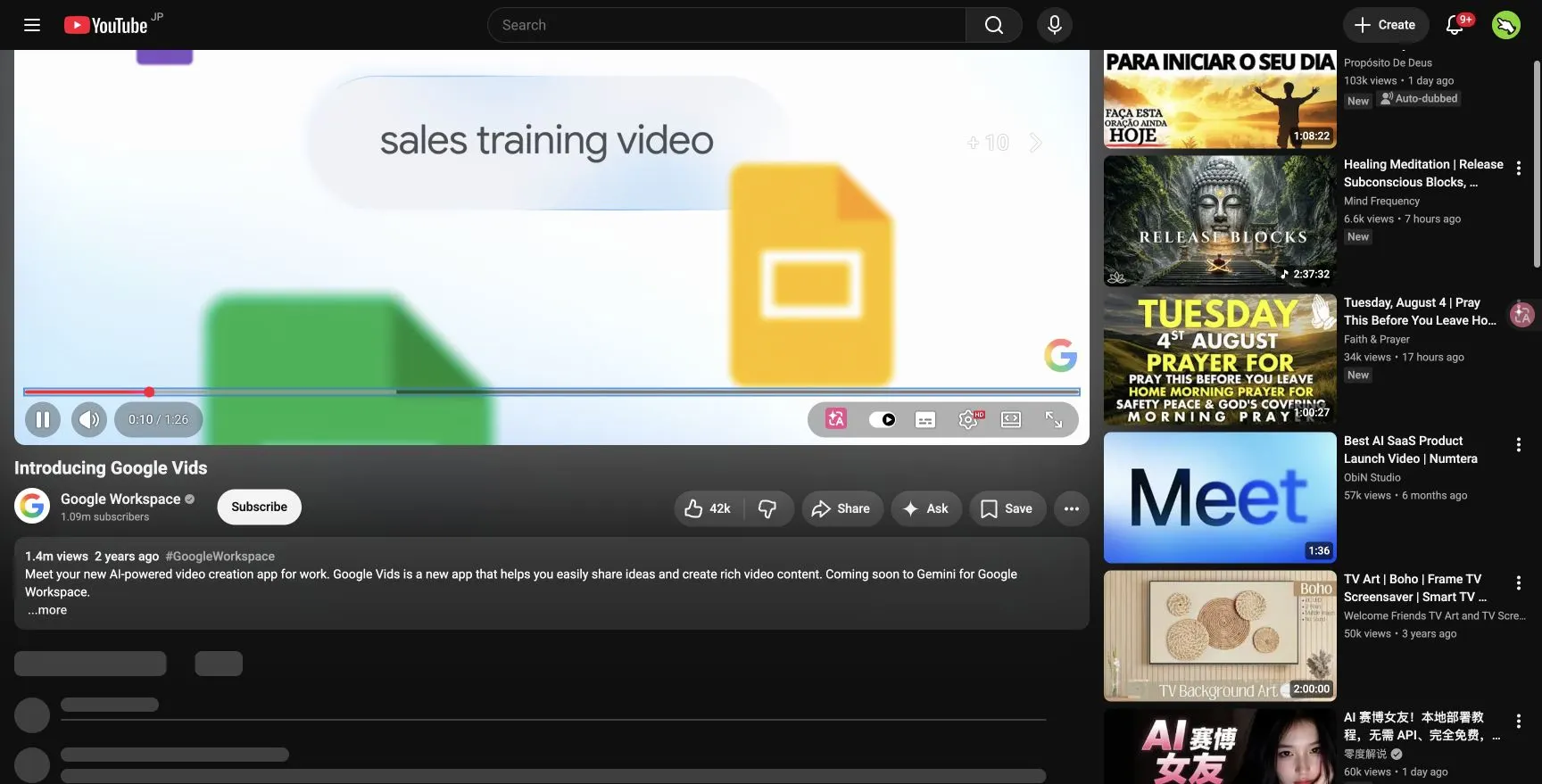
Fast editing works here because every reveal answers the same question: what can this app help someone make at work? A weaker launch film uses speed to hide a missing priority. If the product name, job, and main change cannot survive on three clean frames, more transitions will not fix the brief.
Briefing question: what should a viewer be able to say about the product after the first 15 seconds?
05
3. Microsoft HoloLens: divide the work between footage and graphics
View BUCK's Microsoft HoloLens case study.
BUCK documents four films, each about two minutes, for industrial and medical applications. The case study explains that the subject matter was difficult to visualize, so the team combined live action with minimal 2D animation, precise grids, and expert copywriting.
This is a useful model for technical content because each medium has a job. Footage establishes the person, place, or physical task. Motion graphics reveal the layer that cannot be filmed directly, such as a spatial relationship, workflow, measurement, or hidden system.
The approach fails when overlays repeat the footage or decorate an explanation that is still vague. Before production, the source needs a real application, verified statistics, and an expert-approved explanation.
06
4. Adobe Foundations: build a series system with room to change
View Oddfellows' Adobe Foundations case study.
The series covers typography, color, and layout. Its value as a reference comes from the balance between fixed rules and topic-specific motion. An educational series needs a recognizable opening, type hierarchy, caption treatment, and closing behavior. It also needs enough variation for typography to feel different from color or layout.
For a recurring course or article series, list the elements that stay fixed and the elements that respond to the lesson. If every episode uses the same metaphor, density, and pace, consistency starts to flatten the subject.
Use it when: you have a curriculum, clear episode boundaries, expert material, and a repeatable visual system.
07
5. Redis: let kinetic type carry facts, not filler
Read Column Five's Redis motion graphics case study.
Column Five describes a system of more than ten explainers and product demos. The work uses kinetic type, controlled color, and focused visualizations for a technical audience. The important production discipline is one useful fact per frame.
Kinetic type earns its place when the words are the evidence: a product term, a measured figure, a comparison, or a concise claim. The frame needs a clear reading order and enough hold time for the viewer to verify what was shown.
The danger is treating speed as a synonym for technical sophistication. Developers do not need more movement. They need accurate language with less friction. Every number still needs a unit, date, scope, and owner.
08
6. Wejo: place data inside the decision it supports
View FLOW's Wejo data visualization case study.
FLOW starts with a retail problem, then uses 3D environments to establish physical context and 2D overlays to reveal connected-vehicle data. The case-study text explains the business questions first: where customers come from, how often they visit, where else they shop, and how locations change over time.
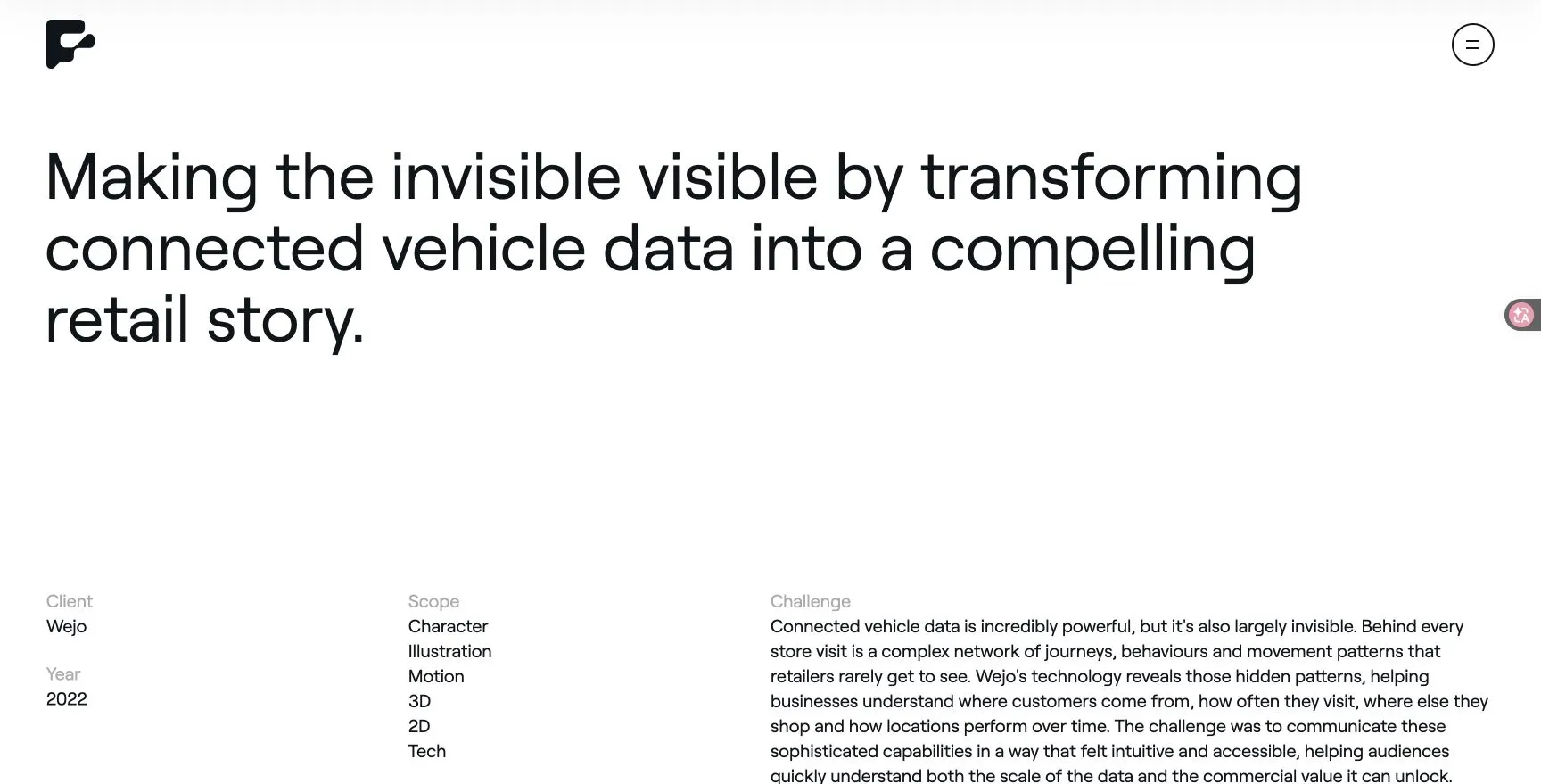
That order gives every chart a reason to appear. A practical scene sequence is: place, behavior, data layer, then decision. Starting with a dashboard would force the viewer to decode the interface before knowing why the information matters.
Animated data still needs the same discipline as a static chart. Labels, timeframe, units, population, and source cannot disappear just because the camera is moving.
09
7. TapVid porcelain explainer: turn a process into visible stages
Open the public TapVid case Earth, Cobalt, Fire.
The source prompt asks for an introductory course that lets a beginner move through shaping, glazing, and firing. The final video turns those stages into a clear sequence. At about 1:15, a cobalt layer enters a simple line drawing of the vessel while the transcript explains how the porous surface takes in the material.
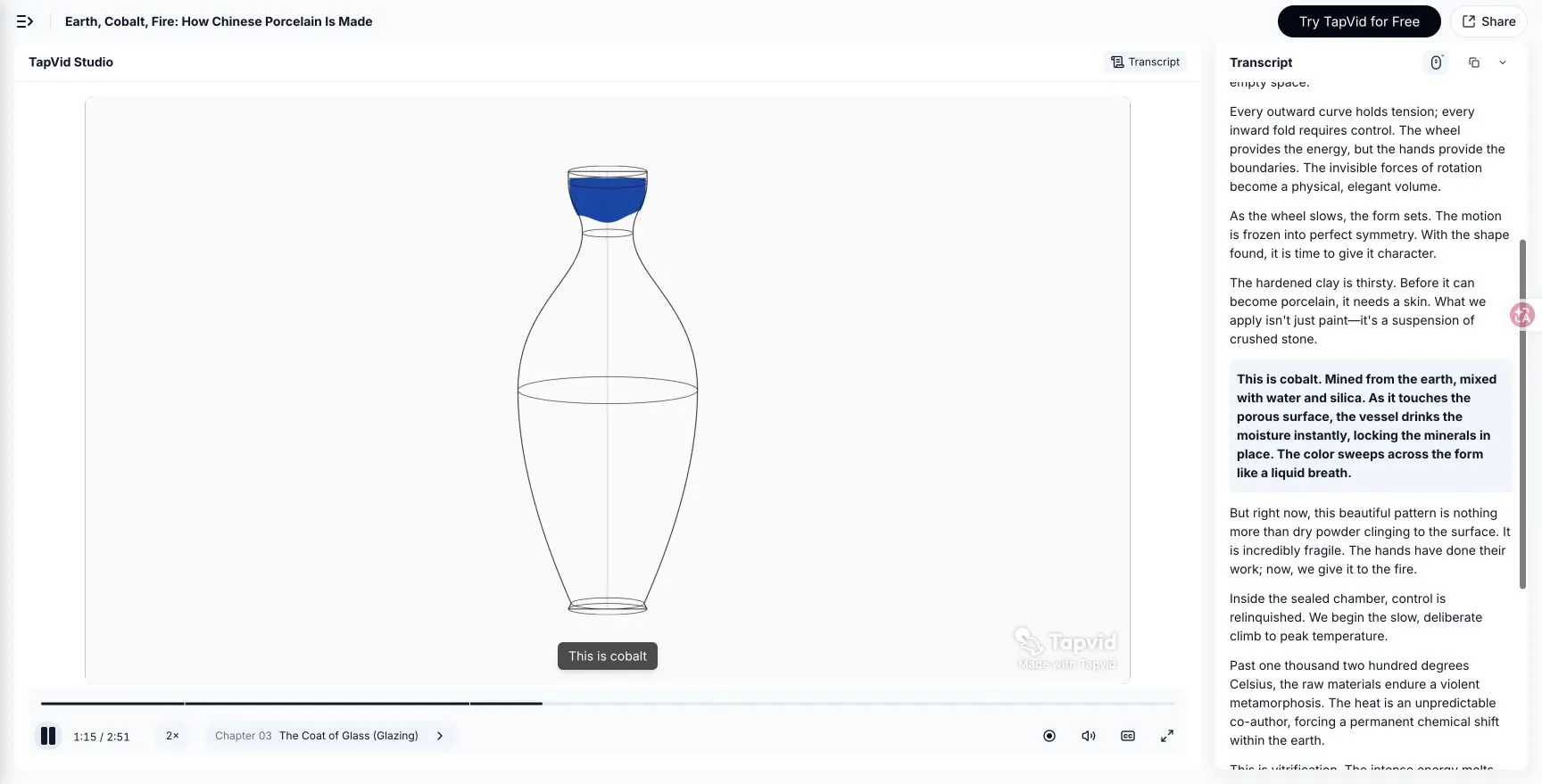
The scene works because the animation is tied to a physical change. It is not motion added to a paragraph. The graphic shows where the cobalt goes while the narration explains why it stays there.
The limitation is also visible. A minimal diagram can clarify the process, but it cannot replace real material detail when texture, hand technique, or historical authenticity is the lesson. A stronger production brief would decide which stages need diagrammatic explanation and which need photography or footage.
10
8. TapVid limits lesson: make an abstract failure concrete
Open the public TapVid case Sneaking Up on a Number.
The video begins with a rational function and asks what happens at x = 2. At about 0:20, the equation, graph, and highlighted transcript are visible together. The undefined point becomes a visual interruption in an otherwise continuous line.
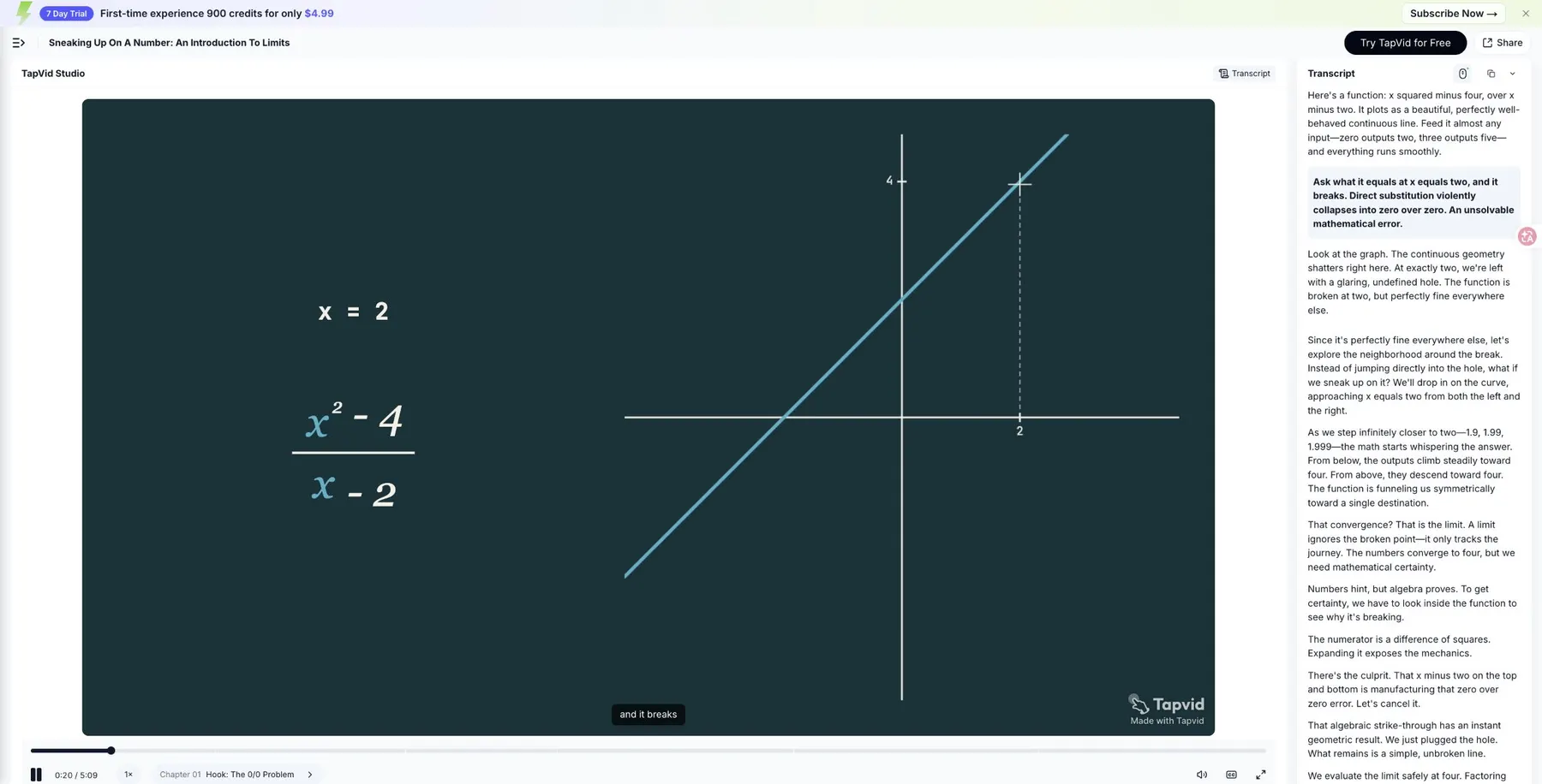
This is a strong motion graphics job: give an invisible mathematical condition a place on screen. The viewer can connect the algebraic expression to the missing point before the lesson moves into limit behavior.
There is a tradeoff. The public version runs for 5:09 and carries a dense transcript. For a short social cut, the hook and the “hole” visual could stand alone. For a full lesson, the longer sequence has room to show numerical approach, algebraic proof, and edge cases.
11
9. TapVid Vera CPU explainer: organize technical detail into a hierarchy
Open the public TapVid Vera CPU case.
During the live review, the 2:45 video moved from a problem setup into an architecture section. At about 1:07, four labeled blocks for branch prediction, decoding, out-of-order execution, and prefetching appear on one grid while animated nodes connect the system.
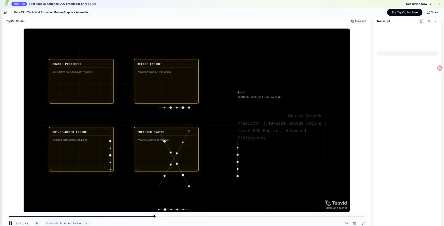
The hierarchy is useful because the viewer sees the system before reading every subcomponent. The risk is mobile legibility. The secondary labels are small, so a vertical or phone-first version would need fewer blocks per scene or a closer camera.
This example is a reminder that technical accuracy and screen design must be reviewed together. A correct diagram still fails if its labels cannot be read in the intended viewing context.
12
How to turn motion graphics examples into a production brief
Do not write “make it like this” in a production brief. Translate the reference into decisions:
- Job: what does the example help its viewer understand, feel, or do?
- Order: what appears first, and what information is deliberately delayed?
- Visual carrier: is the main idea carried by footage, type, diagram, data, character, or interface?
- Evidence: what facts, examples, data, or expert review make the sequence defensible?
- Constraint: what will break when the format, runtime, screen size, or source material changes?
Use the answers to write a plain-language direction. For example: “Start with Slack's crowded problem state, but rebuild every scene from our own user problem, interface, and brand system.” That instruction identifies the logic worth borrowing and the parts that must remain original. Copying a palette, character, transition, or logo behavior does neither.
13
Where TapVid fits in this motion graphics workflow
TapVid is positioned as an Explainer Video Engine that turns creator-owned source material into a motion-led explainer. That boundary matters here. The product is not the source of the argument, and it is not being tested as a system that invents a campaign from nothing. The creator supplies the article, script, PDF, or production brief. TapVid organizes that source into a reviewable video draft.
The TapVid AI Motion Graphics Generator is the closest product route for this workflow. If the starting material is a finished script or article, the text to motion graphics workflow is the more specific entry point.
14
From creator-owned brief to production plan
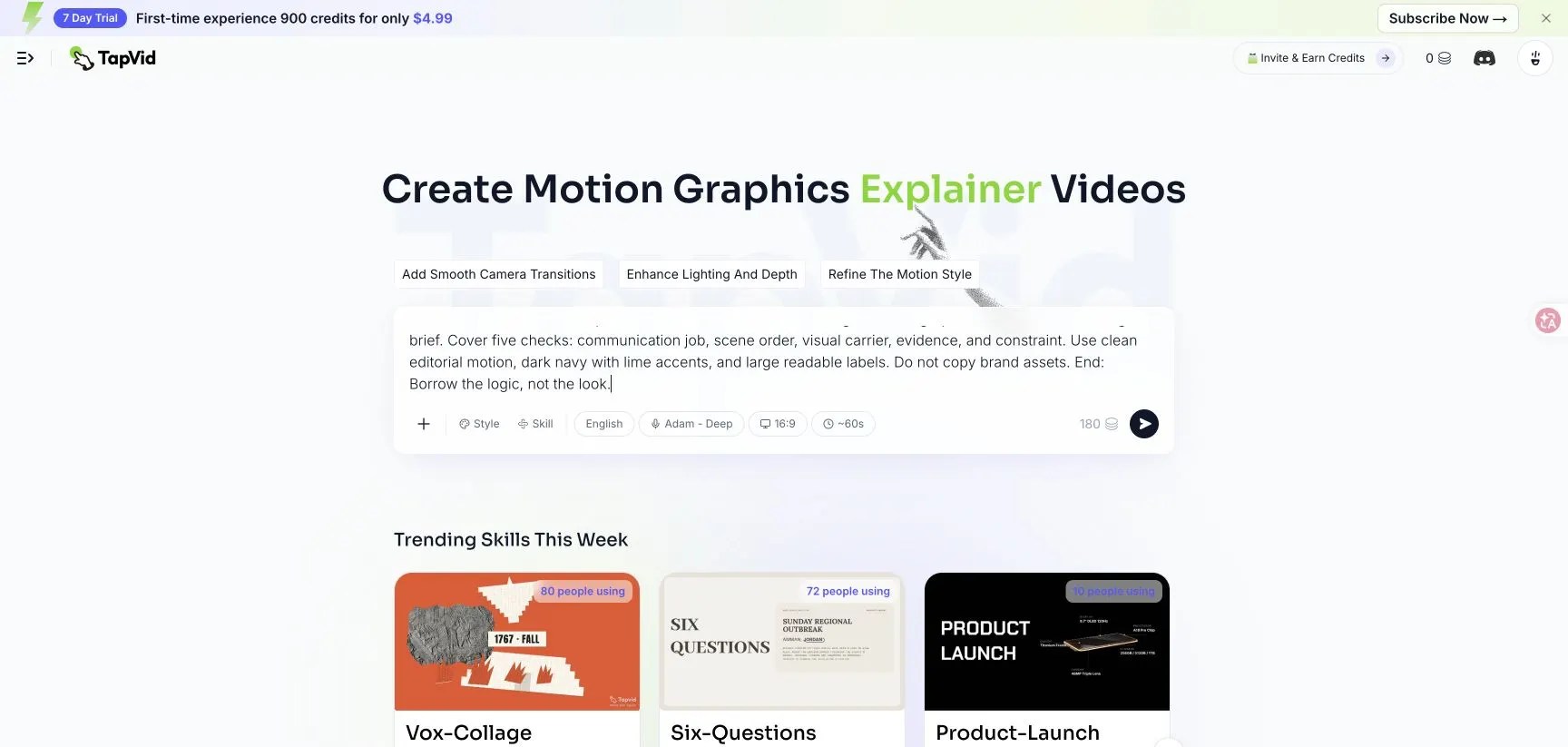
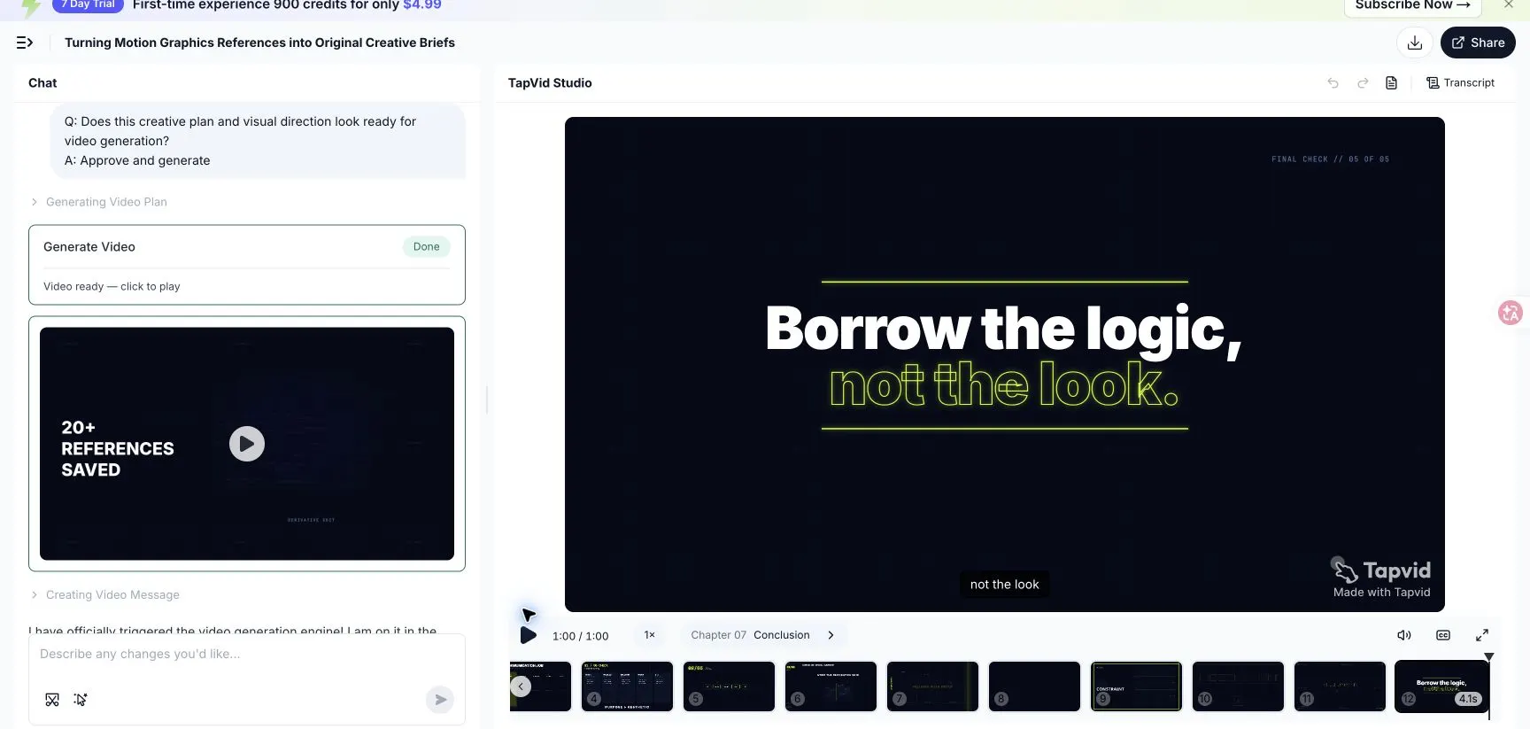
The test used a new 60-second, 16:9 English source brief. It already contained the audience, the five checks, the visual constraints, and the closing line. The checks were communication job, scene order, visual carrier, evidence, and constraint. The brief requested a dark navy and lime editorial system, large readable labels, no copied brand assets, and the closing line “Borrow the logic, not the look.” TapVid's job was to structure and visualize that approved content.
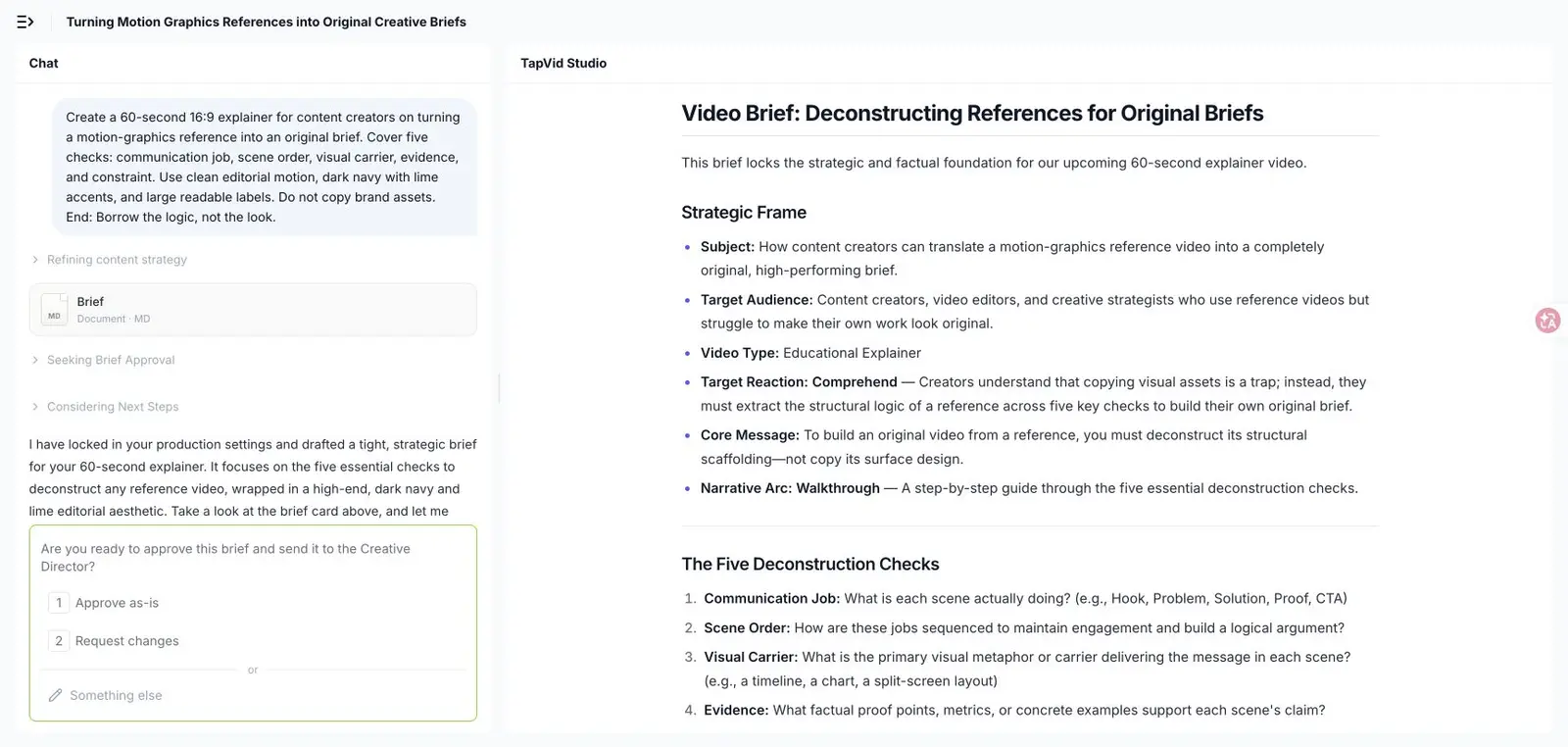
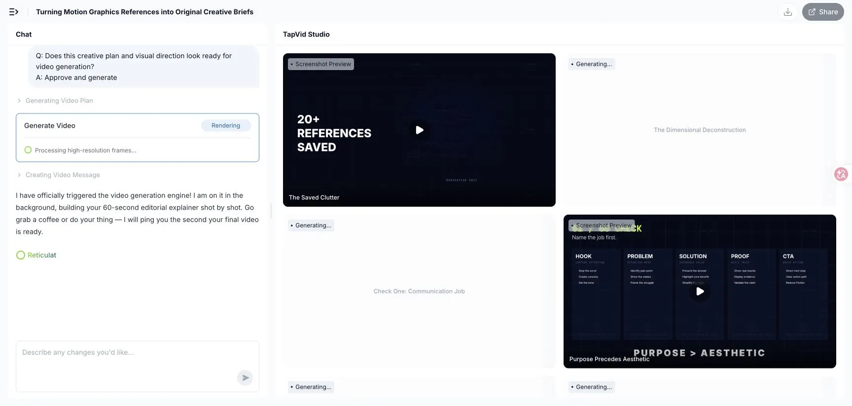
TapVid did not jump directly from the source brief to a finished video. It first produced a strategic brief, identified the audience and communication goal, and paused for approval. After approval, it expanded the brief into a visual system and a timed script. The script contained 12 scenes across the requested 60 seconds, including separate scenes for the five checks and a final takeaway.
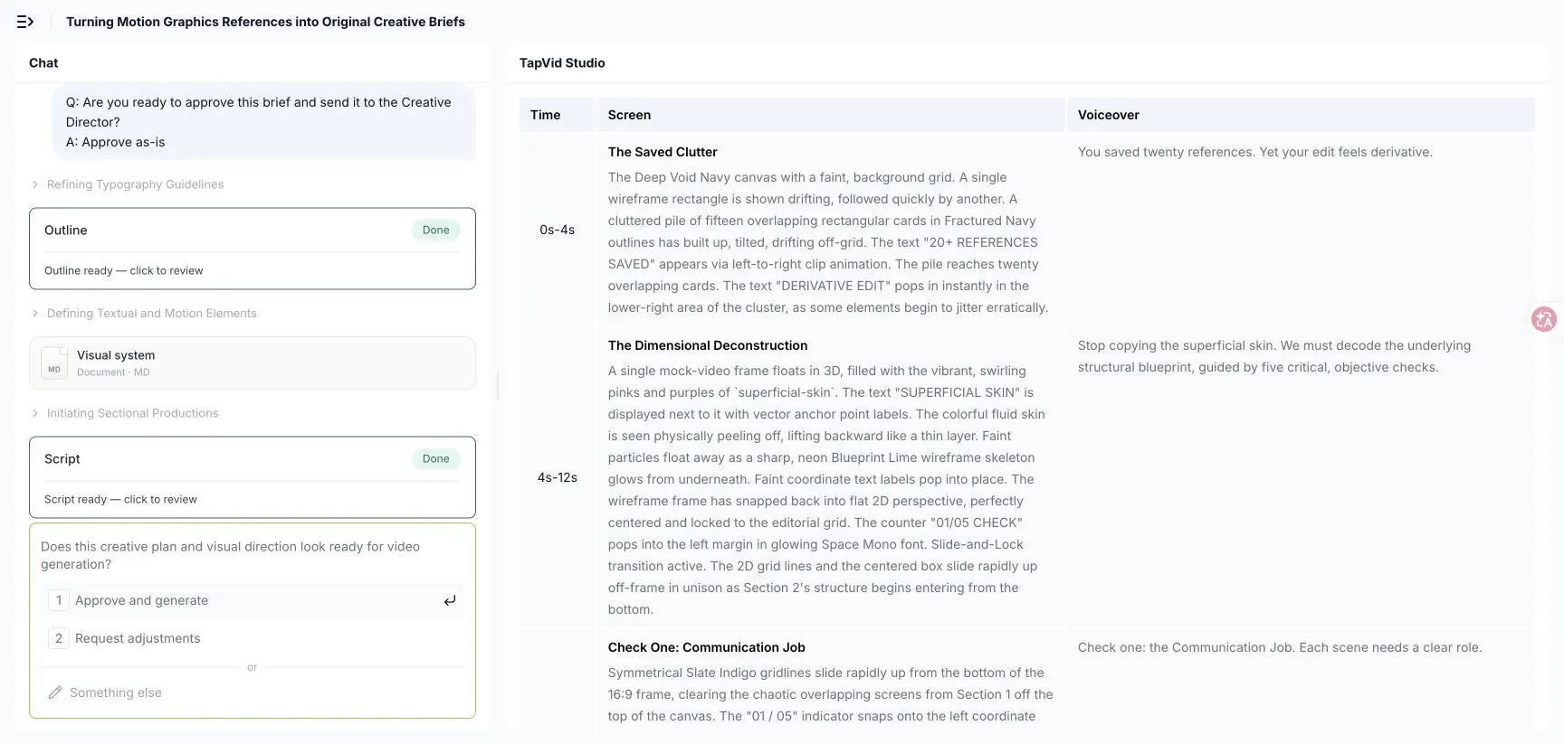
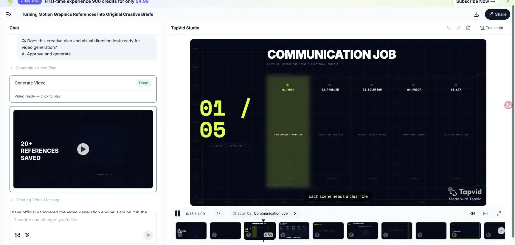
The second approval gate exposed the production plan as a table with timing, screen direction, and voiceover. That made it possible to catch a weak claim or an unreadable scene before rendering. In this run, the plan translated “communication job” into five familiar launch blocks, then used a scene-order timeline for the next check.
15
From approval to scene previews
After approval, TapVid generated the 12 scenes independently before final assembly. The scene previews stayed inside the requested navy and lime system and made it easy to compare the opening problem state with the structured checklist. The useful part of the workflow was not simply that software produced motion. The brief, visual rules, script, and scene previews remained visible as reviewable artifacts.
16
What the completed run proved and what it missed
In this single observed run, the 1:00 player with all 12 scene thumbnails became ready 20 minutes and 5 seconds after the initial submission. This is a dated run log, not a speed promise. Playback confirmed the requested communication-job sequence and the final takeaway frame.
The test also exposed a factual-review failure. The generated script introduced illustrative numbers such as “84% PERFORMANCE” and “+40% SPEED” even though the source brief supplied no data. Those values are unsupported. They must be removed or replaced with approved, sourced facts before the video is shared or embedded. A polished preview does not remove the need for source review.
This was one observed run, not a controlled speed or quality benchmark. The test did not compare alternate prompts, voices, styles, or models. The run is evidence that the staged workflow and generated previews were visible in the product on the test date; it is not evidence that every brief will produce the same quality or timing.
The practical handoff starts with an approved source, one audience, one communication job, and explicit scene constraints. Use TapVid to create a structured draft, then review factual scope, reading order, timing, accessibility, rights, and brand fit. The tool can organize and visualize the source. The creator still owns the editorial decision about what matters and whether the result is accurate.
The strongest motion graphics examples are not the ones you admire most. They are the ones whose communication logic you can explain, support with your own source material, and adapt without copying the surface.
17
Frequently asked questions
What are good motion graphics examples to study?
Good examples make their communication job visible. Slack shows a problem-to-improved-state story. Google Vids shows a launch reveal. HoloLens combines footage with diagrams. Wejo places data inside a business decision. The best reference is the one that solves a problem similar to yours.
How do I choose a motion graphics style?
Choose the communication job and viewing context first. Then select a visual carrier that your source can support. A diagram needs accurate relationships. Kinetic type needs concise approved copy. Data animation needs units, scope, and readable labels.
Can I copy the style of a motion graphics example?
Study sequence, hierarchy, pacing, and information density. Rebuild color, typography, illustration, characters, transitions, and logo behavior from your own brand system and licensed assets. Do not reproduce a signature treatment associated with another brand or artist.
Do I need to be a motion designer to use these examples?
No. You need to identify the communication job, source evidence, viewing context, and production constraint. A motion designer or generation tool can turn that direction into scenes, but the brief still needs an accountable owner who can approve the facts and priorities.
Can AI create motion graphics from a reference?
AI can help turn approved material into scenes, but a reference is not a complete brief. Define the viewer, outcome, source, evidence, and constraints first. Then review the output for accuracy, rights, accessibility, and brand fit.