
TL;DR
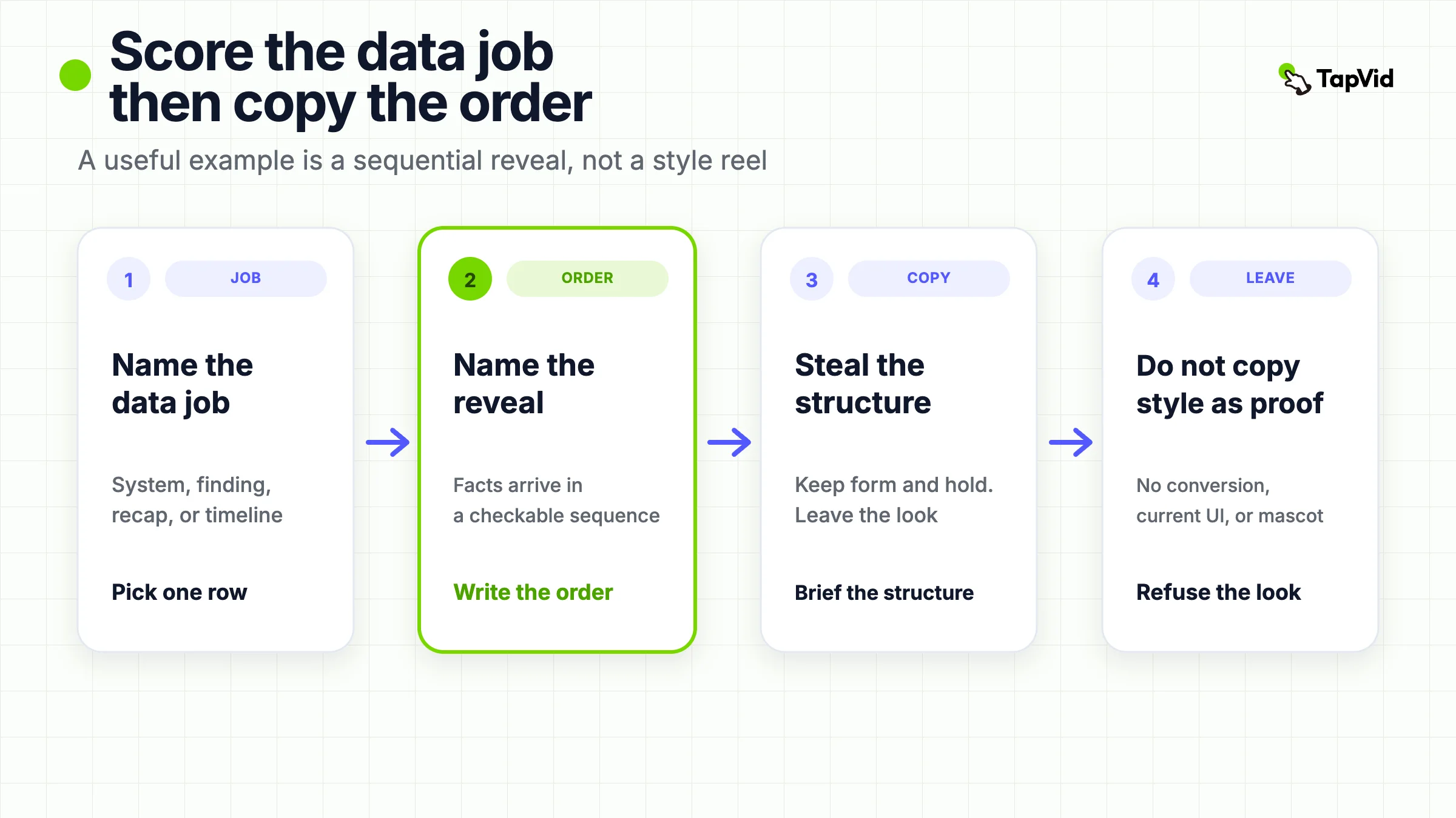
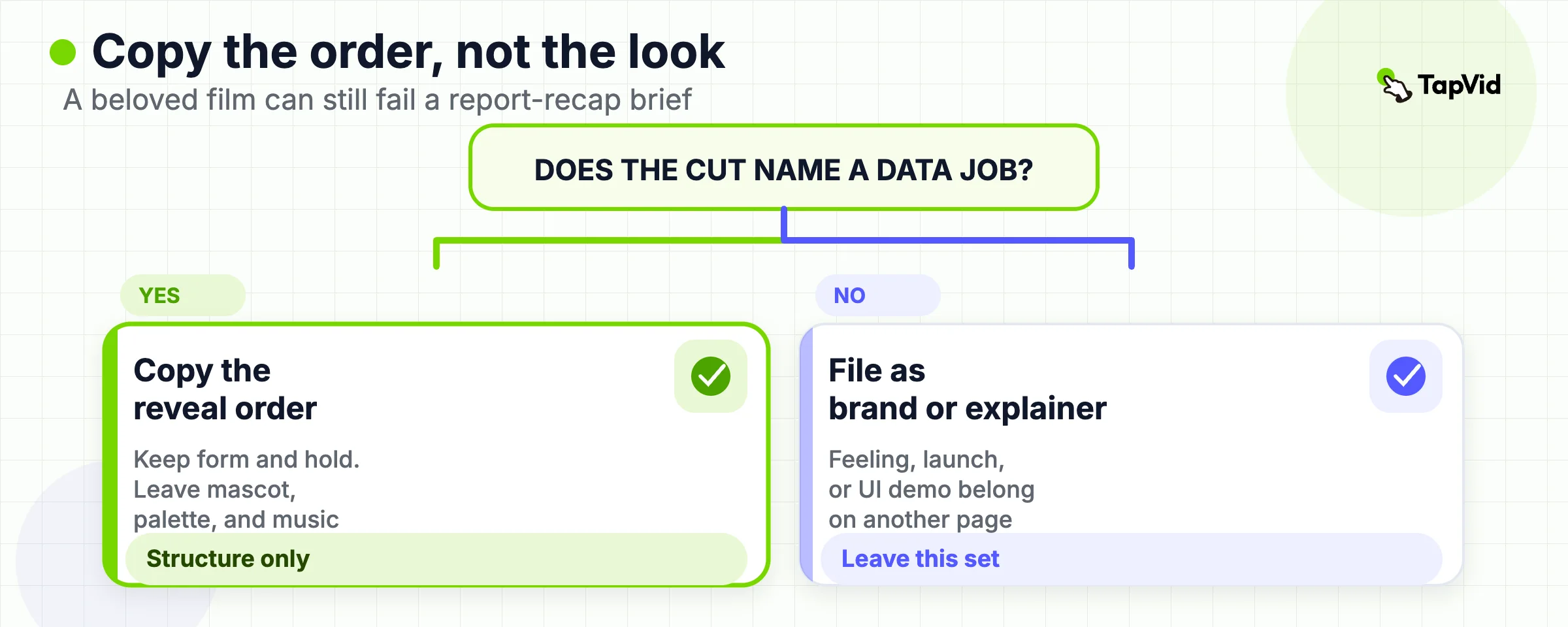
An infographic video example is useful when you can name the data job, the order the facts arrive, and the claim the pictures can support. The six videos below are opened from official pages, not from a vendor swipe file. Copy the reveal structure. Do not copy the illustration style as if it were proof, and do not treat a research film as a product demo.
Search for infographic video examples and you get two piles that look similar in motion. One pile is a gallery of named films. Filmora's 2026 list walks through Kurzgesagt, Vox, The Guardian, and others, then turns into a Filmora how-to (Filmora). Designrush's 2026 page names ten types, from product explainer to year in review, with almost no original watch links (Designrush). The other pile is a production guide. Animation Agency defines a video infographic as sequenced charts and icons with voice and timing (Animation Agency). 10 Studio teaches narrative flow and then shows style families (10 Studio).
Neither pile tells a team which structure to steal for a report recap. A product-launch loop, a brand manifesto, and a chart that builds in reading order can all be called "animated infographic" on a listicle. Only the last one is an infographic video in the sense this page uses. If you copy the wrong object, you ship a stylish explainer that never shows the number, or a chart dump that never makes an argument.
This page is a classifier with six sourced examples. Production steps live on the infographic video guide. Broader motion-graphics jobs live on the motion graphics examples page. The generator route is the infographic video maker. Stay here when the job is to name the data reveal before you brief a cut.
01
Score Each Cut by Its Data Job
Use the table before you open a reference. The only dimensions that matter at this stage are the data job, the reveal form, the claim the pixels can carry, and the claim they must not be asked to prove.
| Example | Data job | Reveal form | Claim it can support | Claim it cannot support |
|---|---|---|---|---|
| Kurzgesagt, stock exchange | Explain a system | Mechanism, then consequence | A viewer can retell how a market matches buyers and sellers | That any broker, app, or return is current |
| Vox, color names | Stage a research pattern | Ordered finding, then caveat | A viewer can repeat the reported order of color terms | That every language fits the hierarchy |
| The Guardian, Bitcoin | Define a mechanism | Problem, paper, shared ledger | What the 2014 film said Bitcoin was trying to do | Today's price, regulation, or product risk |
| National Geographic, climate | Keep a causal chain | Cause, then effect, then human lever | The film's greenhouse-effect sequence | A local forecast or a policy recommendation |
| JESS3, Wikipedia | Recap organizational growth | Dated facts in anniversary order | Wikipedia's 2011 anniversary story as JESS3 told it | Current editor counts or today's product UI |
| Life Noggin, internet history | Carry a timeline | Dated events in sequence | A short history of named network milestones | A complete technical history or a product origin story |
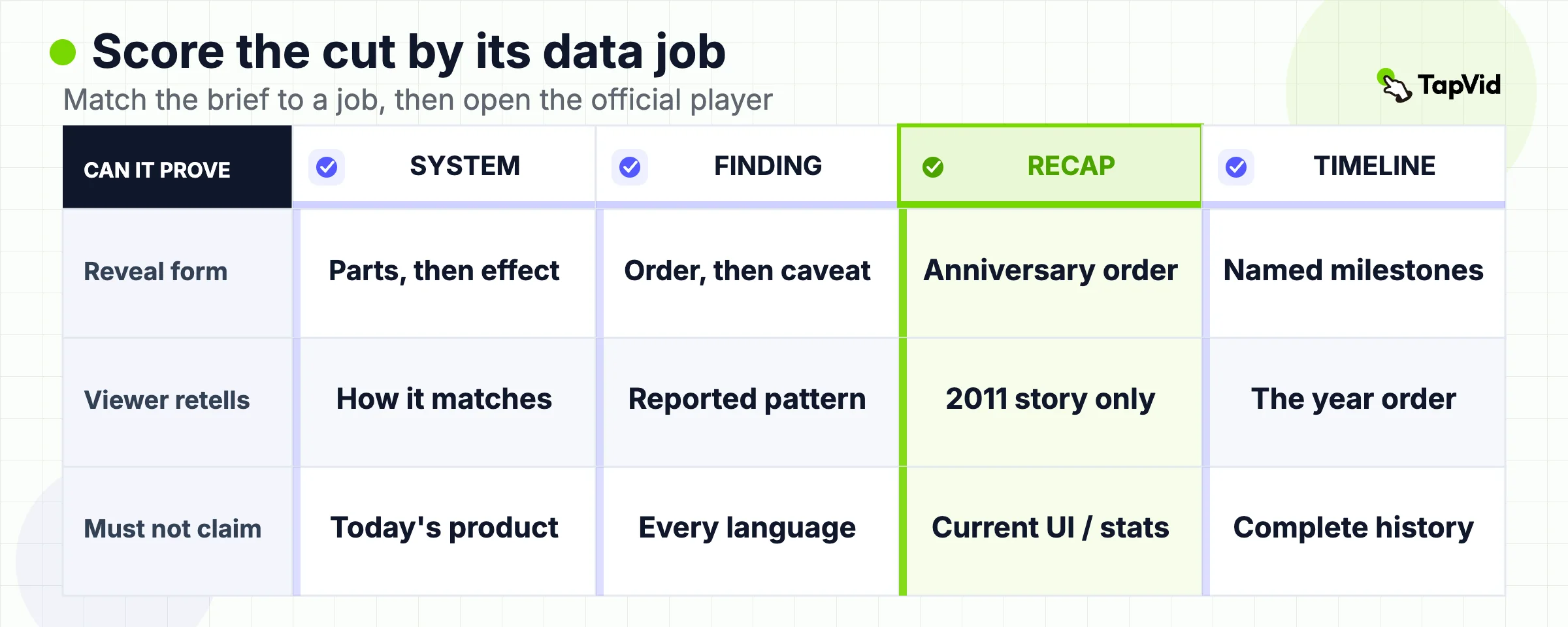
The table is a selection aid, not a ranking. Choose the row whose job matches the brief, then read the full example and open the original page. A row is not a license to reuse another team's footage, characters, or soundtrack.
02
The Data-Reveal Test for This Format
A useful infographic video example is a motion-led cut whose argument is a sequential data reveal. The pictures have to carry facts in order: a number, a comparison, a ranked list, a map change, a timeline, or a mechanism that only makes sense when the parts arrive one at a time. Animation Agency's definition is the right starting line. A static infographic holds the whole argument in one frame. A video infographic adds sequence, timing, and often audio so the viewer is walked from context to finding (Animation Agency).
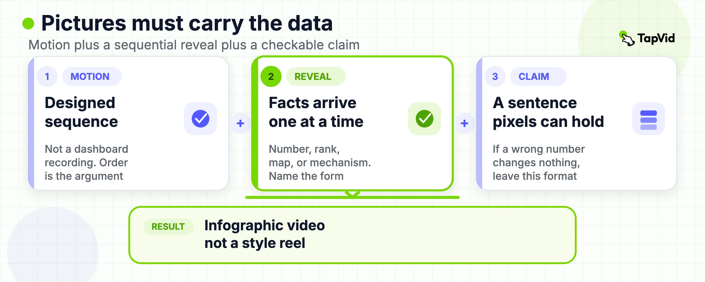
TapVid's own how-to draws a sharper line. A standard explainer uses pictures to illustrate a concept. An infographic video uses pictures to reveal data. The visual is the argument, not the decoration (TapVid infographic video guide). That line is why this page does not treat every motion-graphics explainer as an example. Slack's "Work, simplified." is a strong problem-to-relief film on the motion graphics examples page. It is not an infographic video, because the argument is a change in feeling, not a change in a chart.
Three near-misses show up in every gallery:
- A character explainer with one decorative bar chart. The story would survive if the chart were deleted.
- A product-launch montage with kinetic type. Designrush lists this family as "the product explainer" and "the commercial ad" (Designrush). Those are launch or brand jobs.
- A dashboard screen recording. Motion exists. Sequential argument does not, unless someone designed the order.
If you cannot pause at three frames and name the fact that just landed, the cut has already left this category. Style is not the test. Order is.
03
Four Questions to Ask Before You Copy a Move
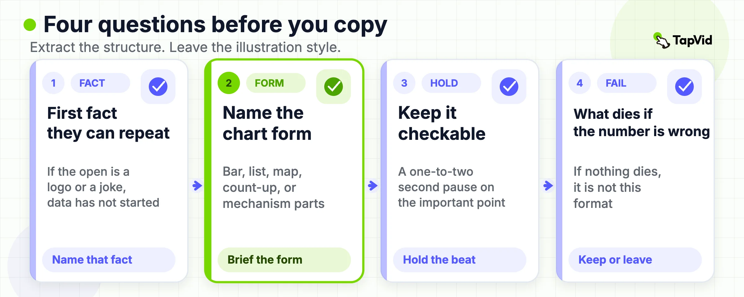
Filmora's tip list is generic: speak to the audience, tell a story, keep text short (Filmora). 10 Studio is more useful when it tells you to isolate one core insight before opening After Effects (10 Studio). Neither page gives an extraction checklist that survives a copyright-safe brief. Use these four questions on every example below.
- What is the first fact the viewer can repeat? If the opening is a logo, a joke, or a mood, the data job has not started.
- What form carries that fact? Bar, line, ranked list, map, count-up, or mechanism diagram. If you cannot name the form, you will brief "make it visual" and get decoration.
- What is the hold? A chart that appears and leaves in the same second cannot be checked. The how-to page asks for a one-to-two-second pause on the important point (TapVid infographic video guide).
- What claim would fail if the number were wrong? If a wrong number would not change the film, the film is not an infographic video.
Write the four answers in the brief before you hire a studio, open an editor, or paste a report into a maker. The questions also tell you when to leave this page. If the job is "show the current UI," you need a product demo, not an infographic. If the job is "make the brand feel premium," you need a motion-graphics format from the other examples guide.
04
Kurzgesagt: Reveal a System One Mechanism at a Time
Watch How The Stock Exchange Works (For Dummies) on the official Kurzgesagt channel. The film was published in November 2013. It explains why shares exist, how a company and a shareholder each use the market, and how price can move for reasons that are not a simple "the company did well."
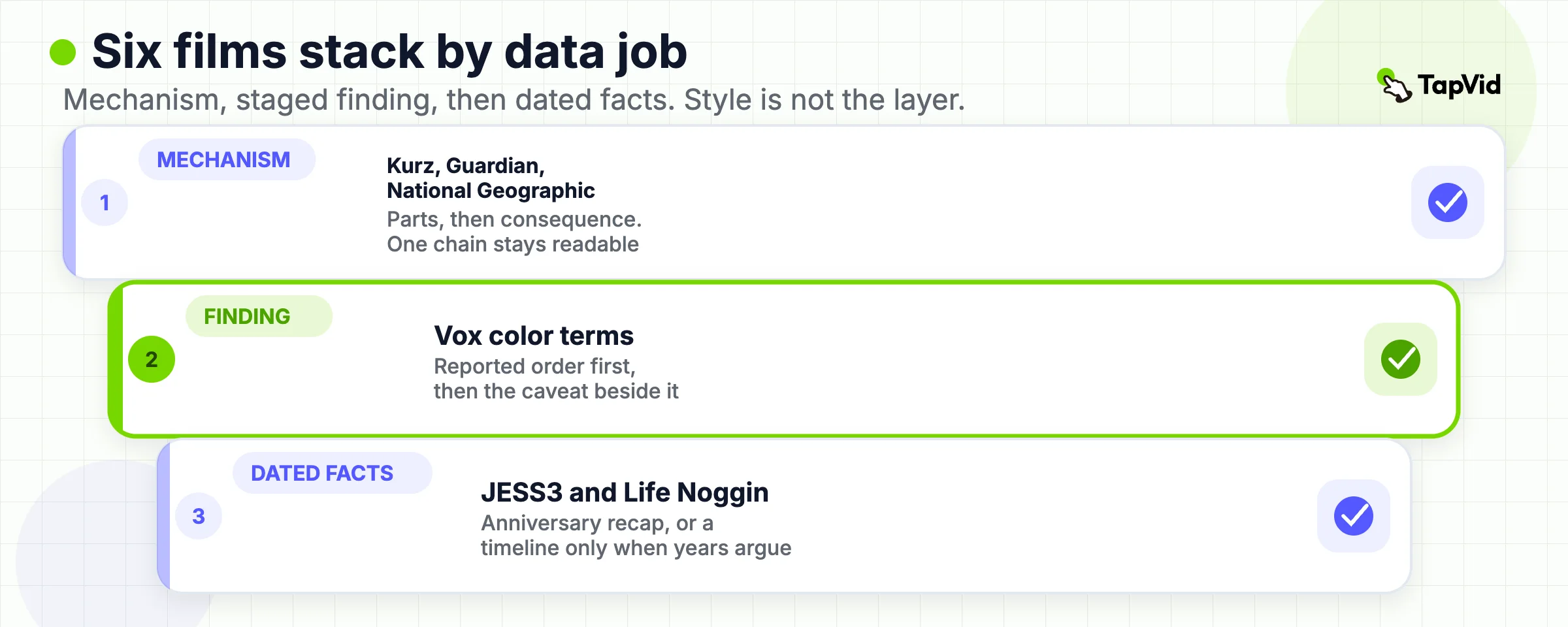
The useful lesson is the order, not the bird. The film does not open with a ticker or a trading-app UI. It opens with a marketplace metaphor, then adds securities, then adds the matching of buyers and sellers, then adds the ways a price can detach from a simple pizza-slice story about company value. Each scene answers one question. A viewer can retell the mechanism after one pass even if they forget the jokes.
Use this pattern when the brief is "explain how a system works" and the facts are relationships, not a quarterly table. Do not use it when the next action is "open our product and click here." The 2013 film cannot prove a current brokerage, fee, or return. It also cannot prove that a cute mascot is required. The reusable object is the one-question-per-scene mechanism chain.
Limitation: the film is a general-education piece. Any number it uses is part of that 2013 explanation. Do not drop those numbers into a 2026 sales deck as if they were a live market fact.
05
Vox: Stage a Research Pattern Instead of a Style Reel
Open Vox's page for The surprising pattern behind color names around the world, published 16 May 2017, and the matching YouTube upload. The film reports Berlin and Kay's 1969 claim that languages add basic color terms in a shared order, then walks through the later World Color Survey and the caveats.
The data job is a staged finding. First the reported order: dark/light, then red, then green or yellow, then blue, then later terms. Then the test design: speakers naming color chips. Then the criticism: small, industrialized samples and a narrow definition of a "basic" color word. Then the larger survey. The pictures keep the hierarchy visible while the narration adds the limit. That is the opposite of a style reel that flashes maps and adjectives.
Use this pattern when you have a research finding that arrives in steps, and the caveat has to sit next to the headline. A team that deletes the caveat and keeps the pretty color chips has already broken the example. The film can support "this is the pattern the researchers reported, and here is how they tested it." It cannot support "every language works this way" or "our product uses the science of color."
Limitation: Vox is editorial video, not a methods paper. If the brief needs the original 1969 book or the World Color Survey tables, cite those documents. Do not treat the film as the dataset.
06
The Guardian: Define a Mechanism in Under Four Minutes
Open The Guardian's 30 April 2014 page Bitcoin made simple and the official YouTube upload (25 June 2014, 3:25). The film asks what Bitcoin is, where the idea came from, and what problem a shared ledger was trying to solve.
The reveal is compact. Online payments have friction. In 2008 a paper proposes a system that does not rely on one central ledger. Users record transactions together. No single bank or government sits in the middle of every payment. The film then names early use and leaves the "future of finance or technical utopianism" question open. That last beat matters. A 190-second definition that ends with a hard prediction would be a different, weaker object.
Use this pattern for a mechanism definition that has to fit a news or landing slot. Keep the problem, the proposed mechanism, and one dated origin. Do not pack in today's price, today's brands, or a buy/sell recommendation. The 2014 film cannot support a current investment claim, a compliance claim, or a product comparison. It can support "this is how the idea was explained to a general audience in 2014."
- Limitation: the page itself labels the article as more than eleven years old. Treat every operational detail as historical. If you need current policy or market facts, open a current official source. Do not refresh this example by silently swapping in new numbers.
07
National Geographic: Keep Cause and Effect in One Chain
Watch Causes and Effects of Climate Change on the official National Geographic channel (28 August 2017, about 3:05). National Geographic Education also hosts the piece as Climate 101: Cause and Effect.
The film keeps one chain: greenhouse gases let light in and hold heat, human burning of fossil fuels has raised carbon dioxide, the planet warms, effects follow, humans can also change the energy mix. The pictures stay on that chain. They do not branch into a catalog of every possible impact. That is why the cut still reads as an infographic video rather than a nature montage with a voiceover.
Use this pattern when the brief is a causal story with a small number of steps. The how-to page's "three data points per scene" rule is the matching production constraint (TapVid infographic video guide). If you need a local flood map, an industry emissions table, or a policy menu, this film is the wrong reference. It can support the greenhouse-effect sequence it shows. It cannot support a city-level forecast or a claim about a specific company's emissions.
Limitation: climate science updates. The film is a 2017 education piece. Do not present its wording as the latest assessment. If the brief needs a current official dataset, start from that dataset and build a new reveal.
08
JESS3: Recap an Organization With Dated Growth Facts
Open JESS3's project page for The State of Wikipedia and the official YouTube upload. JESS3's 17 January 2011 blog post presents the 3.5-minute film, narrated by Jimmy Wales, as a Creative Commons Attribution-ShareAlike anniversary piece (JESS3 blog). The same channel's why-we-made post embeds that watch URL.
This is the closest public analogue to a report recap. The job is not "what is an encyclopedia." The job is "what had Wikipedia become by its tenth year, in dated facts, for a general audience." Growth, community, and a stated future sit in anniversary order. The pictures are built to carry those facts. That is why agency listicles keep citing it, and why it still belongs on an examples page that is otherwise full of science explainers.
Use this pattern for an annual report, a funding update, or a "year we just had" recap. Write the dated facts first. Then decide which ones deserve a count-up, a map, or a ranked list. Do not start with a style frame from 2011 and go looking for numbers that fit the shapes.
- Limitation: the facts are the 2011 anniversary story. Editor counts, language counts, and traffic are not current unless you replace them from a current Wikimedia source. The film also cannot prove that an anniversary recap will get TechCrunch coverage. JESS3's case study describes that 2011 distribution. It is not a 2026 playbook.
09
Life Noggin: Use a Timeline Only When Dates Carry the Argument
Watch HISTORY OF THE INTERNET on the official Life Noggin channel (15 December 2014, about 3:40). The film walks from the idea of a resilient network, to ARPANET's 1969 login attempt, to later named milestones, and ends on everyday dependence on the network.
A timeline is the most over-copied infographic form. Teams put years on screen because years look like data. This example only works because the dates are the argument. 1962, 1969, 1971, and later beats are not decoration around a brand story. They are the spine. If you remove the years, the film collapses into "computers started talking." That is a weak brief.
Use this pattern when the source pack is a sequence of dated events and the viewer must leave with the order. Do not use it for a product launch that merely wants a "history of us" bumper. A company founded in 2019 does not become an infographic video by adding three logos on a line.
Limitation: the film is a short popular history. It omits most of the technical and political story. It also includes sponsor language at the end. Do not treat it as a complete reference, and do not copy the sponsor bumper into a client recap.
10
Limits These Six Films Do Not Clear
| Claim a gallery implies | What these six films support |
|---|---|
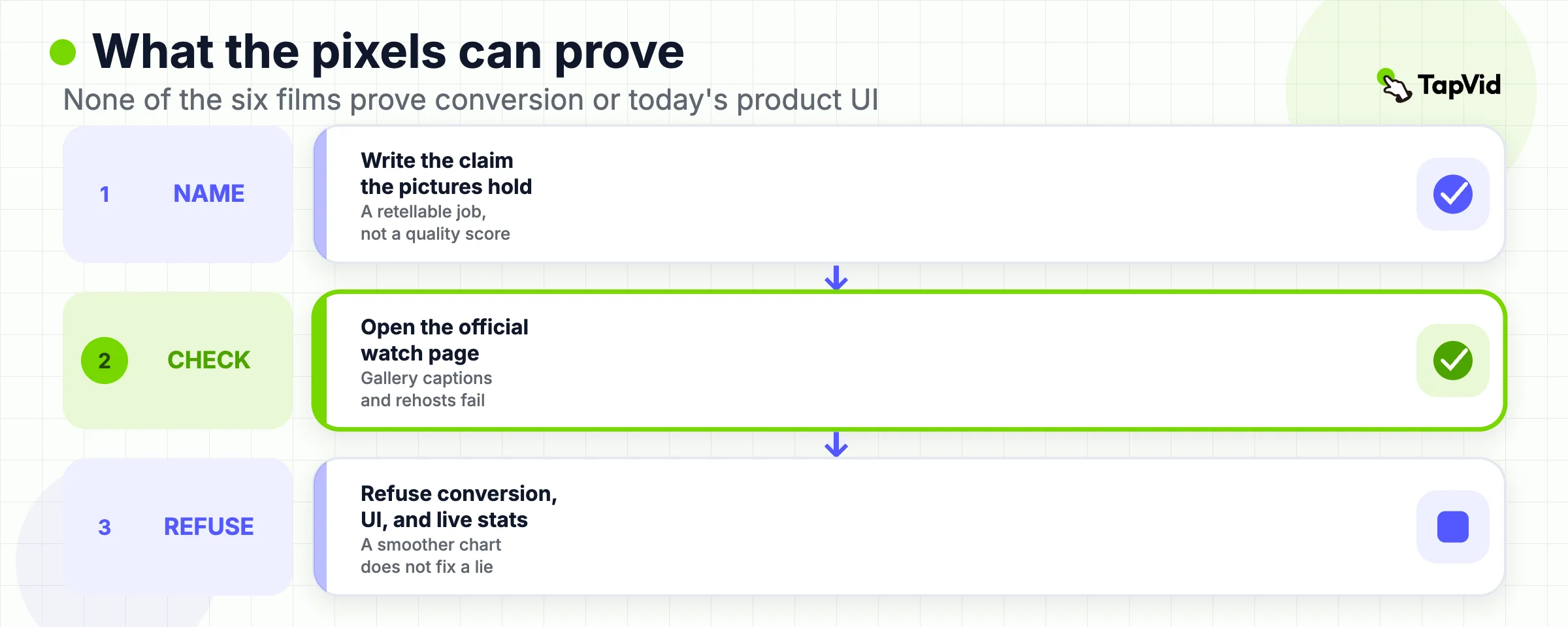
| The look caused attention or sales | None of the six proves conversion |
| Animation is faster than a slide | None proves production speed |
| The dataset is accurate | None proves your numbers |
Gallery pages fail in the same place. They treat "best" as a quality score, then imply that the look caused attention, sales, or learning. Filmora calls its set "the most impressive examples" and then teaches Filmora (Filmora). Motiongility titles a page "15 Best" (Motiongility). Designrush leans on marketing-statistic sentences that this page does not reuse, because those sentences are not tied to the six films above (Designrush).
None of the six examples proves conversion. None proves that animation is faster to produce than a slide. None proves that your dataset is accurate. The how-to page is explicit that AI motion does not authorize AI-invented statistics (TapVid infographic video guide). If a number is wrong, a smoother bar chart makes the error easier to trust.
Also excluded from this page's example set:
- Filmora's Anthropic row. The official Anthropic artifact is a March 2025 research article with papers and interactive graphs, not a confirmed infographic video (Anthropic).
- Agency portfolios that show a still and call it a case study without a watchable official URL.
- TapVid-generated clips that have not been captured in this article as a first-hand run. This draft does not say "we tested."
- If you need a first-hand product proof, that is a later Evidence route, not a sentence you can write from a listicle.
11
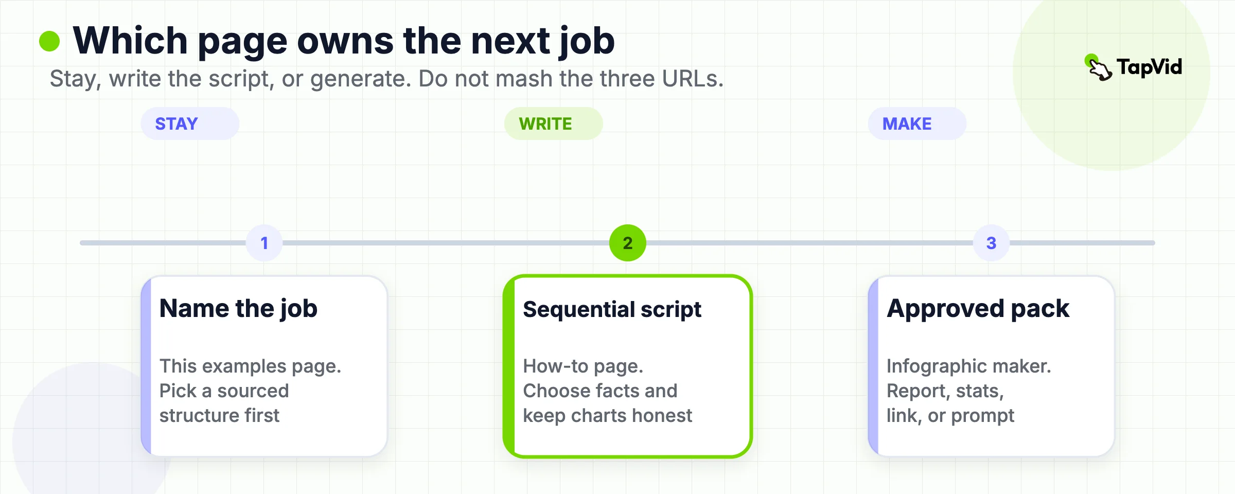
Which TapVid Page Owns Which Job
| Page | Reader job | Do not ask it to do |
|---|---|---|
| This article, `/blog/infographic-video-examples` | Name the data job and pick a sourced structure | Teach After Effects, or generate a file |
| Infographic video guide | Choose data, write a sequential script, keep charts honest | Host the example set |
| Motion graphics examples | Reuse a communication structure across product, brand, and education films | Decide whether a chart is the argument |
| Infographic video maker | Turn an existing report, stats, link, or prompt into a generated cut | Prove that a third-party film is the right reference |
Three live TapVid surfaces sit next to this keyword. They are easy to mash into one URL. They are not the same reader job.
If the next action is "I already have the numbers, I need a draft video," open the maker. If the next action is "I do not know which facts to show," stay on the how-to. If the next action is "I liked a Slack film and want that energy," leave this page. That is a motion-graphics brief.
12
TapVid Fit for a Report Recap
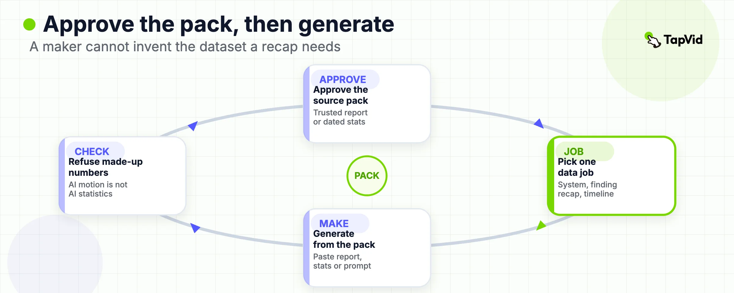
TapVid's official maker page describes a report-to-video path. You paste stats, a report, a link, or a prompt. The product generates counting numbers, charts, icons, and pacing from that content, then you refine by prompt and export an MP4 (TapVid infographic video maker). The same page says there is no dedicated spreadsheet importer. If you are working straight from a CSV and only need charts, it points to the animated chart maker instead.
That is the honest product placement for this article. The examples above all start from material a team already trusted: a research claim, a dated history, an anniversary fact set, a mechanism definition. A maker cannot invent that pack. If you paste a vague prompt and no source, you will get a confident-looking reveal of unverified numbers. The how-to page already forbids using AI to derive statistics that will be presented as fact (TapVid infographic video guide).
Use the maker when the source pack is approved and the job matches one of the official formats on that page: stat highlights, animated charts, timeline or process, report or survey recap, comparison, or a short social clip. Check the pricing page for credits. The maker page says exported videos carry a small TapVid watermark in the bottom-right corner unless a paid plan removes it. Do not brief the maker as After Effects, as a live dashboard recorder, or as a guarantee that stakeholders will watch the recap.
- This article has not run a TapVid project for these six briefs. The product sentences above are official-page facts, not a hands-on score.
13
Frequently asked questions
What is an infographic video example?
A watchable cut whose argument is a sequential data reveal, with an official source you can open. Style alone does not qualify.
How is that different from an explainer video?
An explainer can illustrate a concept with or without numbers. An infographic video fails if the data reveal is removed. Broader explainer patterns live on the explainer examples guide.
How many examples do I need to study?
One matching job is enough if you can answer the four questions. Six is a map, not a quota.
Can I use these videos in my own ad or course?
Not from this page. Open each official source and follow that owner's license. JESS3's Wikipedia film is the rare case that states Creative Commons Attribution-ShareAlike on the 2011 post. The others are official watch links, not stock.
Do I need After Effects to make one?
No. This page does not teach a tool path. Official TapVid copy says the maker generates layout, charts, and pacing from a report or prompt, without a timeline editor (TapVid infographic video maker). Accuracy still needs a human-checked source pack.
Can I import a spreadsheet?
The official maker page says there is no dedicated spreadsheet importer. Paste numbers or describe them in the prompt, or use the animated chart maker for table-first work.
Will an infographic video raise conversion?
None of the six sources above prove that. Do not brief a recap as a conversion test unless you have your own measurement plan.
Where should I go next?
If you need production rules, open the infographic video guide. If you already have approved stats or a report, open the infographic video maker.