
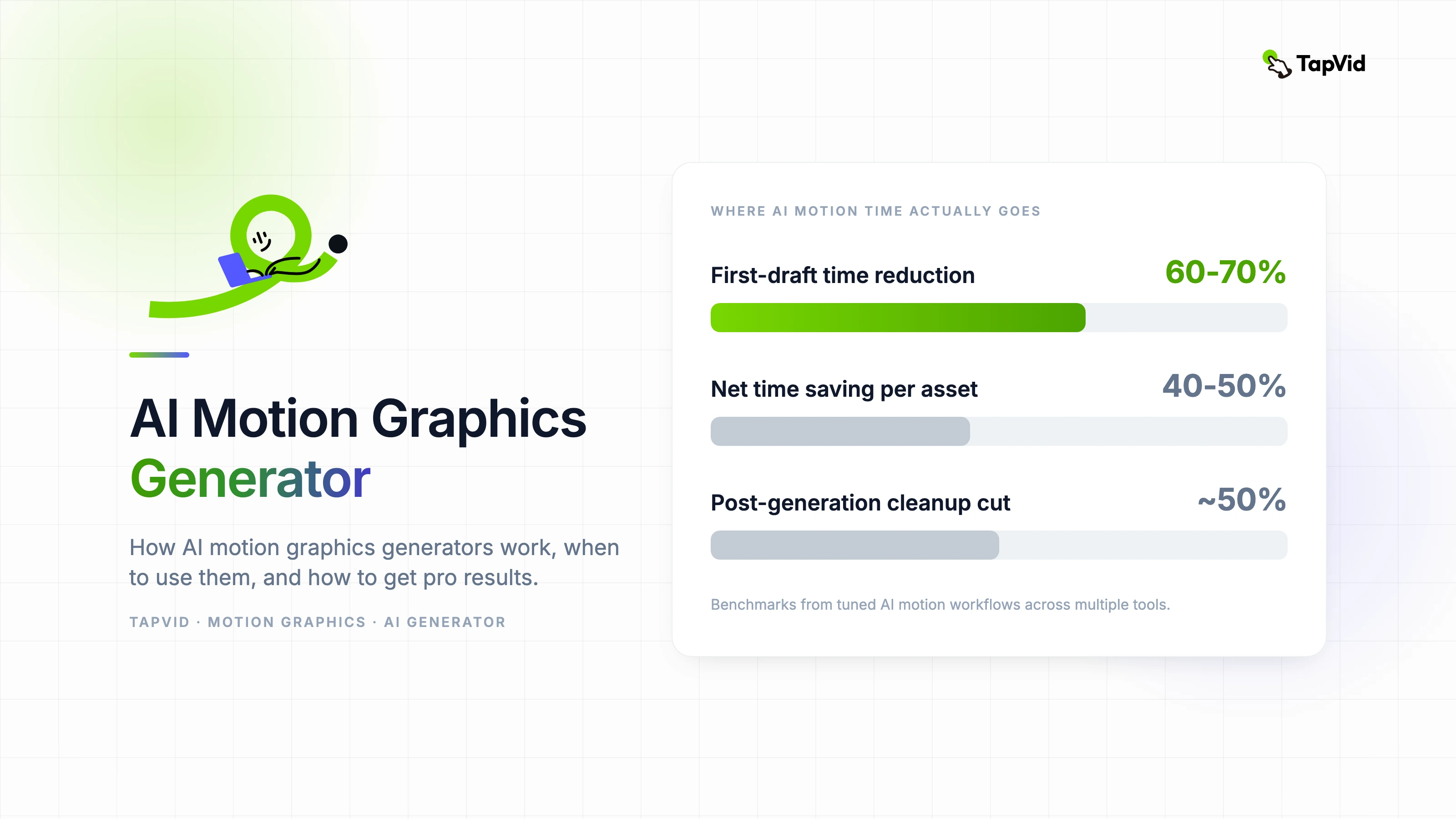
AI Motion Graphics Generator: A Complete Practical Guide
A practical breakdown of how AI motion graphics generators work, when to use them, and how to get professional results without a dedicated motion team.
Apr 3, 2026 · 10 min read

Loading...
A director's guide to motion graphics for social media — format specs, timing principles, and how to build repeatable templates that maintain brand identity at scroll speed.
Summarize with
10 min read
Written and edited by
Yibo Wang
CPO & Head of Product Design, SigmaZ AI Company
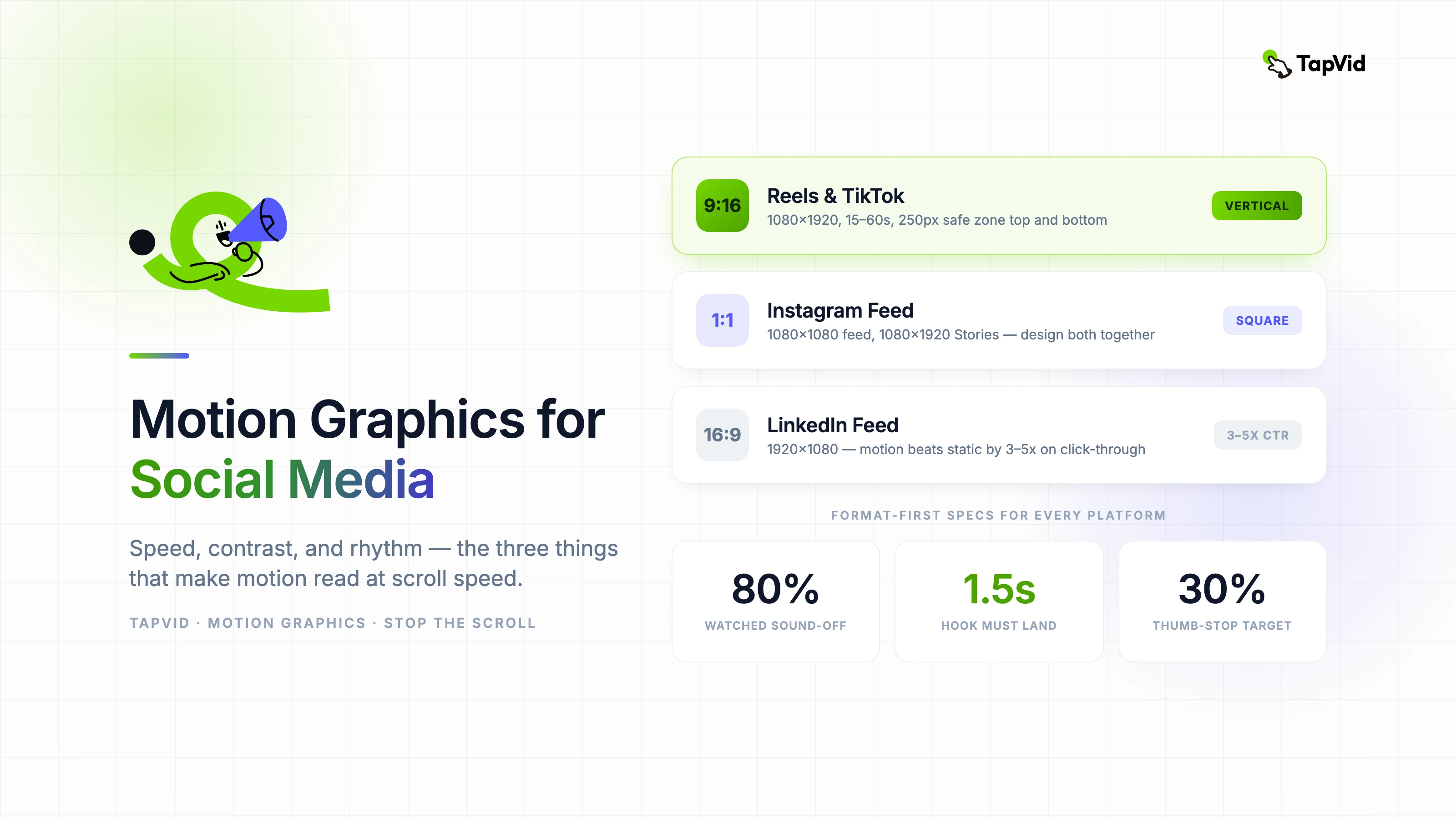
Korean entertainment brands have been at the cutting edge of motion graphics for social media for a decade. I have watched global brands scramble to match an aesthetic standard that K-entertainment agencies developed while everyone else was still figuring out what a vertical video was. Most of what works for social motion comes down to three things: speed, contrast, and rhythm. Let me show you what I mean.
Broadcast motion graphics are designed for passive viewing — audiences sit, watch, and wait. Social motion graphics compete against infinite scroll, notification sounds, and the physical habit of a thumb that never fully stops moving. The design problem is categorically different.
The first second is the only second that is guaranteed. Every motion design decision needs to be evaluated against the question: does this read in the first second without sound? If the answer is no, the design needs to change.
Sound-off is the default, not the exception. Over 80 percent of social video is watched without audio. Motion graphics that depend on music for rhythm or narration for meaning fail the majority of their potential audience before they start.
The visual hook must land within the first 1.5 seconds. This is not a creative preference — it is the empirical threshold at which scroll-stopping rate drops significantly in platform analytics. Design your opening frame first, not last.
Fifteen-second social motion graphics outperform sixty-second ones on completion rate by a wide margin. If your message requires sixty seconds, it probably requires a different format. Use motion graphics for single-message delivery; use long-form video for multi-step explanation.
Loop design is an underused advantage. A motion graphic that loops seamlessly accumulates watch time with no additional production cost. Viewers who replay even once double the effective watch time metric. Design for the loop from the first frame.
High contrast is not optional for mobile. Text that reads comfortably on a desktop monitor at 2:1 contrast disappears on a phone screen in daylight. Design to a minimum 4.5:1 contrast ratio between text and background — this is the WCAG AA standard and also the practical threshold for legibility on mobile.
Font size for social motion graphics should be uncomfortably large during design. On a phone screen, what looks enormous on your desktop monitor looks correct. A safe minimum is 48px at 1080px canvas width for any text that needs to be readable at a glance.
Limit your palette to two active colors per frame. More than two competing colors in motion creates visual noise that reads as chaos rather than energy. Use your brand's primary color for emphasis, neutral for base, and reserve a third accent for the single most important element per scene.
The three metrics that matter for social motion graphics are thumb-stop rate (how many people paused on your content), loop rate (how many watched more than once), and save rate (how many saved for later). Likes and comments are engagement signals but they do not measure motion effectiveness specifically.
A benchmark to target: thumb-stop rate above 30 percent indicates the first second is working. Below 20 percent means the opening frame is not competing for attention at scroll speed. Redesign the opening first, then evaluate everything else.
Related articles
A practical breakdown of how AI motion graphics generators work, when to use them, and how to get professional results without a dedicated motion team.
Apr 3, 2026 · 10 min read
How professional motion graphics animators approach commercial projects — from initial brief to final delivery — and where AI fits into a real production system.
Apr 3, 2026 · 13 min read
A style-first guide to developing a distinctive motion graphics aesthetic — covering visual identity, experimental techniques, and building a creative portfolio that attracts the right audience.
Apr 3, 2026 · 10 min read
Join thousands of product teams using AI to create professional videos in minutes.